
Photo by Lorena Schmidt on Unsplash
This post is following of above post.
In this post, let's make some graphs to understand data distributions, data relationship.
Fisrt, a histgram of gr_us.


ecdf plot of gr_us.


boxplot of gr_us


We see there are a few outliers on upper area.
ne_ag histogram.


ecdf plot of ne_ag


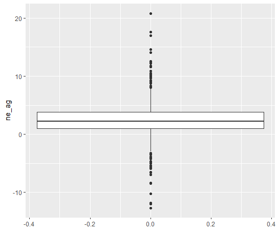
boxplot of ne_ag

year vs. gr_us


country vs. gr_us


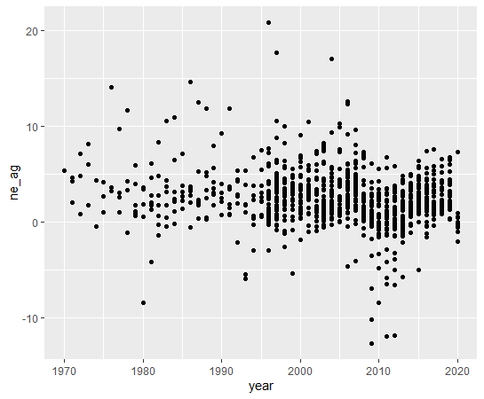
year vs. ne_ag

country vs. ne_ag


Finally, gr_us vs. ne_ag


In this graph, we see the greater gr_us, the lower variance of ne_ag.
That's it. Thank you!
Next post is
To see the fist post,