
Photo by Casey Horner on Unsplash
This post is following of above post.
In this post, let's draw scatter plots using R ggplot2::geom_point.
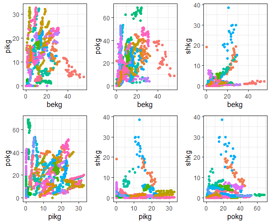
First of all, let's see correlations about 4 KG_CAPs.
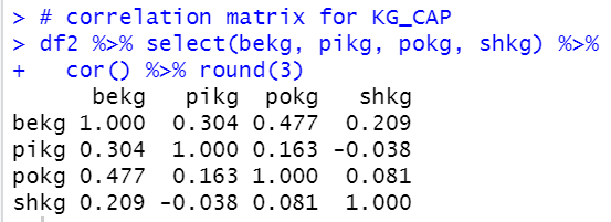
bekg: BEEF KG_CAP and pokg: POULTRY KG_CAP are the most strongly correlated pair.
pikg: PIG KG_CAP and shkg: SHEEP KG_CAP are the least weakly correlated pair.
Then, let's draw scatter plots.
First, bekg: BEEF KG_CAP and pikg: PIG KG_CAP
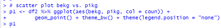
We see some countries seems have negative correlation.
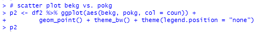
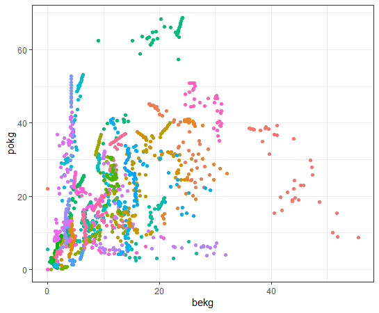
Let's see bekg and pokg: POULTRY KG_CAP
How about bekg and shkg: SHEEP KG_CAP?
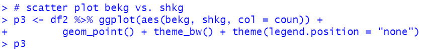
Many countries have relatively low value for shkg compared to bekg.
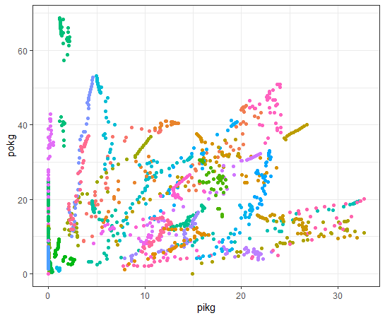
pikg and pokg

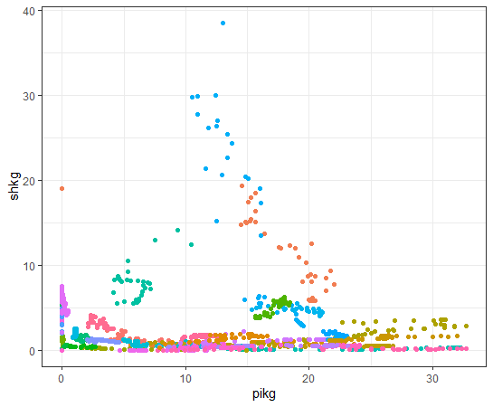
pikg and shkg
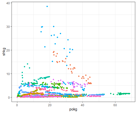
Lastly, pokg and shkg
Now, we have 6 scatter plot objects, p1 ~ p6.
Let's show it at once. we use gridExtra::grid.arrange() function.
That's it. Thank you!
Next post is
To read the 1st post,