
This post is following of the above post.
In this post, let's make some graphs.
Firstly, let's see year vs. ppp. I use plot() function.

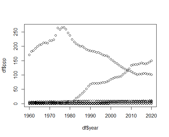
We see 2 countries have relatively high ppp than oters.
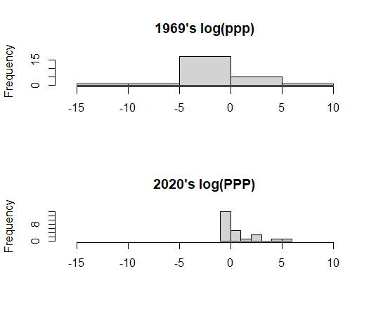
Let's convert ppp to logarithmic value and make a graph.
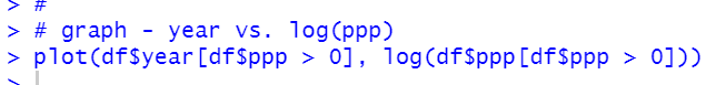
We see 1960's ppp are more variance than 2020's ppp.
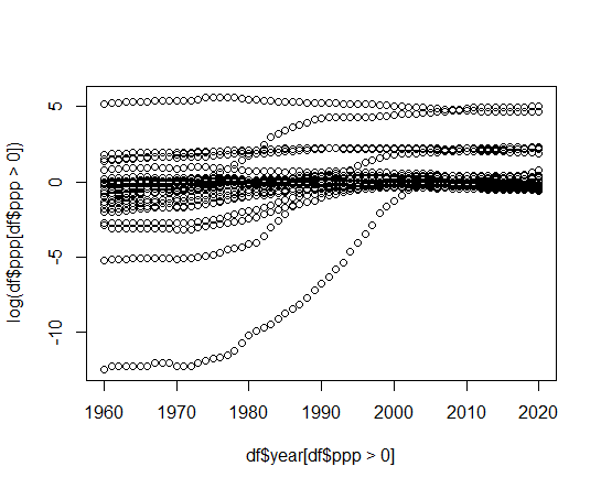
Let's make histogram. I use hist() function.
Then, let's see iso vs. ppp
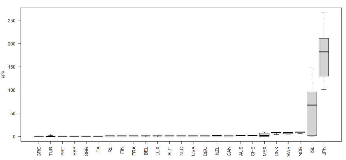
I see ISL and JPN are very different than others.
Let's make a graph with log(ppp).

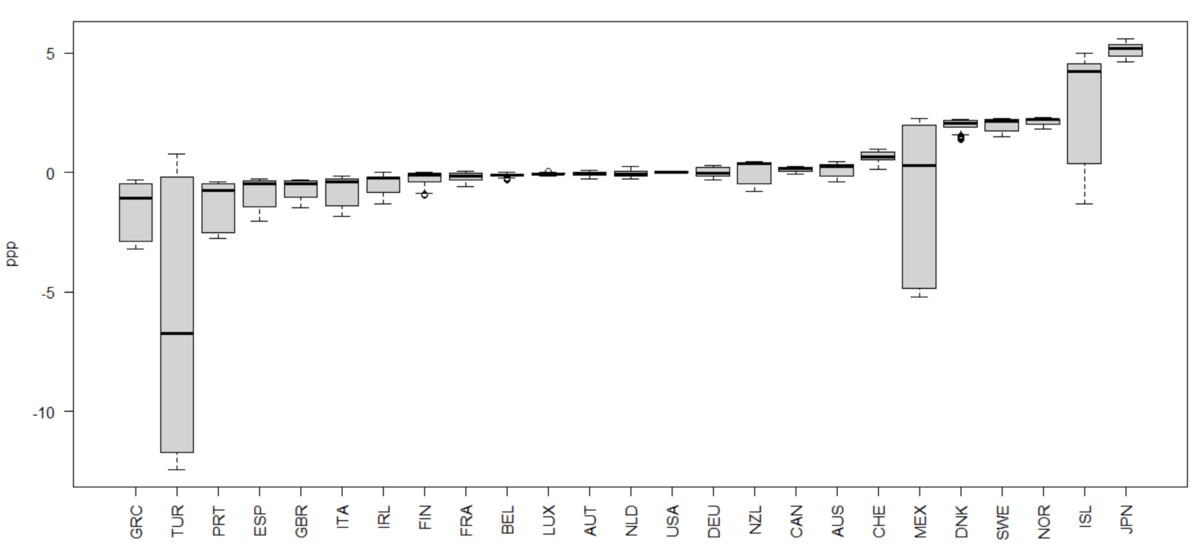
I see TUR, MEX and ISL are very volatile.
Let's see which country are volatile/stable for ppp. I use filter(), group_by(), summarize() and arrange() function.
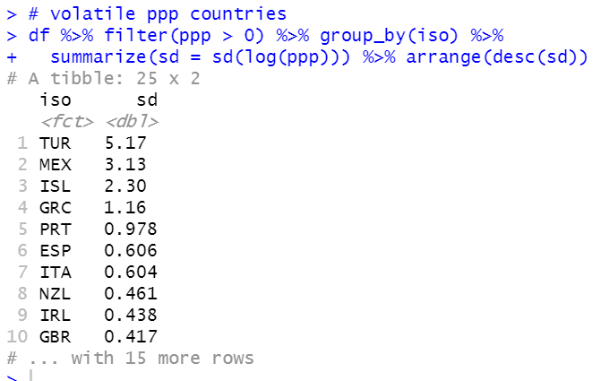
As you see in the previous graph, TUR, MEAX and ISL are top 3 volatiole ppp countries.
Which are stable countries?
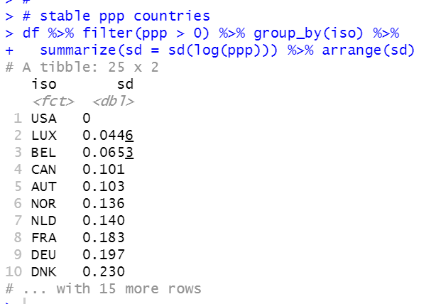
USA has zero sd because ppp is based on us dollar. LUX, BEL and CAN are top 3 stable ppp countries.
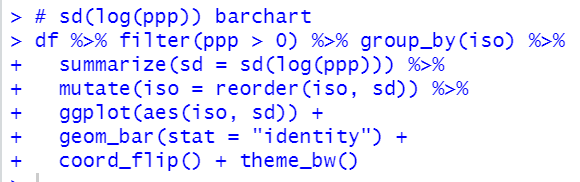
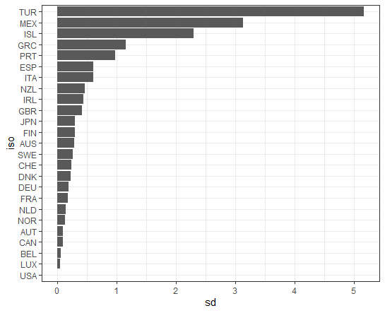
Let's make a barchart. I use ggplot() + geom_bar() function and I use coord_flip() function to flip X-axis and Y-axis.
That's it. Thank you!
Next post is
To read the 1st post,