
Photo by CHUTTERSNAP on Unsplash
This posit is following of above post.
Let's see data on some graphs.
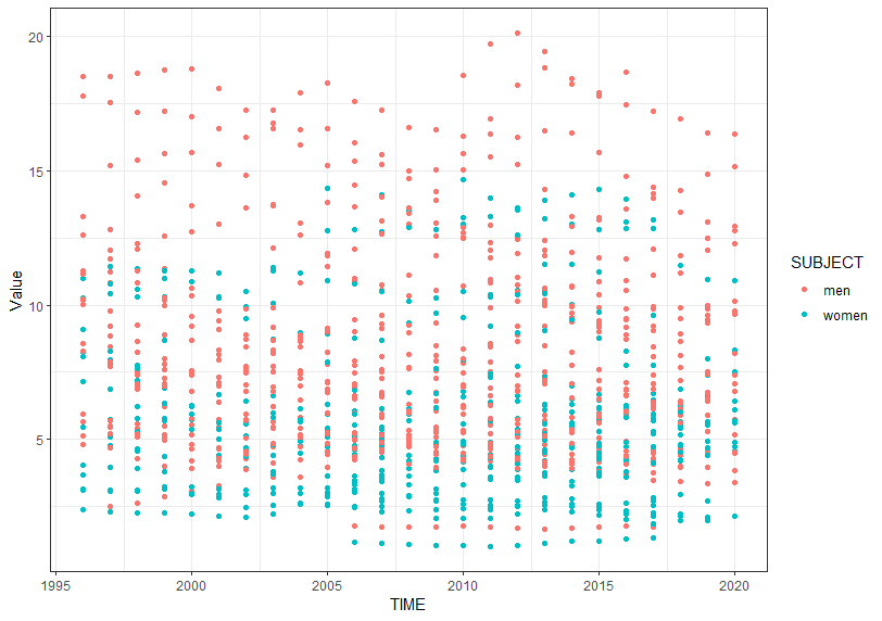
I use ggplot2 package which is included in tidyverse package.
gerom_point() function makes scatter plot. I see men has higher self-employed percentage than women in general.
Next, let's see which LOCATION has the higest/lowest value.
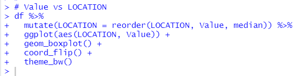
JPN has extremely low percentge and ZAF hs the higest percentage.
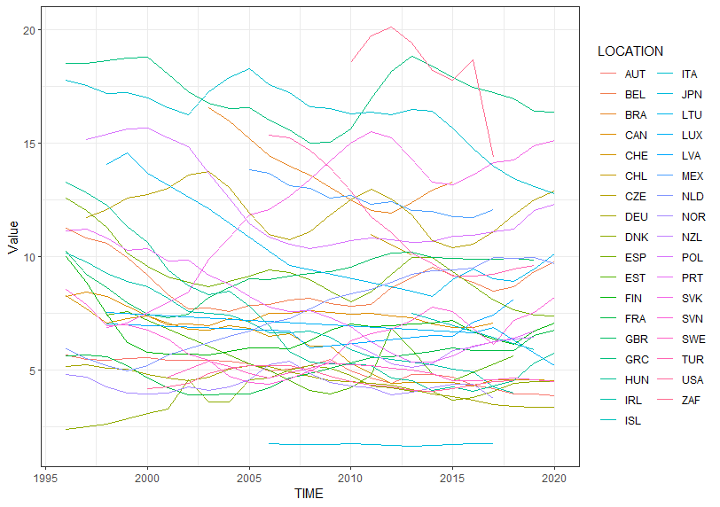
Next, let's see trend line by LOCATION
Next, let's see women trend
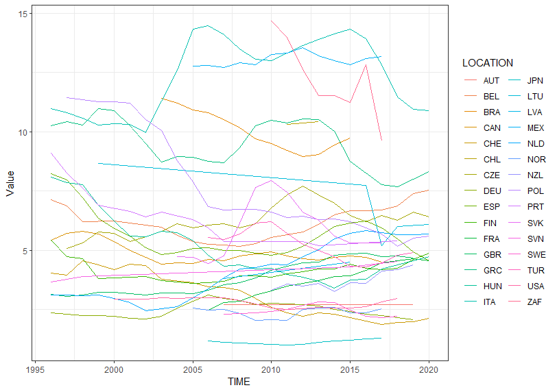
I don't see typical time trend.
Next, let's see histograms.
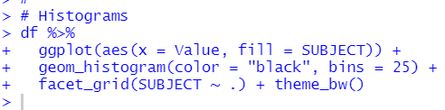
mem's value has wider spread.
Next, let's see which LOCATION has the largest observations.

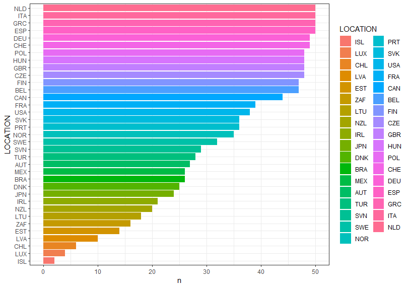
NLD, ITA, GRC and ESP hve the largest observations.
In this post, I use ggplot2 package to vizualization.
geom_point() for scatter plot,
geom_line() for line chart,
geom_boxplot() for box plot,
geom_histogram() for histogram and
geom_bar() for bar chart.
That's it. Thank you!
Next post is
To read the first post,