
Photo by Fatih Yürür on Unsplash
This post is following of above post.
In the previous post, I made a new data frame, df_new, which has mem variable and women variable.
Let's visualize those data.
Firstly, men data by LOCATION

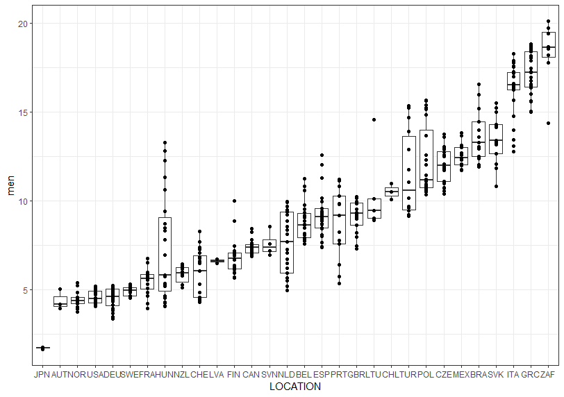
JPN has the lowest and ZAF has the highest.
Next, women by LOCATION

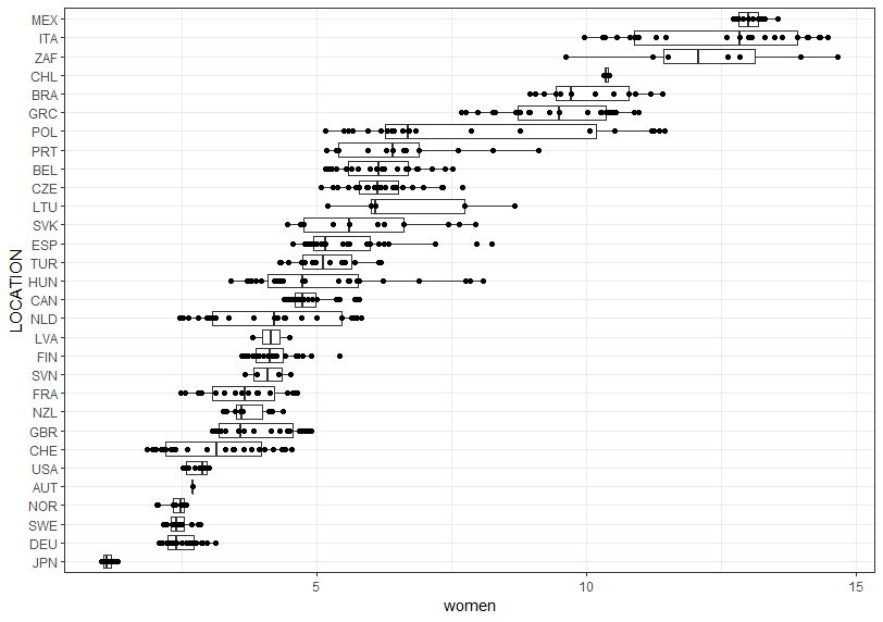
JPN has the lowest, MEX has the highest. JPN has the lowest value for the both men and women.
Then, let' see men by TIME.

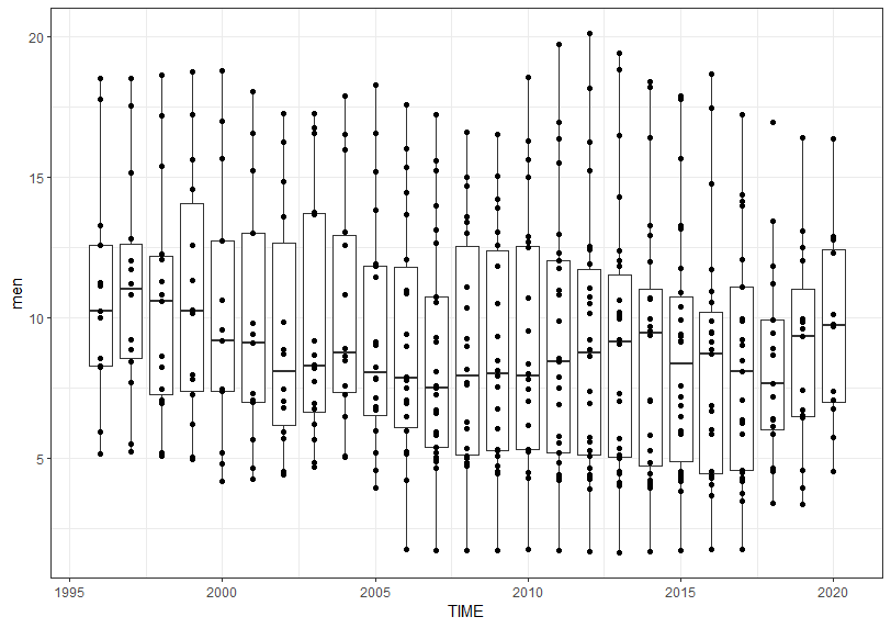
I don't see there is clear trend.
Next, women by TIME.

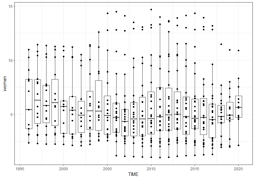
For women young self-employed percent, I don't see clear up or down trend too.
Let's check which TIME has the most many observations.

I see 2021, 2013 and 2015 have the most many observations, each TIME has 26 observations.
By the way, I have other CSV data file which has GDP and per capita GDP data like below.
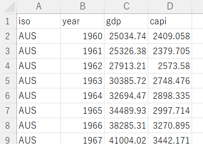
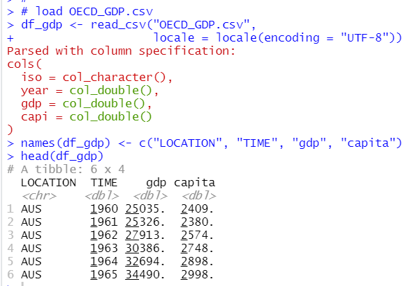
Let's add this data to our data analysis.
Then, I use 2012 and 2015 data only and combine gdp data and younf self-eompoyed data.
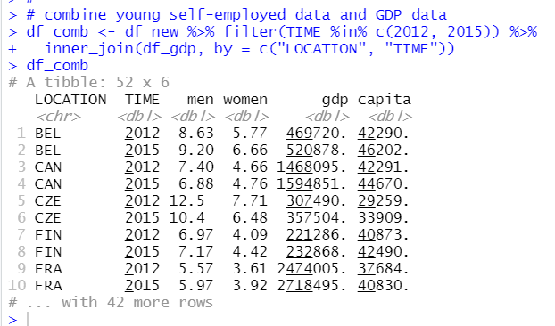
This df_comb has 52 observations and 6 variables.
Let's analyze relationship between GDP data and young self-employed data in next post.
That's it. Thank you!
Next post is
To read the 1st post,