
UnsplashのJ Cruikshankが撮影した写真
This post is following of the above post.
In the previous post, I load CSV file data into R. Then, let's make some basic graphs using ggplot2 package.
Scatter plot
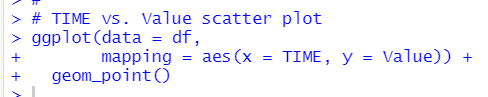
ggplot() + geom_point() makes scatter plot.
Boxplot
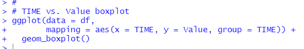
ggplot() + geom_boxplot() makes boxplot
Line plot
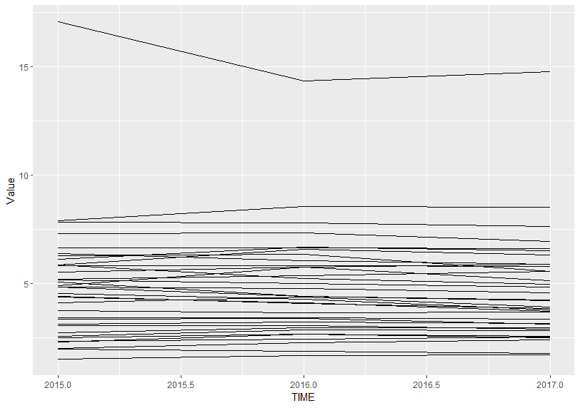
ggplot() + geom_line() makes line plot.
Histogram
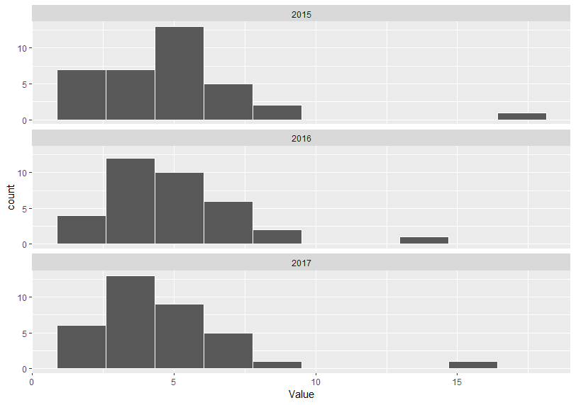
ggplot() + geom_histogram() makes a histogram.
I use color = "white" to make border lines whilte and bins = 10 to make number of bins 10. Then, I use facet_wrap() function to make histogram for each TIME.
Violin plot
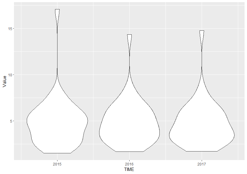
ggplot() + geom_violin() makes violin plot.
Density plot
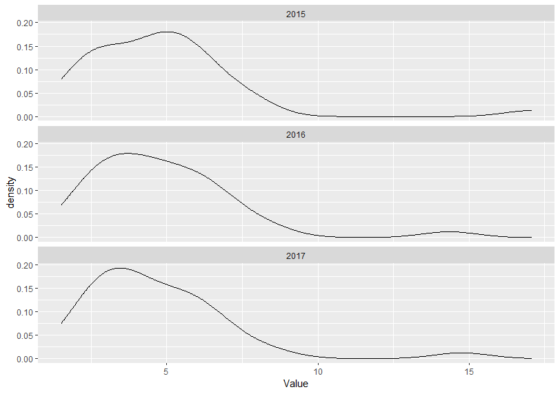
ggplot() + geom_density() makes density plots. It is like histogram.
According to above plots, I find Debt to Surplus Ratio has similar distribution pattern for 2015, 2016 and 2017, almost LOCATION has less than 10 value.
That's it. Thank you!
The next post is
To read from the 1st post,