
UnsplashのAlicia Steelsが撮影した写真
This post is following of above post.
In the previous post, I made a dataframe for data analysis, named 'df2'.
Now, let's start data analysis with data visualization.
I will make 5 Named Graphs (5NG) using R.
My text book is
Chapter 2 Data Visualization | Statistical Inference via Data Science (moderndive.com)
Let's start with 5NG #1, Scatter Plot.
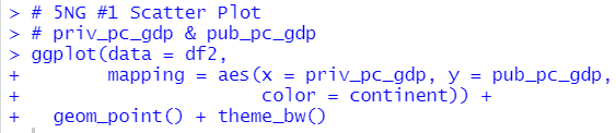
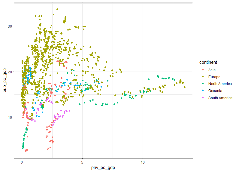
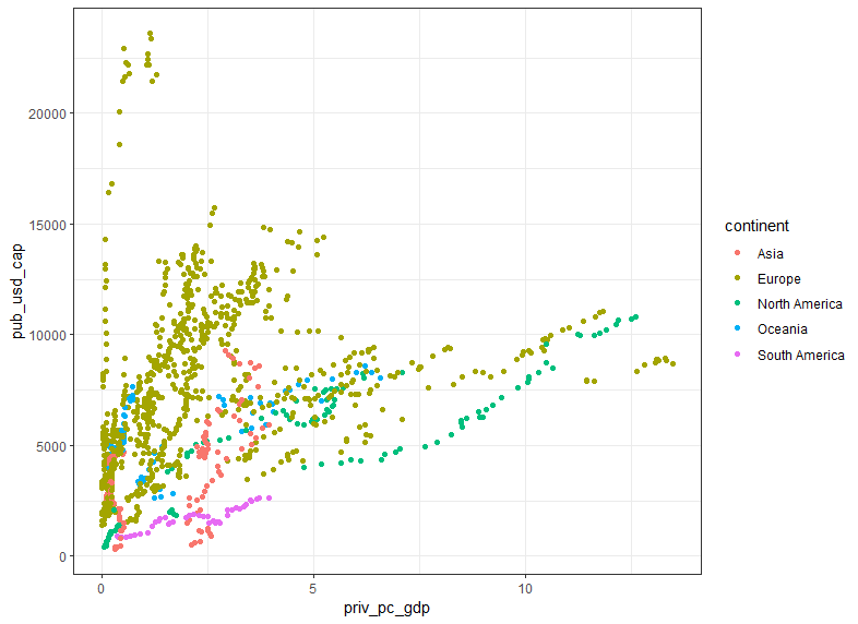
geom_point() makes scatter plot. I see relatively positive relationship between priv_pc_gdp and pub_pc_gdp.

I see relatively positive relationship between priv_pc_gdp and pub_usd_cap too.

I see there is strong correlation between pub_pc_gdp and pub_usd_cap.
Next, Line Graph.

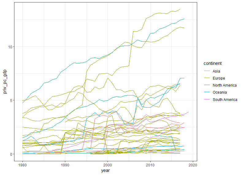
geom_line() makes line graphs. prive_pc_gdp are increasing in general.

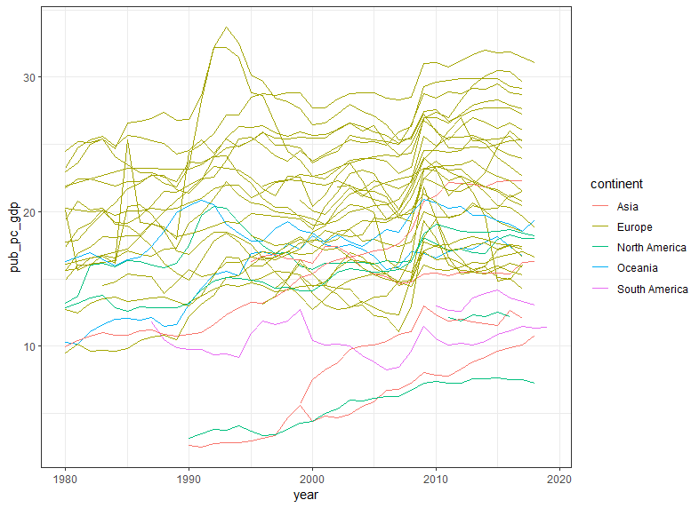
pub_pc_gdp has more variation than priv_pc_gdp.

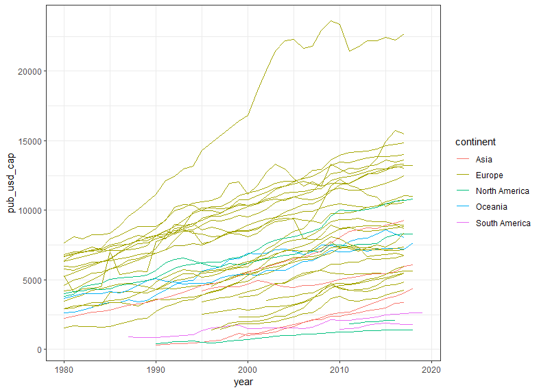
pub_usd_cap are increasing for almost all countires.
#3 5NG is histogram.

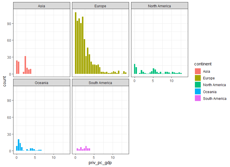
geom_histogram() makes histograms. I use facet_wrap(~ continent) to make histograms for each continent.

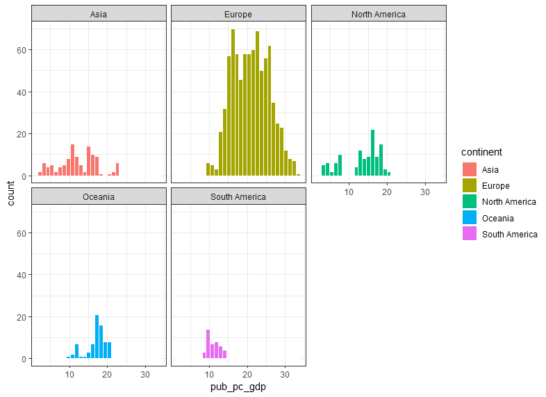
I see Europe has higher percentage than other continents about pub_pc_gdp.

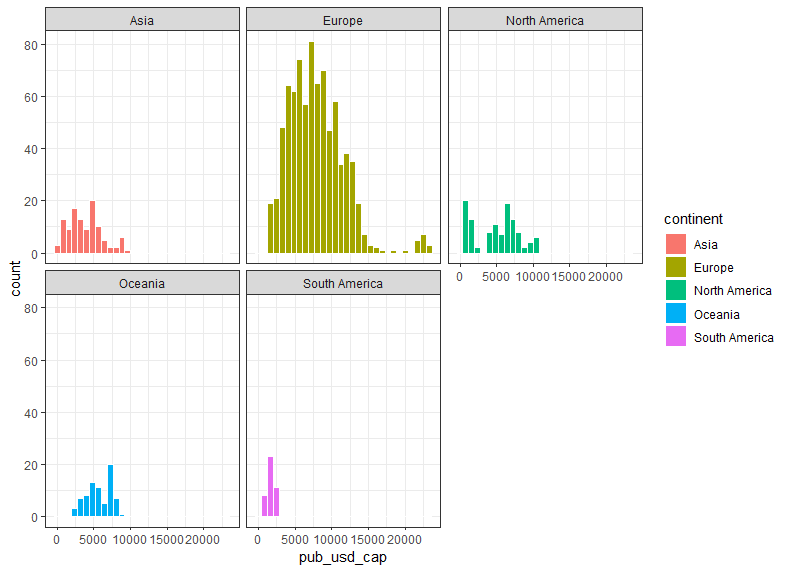
Sounth America has the lowest pub_usd_cap distribution.
The 4th 5NG is Boxplot.
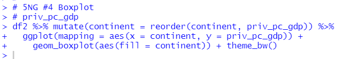
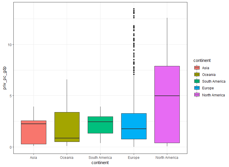
geom_boxplot() makes a boxplot. I use mutate() and reorder() to reorder continent by average value. So, I can easily see Notrh America has the highest average priv_pc_gdp.
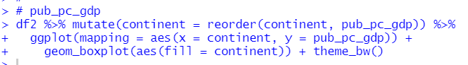
I see Europe has the higest average pub_pc_gdp and the highest medain too.
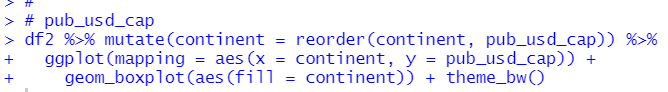
Europe has the highest average and median value for pub_usd_cap.
The last 5NG is Barplot.
To make a barplot, we can use geom_bar() and geom_col() function.


geom_bar() automatically count number of observations and make barplot.
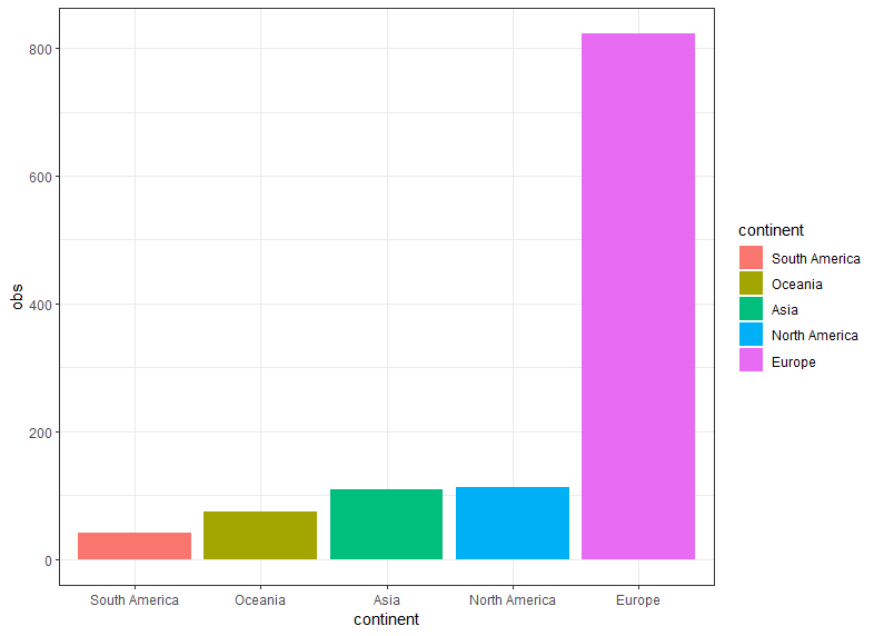
Before using geom_col() function, we need to calculate summary statistics data such as number of observations.
That's it. Thank you!
Next post is
To read the 1st post,