
UnsplashのAlejandro Contrerasが撮影した写真
This post is following of the above post.
Let's check which LOCATION has the most observations.
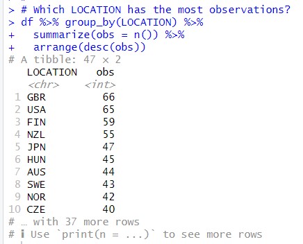
I see GBR has the most observations, 66 observations. USA has the 2nd most, FIN has the 3rd most.
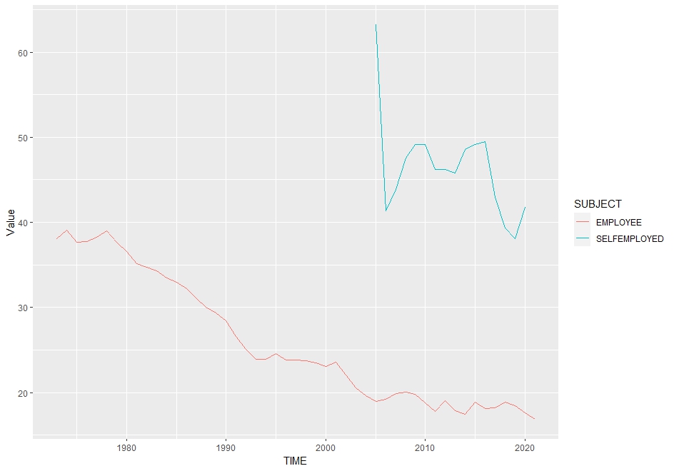
Let's see GBR data line graph.
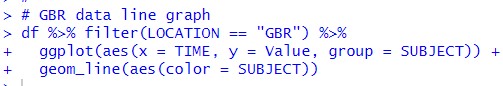
I see the both EMPLOYEE and SELFEMPLOYED have downtrend and EMPLOYEE has longer history data.
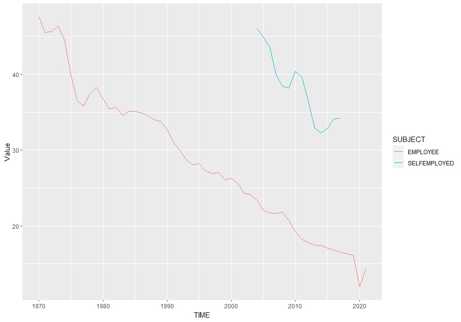
Let' see USA
USA has down trend too.
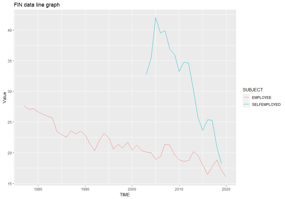
Let' see FIN.
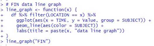
Before making a line graph of FIN, I make a custom function to draw a line graph.
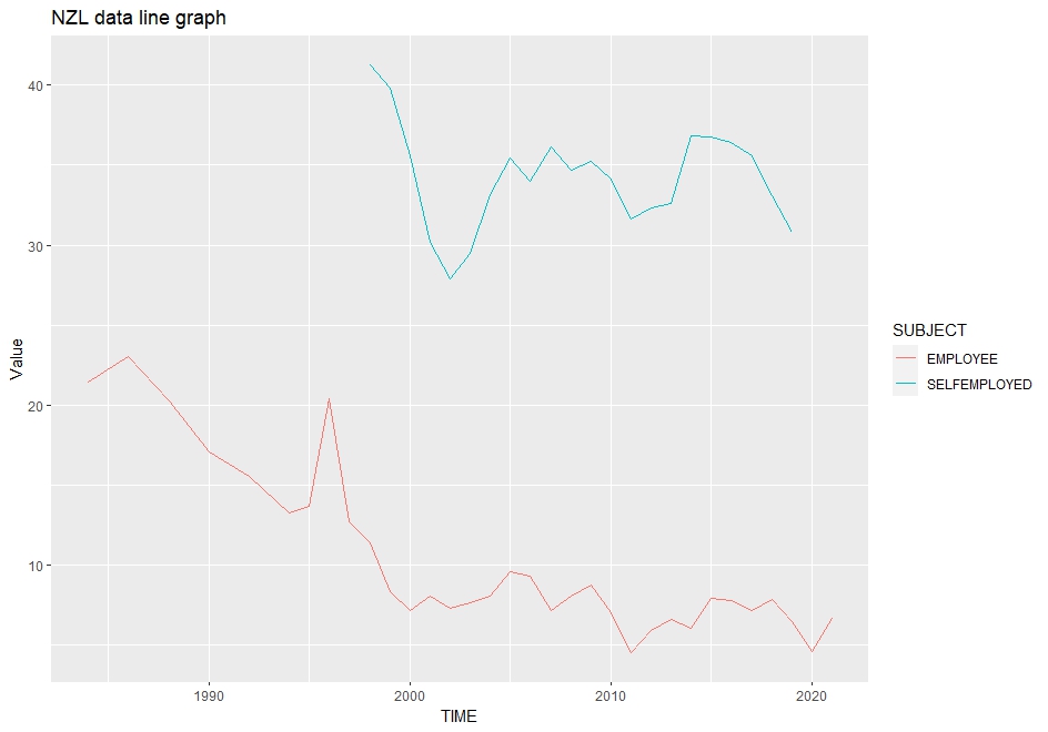
Let's see NZL
![]()
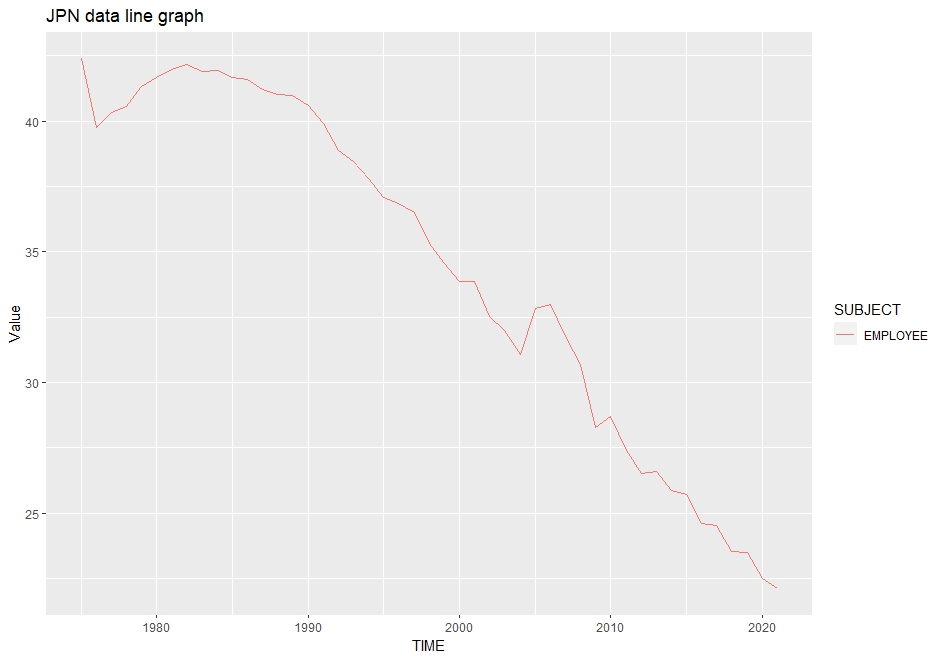
Let's see JPN
![]()
Let's ee HUN
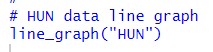
I found JPN does not have SELFEMPLOYED data and all LOCATION have down trend.
Let' see boxplot, x-axis is TIME.
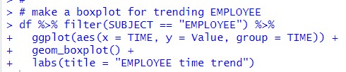
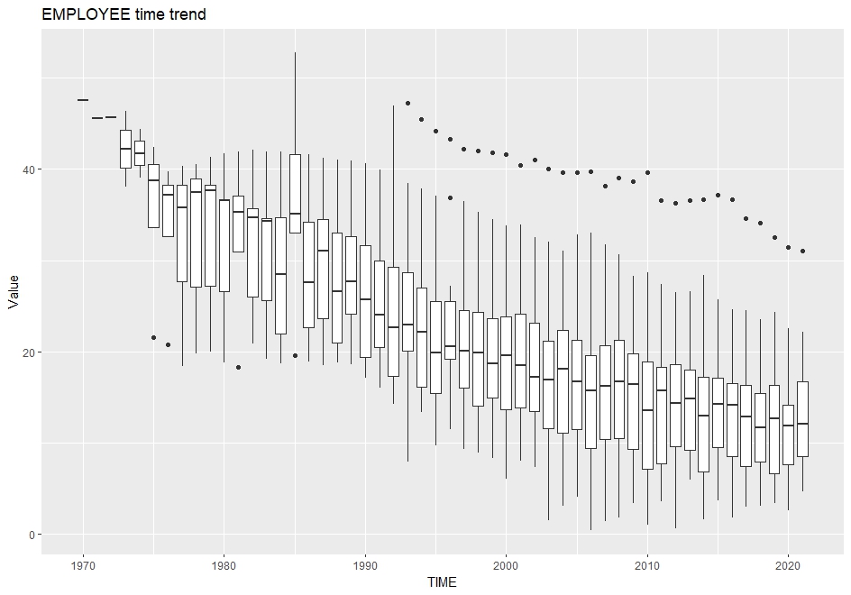
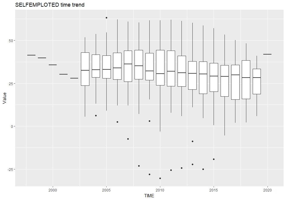
EMPLOYEE has crear down trend while SELFEMPLOYED does not have such crear trend, it has weak down trend.
That's it. Thank you!
To read from the 1st post,