
UnsplashのQuang Nguyen Vinhが撮影した写真
This post is floowing of above post.
In this post, I will draw some graphs to see relationship of two variables.
Fisrt, I see per capita and location with boxplots.


I see SAU, AUS and so on are rich locations while ZAF, COL and so on are not rich locations.
Next, locations and acc_nights.


FRA is espacially many acc_nights.
Next, locations and inter_arr


FRA is the top again.
Let's go on, locations and inter_dep

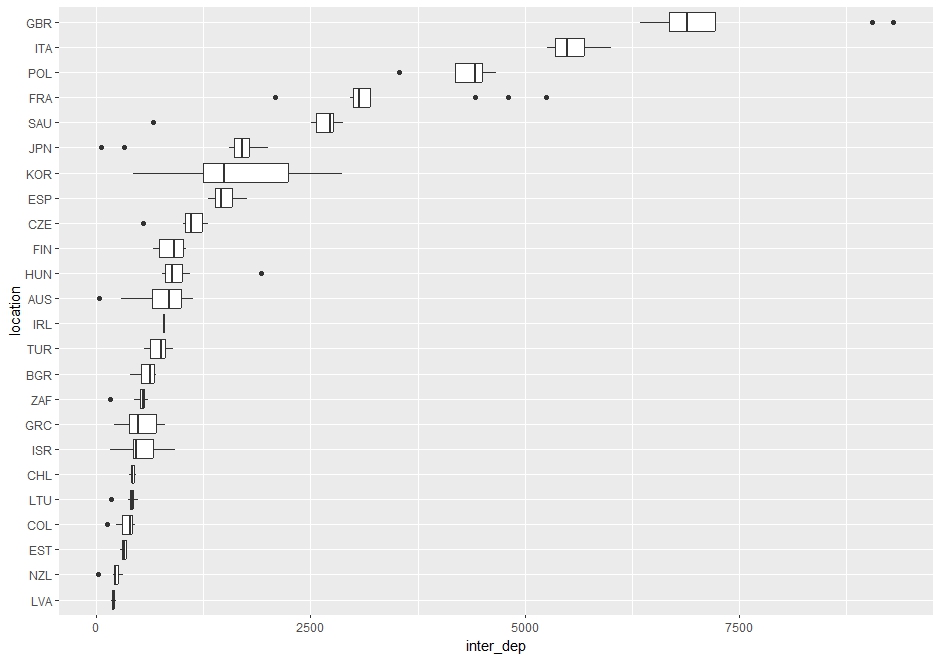
For inter_dep, GBR is the top.
Then, let's check time series trend. I start with per capita.


For per capita, I see up trend.
How about acc_nights?


I see 2020 and 2021 dropped, it maybe due to COVID-19 pandemic.
Let's ee inter_arr.


For inter_arr, I see more clear drop in 2020 and 2021.
Let's see inter_dep.


I see same drop about inter_dep in 2020 and 2021.
Then, let's make scatter plot to see two numerical variables relationship.
First, per_capita and acc_nights.


I don't see clear pettern. some locations have positive lelationship ande some have negative relationship.
Let's see per_capita and inter_arr.


I see positive relationship.
How about per_capita and inter_dep?


I also see positiove relationship.
Then, let's see acc_nights and inter_arr.


For overall relationship, there is positive relationship but for each location level, some have positive and some have negative and some have no relationship.
Let's see acc_nights and inter_dep.


Same as acc_nights and inter_arr.
Lastly, let' see inter_arr and inter_dep.


I see inter_arr and inter_dep have positive relationship.
That's it for this post. Thank you!
Next post is
To read the 1st post,