
UnsplashのPierre Lemosが撮影した写真
Thsi post is following of the above post.
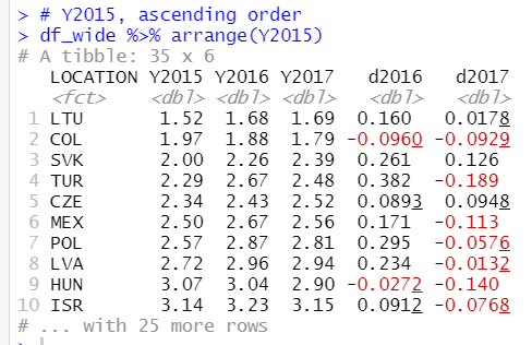
In this post I will arrange data frame with arrange() function of dplyr packkage.
Let's make a graph with ggplot2 packages.
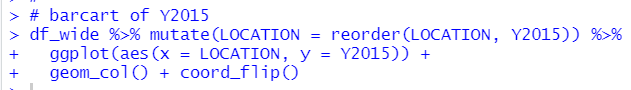
LUX has the highest debt to surplus ratio in 2015. LTU has the lowest debt to surplus ratio in 2015.
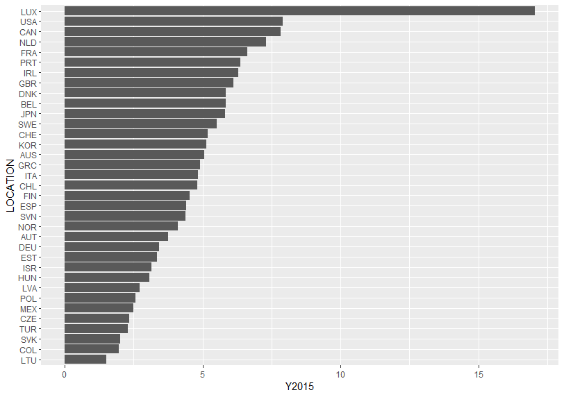
Let's see Y2016.
This time, I use order() function instead of arrange() funtion.
Let's see a bar chart.
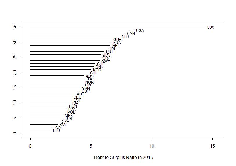
This time I used plot() function, lines() function and text() function instated of using ggplot2 package.
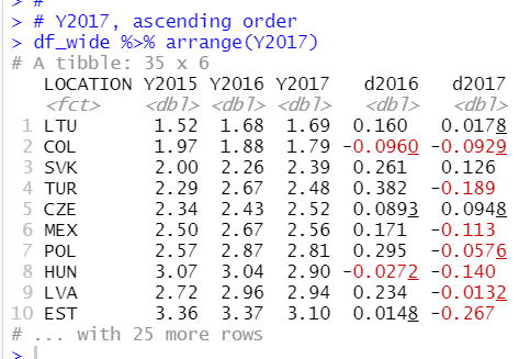
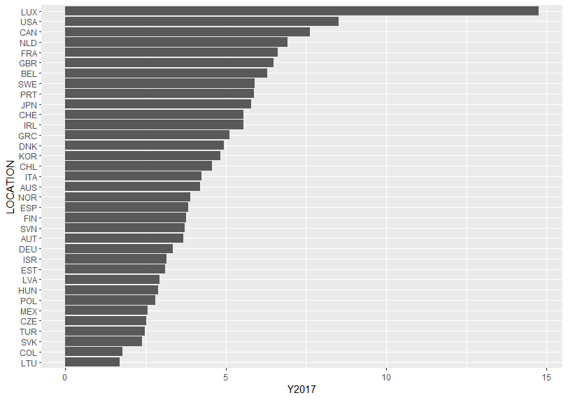
How about Y2017?
Let's make a bar chart.
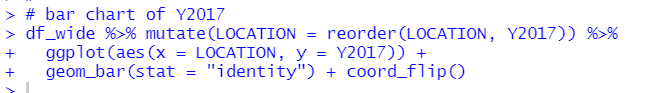
This time I used geom_bar(stat = "identity") instead of geom_col() function.
LTU has the lowest and LUX has the higest.
Let's see d2016, it is change from Y2015 to Y2017.
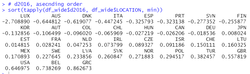
This time I use tapply() function and sort() function. LUX has the smallest(negative) change and GRC has the largest(positive) change.
Let's make a bar chart
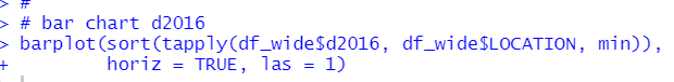
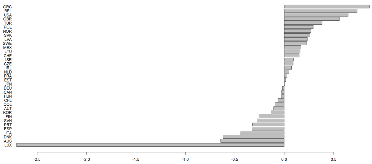
This time I used barplot() function.
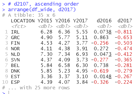
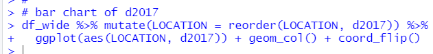
Let's see d2017, it is change from Y2016 to Y2017.
Let's make a bar chart.
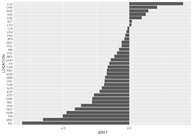
LUX has the highest(positive) change and IRL has the lowest(negative) change.
That's it. Thank you!
Next post is
To read the first post,