www.crosshyou.info

政府統計の総合窓口のデータや、OECDやUCIやのデータを使って、Rの練習をしています。ときどき、読書記録も載せています。

OECD International Student Mobility Data Analysis 5 - Making a slope chart using R plot(), lines(), points() and text() functions.

f:id:cross_hyou:20210722195622j:plain

 Photo by Aditi Jain on Unsplash  

www.crosshyou.info

 This post is following of above post.
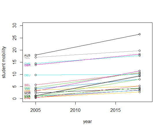
In this post, I will make a slope chart using R.
We can get an idea of changes based on the slope of the lines, so we can see which country has improved student mobility very easily.

Let's get started.

First of all, make an empty plot canvas with plot() function.

f:id:cross_hyou:20210722200915p:plain

f:id:cross_hyou:20210722200926p:plain

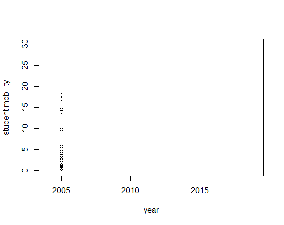
Then, draw a start value with points() function.

f:id:cross_hyou:20210722201019p:plain

f:id:cross_hyou:20210722201029p:plain

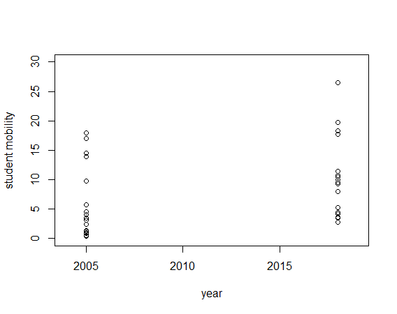
Then, add end value with points() function.

f:id:cross_hyou:20210722201147p:plain

f:id:cross_hyou:20210722201156p:plain

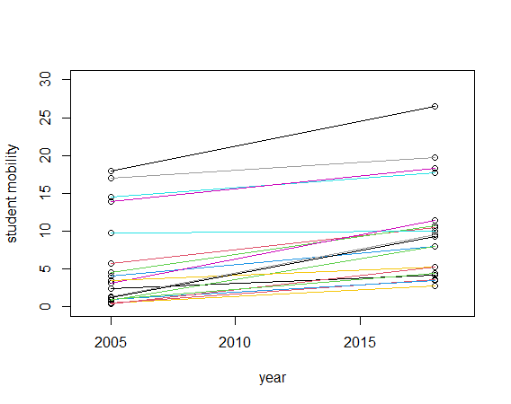
Next, using for() and lines() function, we will add slopes.

f:id:cross_hyou:20210722201316p:plain

f:id:cross_hyou:20210722201324p:plain

Then, add iso code at the left side with text() function.

f:id:cross_hyou:20210722201432p:plain

f:id:cross_hyou:20210722201442p:plain

Lastly, we will add iso code at the right side too.

f:id:cross_hyou:20210722201552p:plain

f:id:cross_hyou:20210722201603p:plain

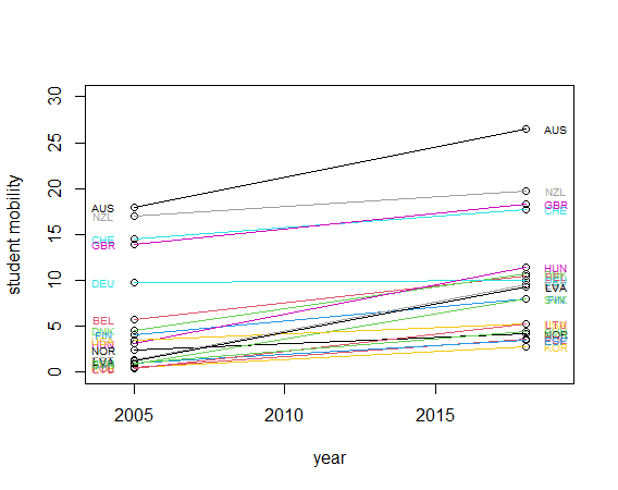
All right, We made a slope chart. We will see AUS has largely improved.

That's it. Thank you!


To read 1st psot,


www.crosshyou.info