
Bing Image Creator : Photograph, Landscape, Beautiful Trees, Blue Sea and Beach
This post is following of above post.
In this post, I will make some grpahps to see waht OECD Influenza vaccination rates looks like.
First, I draw histogram.

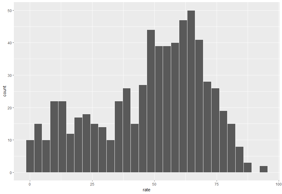
For vaccinationrate, lower rates area seems leveled distribution, upper rates area seems normla distribution.

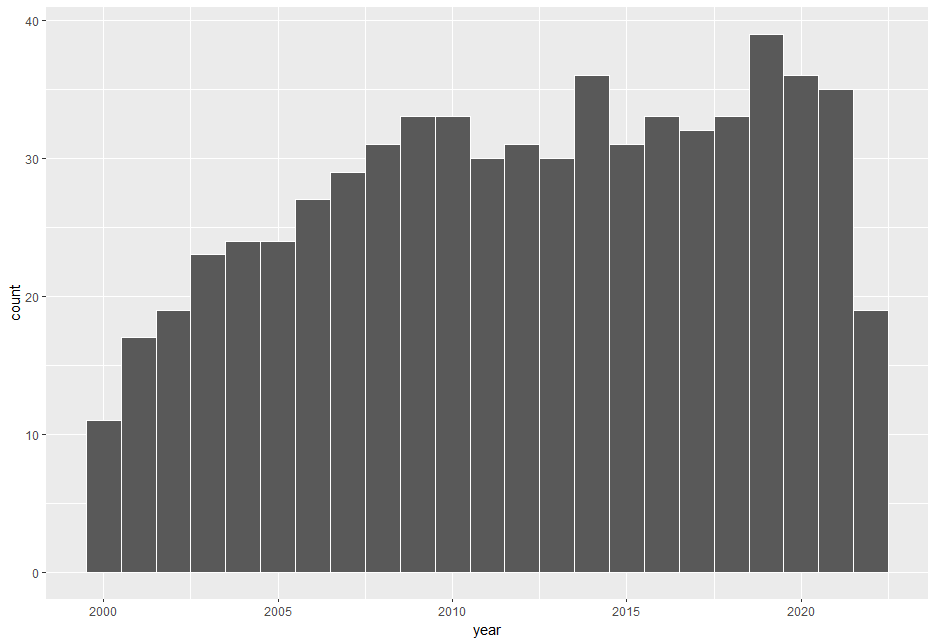
For year, older years have less observations.
Next, I draw Q-Q Plot


Using Q-Q Plot, I can check whether a sample is normal distributiion or not. I see the both(rate and year) are not normal distribution.
Next, Scatter Plot
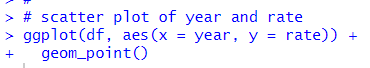

Using Scatter Plot, we can see relationships between two variables, above scatter plot cannnot tell much. So, I use Boxplot.


Thick black line is median. I see there is not distinct trend.
I also make a boxplot with loc and rate.


KOR has the higest mesdian rate and EST has the lowest.
That's it. Thank you!
The next post is
To read from the first post,