UnsplashのNatalia Marcelewiczが撮影した写真
This post is following of the above post.
In this post, let's visualize data with ggplot2 package.
First, let's make an overall histogram.


Many observations are 100% care.
Next, let's see "care" by "region".


South_Asia region is the worst care (%) region.
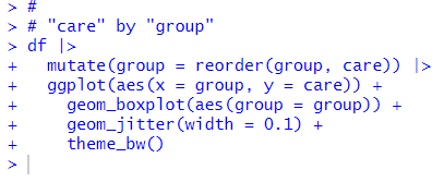
Next, "care" by "group"


As expected, Low_income has the lowest, High_income has the highest median value.
Next, let's see "care" by "year"


Number of "100% care" is increasing along with "year".
That's it. Thank you!
Next post is
To read from the 1st post,