Generated by Bing Image Creator: Closeup photo of daisy flowers, which is planted on grass mountains.
This post is following of the above post. In the above post, I calculated improvement/worsen for lead time to import.
Let's visualize it in this post.
Let's begin by region.


Meddle East & North Africa region has most improved change.
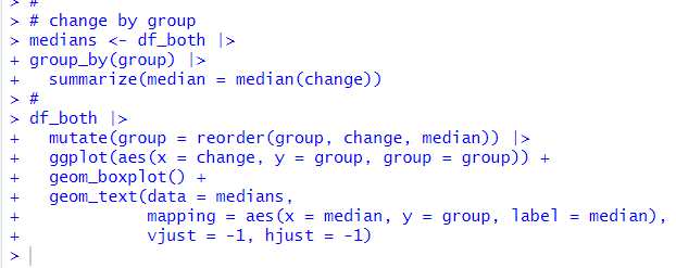
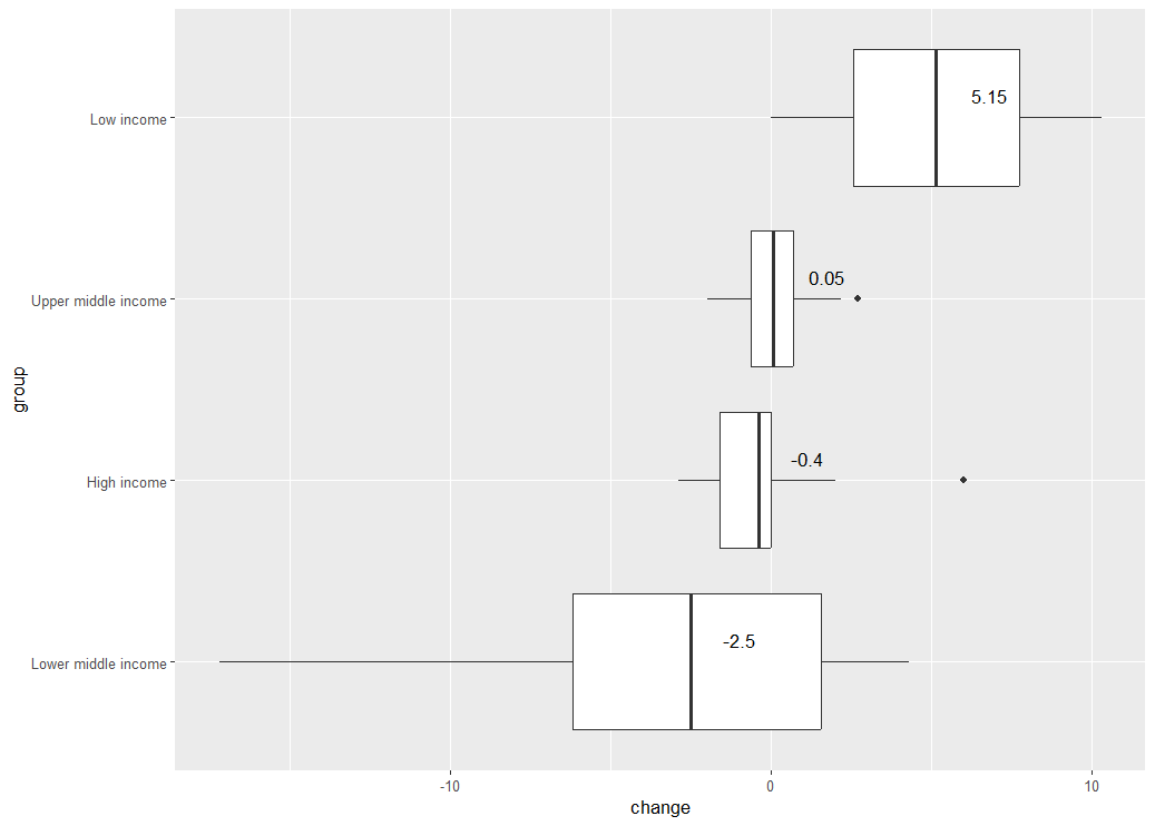
Next, let's see by group


Lower middle income group has most improved while Lowe income group has most worsen.
Lastly, let's see inital Lead time to import vs. change.


Initial Lead time to import and change have negative correlation.
That's it. Thank you!
Next post is
To read form the 1st post