
Photo by Tim Rebkavets on Unsplash
HistDataパッケージのGaltonのデータは、1886年、Galtonという人が親の身長と子どもの身長を表に表したデータから作られています。
まずは、データを読み込みます。
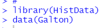
str()関数とsummary()関数をつかってデータがどんなものか確認します。
928個のデータで、変数は、parentとchildです。
plot()関数でparentとchildの関係性をグラフにしてみます。
![]()

ヘルプでは以下のようなコードが載っています。
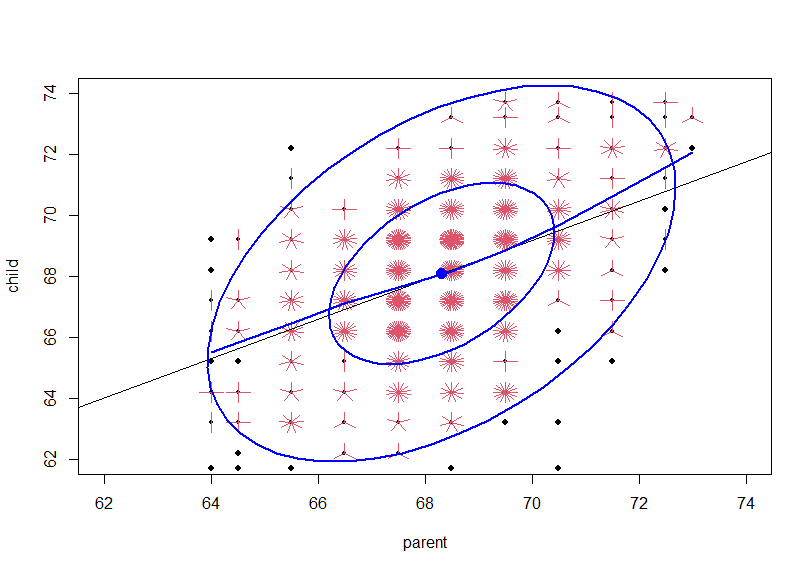
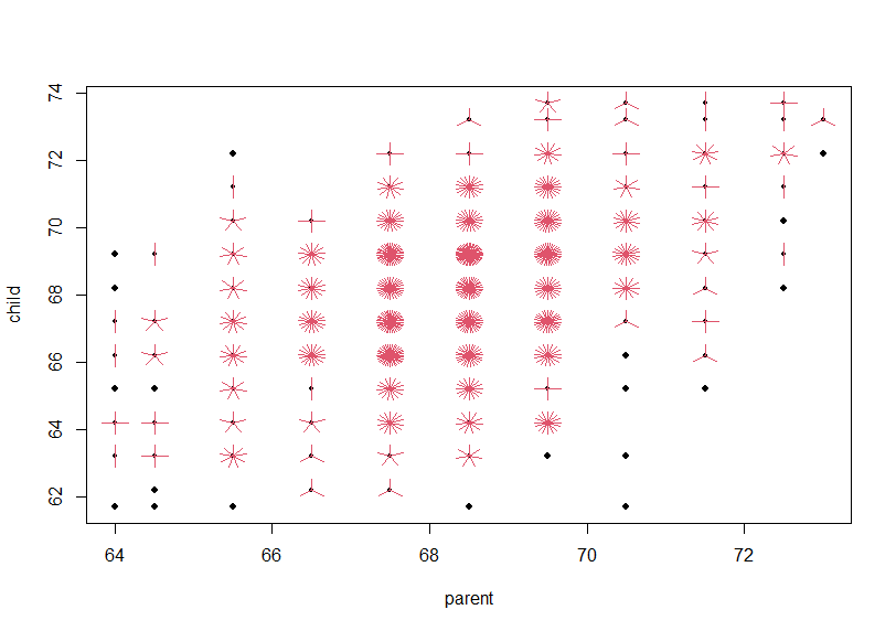
どうやら、同じparent, childのデータがたくさんあるようなので、sunfloweplot()というのを使っているようです。
table()関数で処理するとよくわかります。
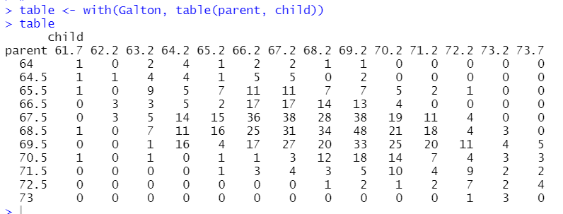
parentが64でchildが61.7のデータ(一番左上です)は1つだけ、parentが68.5でchildは69.2のデータは45個もある、などわかります。
sunflowerplot()関数だけを使ってみます。
![]()
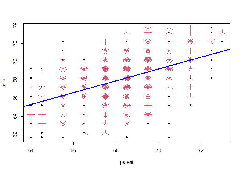
これにlm()関数の回帰線をabline()関数を使って重ねます。
![]()
そして、carパッケージのdataEllipse()関数というので、楕円形の何かを重ねていますね。この楕円形はよくわからないです。
ggplot2でも同じように、データの数を考慮した散布図を作ってみます。
まずは、tableをas.data.frame()関数でデータフレームに転換します。
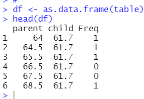
テーブルのオブジェクトをデータフレームにすると、Freqという変数が追加されました。
tidyverseパッケージを読み込み、ggplot2でグラフを描いてみます。
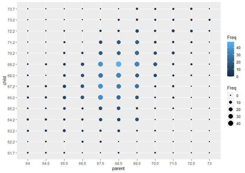
Freqを大きさと色であらわしました。Freqの値が大きいほど〇は大きく、明るい色になります。
今回のコードは以下のとおりです。
library(HistData)
data(Galton)
#
str(Galton)
summary(Galton)
#
with(Galton, plot(parent, child))
#
###########################################################################
# sunflower plot with regression line and data ellipses and lowess smooth
###########################################################################
with(Galton,
{
sunflowerplot(parent,child, xlim = c(62,74), ylim = c(62,74))
reg <- lm(child ~ parent)
abline(reg)
lines(lowess(parent, child), col = "blue", lwd = 2)
if (require(car)) {
dataEllipse(parent,child, xlim = c(62,74), ylim = c(62,74),
plot.points = FALSE)
}
})
#
table <- with(Galton, table(parent, child))
table
#
with(Galton, sunflowerplot(parent, child))
#
abline(lm(child ~ parent, data = Galton), col = "blue", lwd = 3)
#
df <- as.data.frame(table)
head(df)
#
library(tidyverse)
#
df %>% ggplot(aes(x = parent, y = child, size = Freq, color = Freq)) +
geom_point()