
(Bing Image Creator で生成: Closeup of white and pink Chaenomeles speciosa flowers, background is deep valley and while clouds, photo)
の続きです。
今回はデータを visualization します。
具体的には、各変数が Region ごとに分布が違うのかをヒストグラムで確認します。
まずは、Channel です。Channel はカテゴリカル変数なので、geom_bar() 関数でバーチャートを描きます。

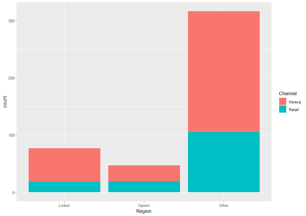
Lisbon は Horecaの割合が多く、Oporto はHoreca と Retail が同じくらいですね。
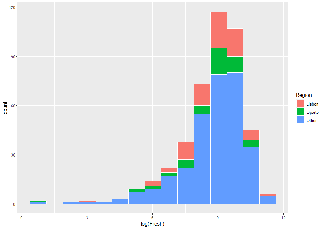
次は、Fresh です。
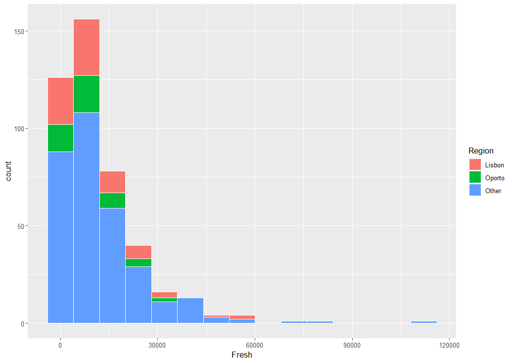
Fresh を対数変換したほうがよさそうですね。
Lisbon と Oporto の違いがよくわからないので、Other を除いてヒストグラムを描いてみます。
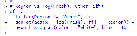
Lisbon のほうが少し、大きな値に分布しているようです。
次は、Milk です。
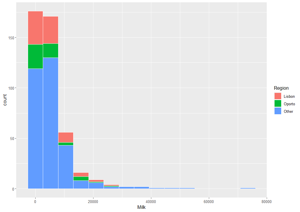
Milkも対数変換したほうがいいですね。Otherを除いて対数変換してみます。
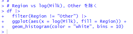
Lisbon のほうが大きな値に分布しているようにみえます。
次は、Grocery です。
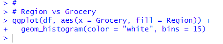
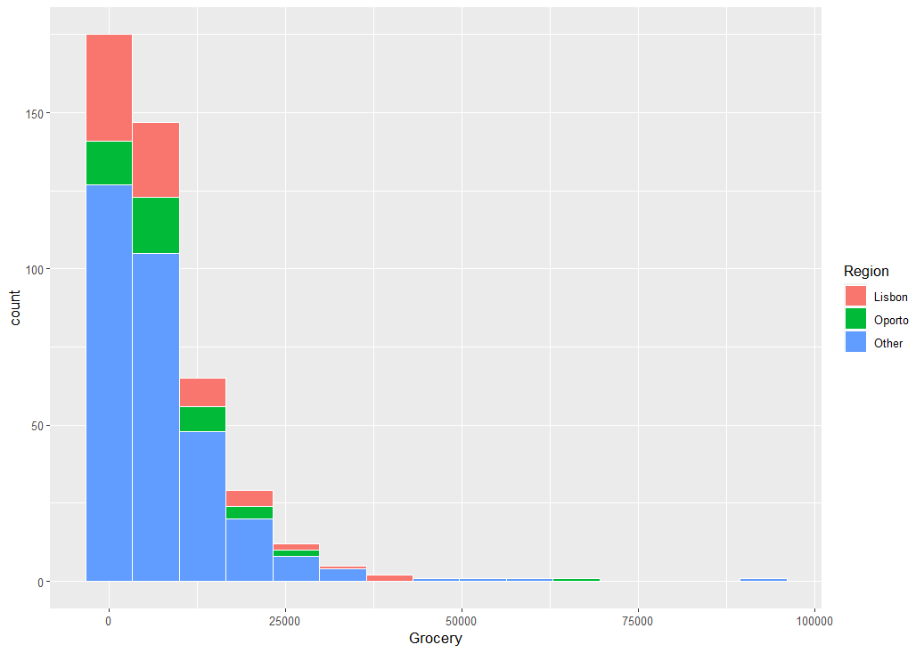
これも Other を除いて対数変換してみます。
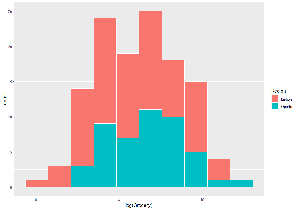
Grocery は Oporto のほうが大きな値のようです。
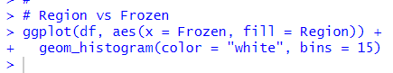
次は、Frozen です。
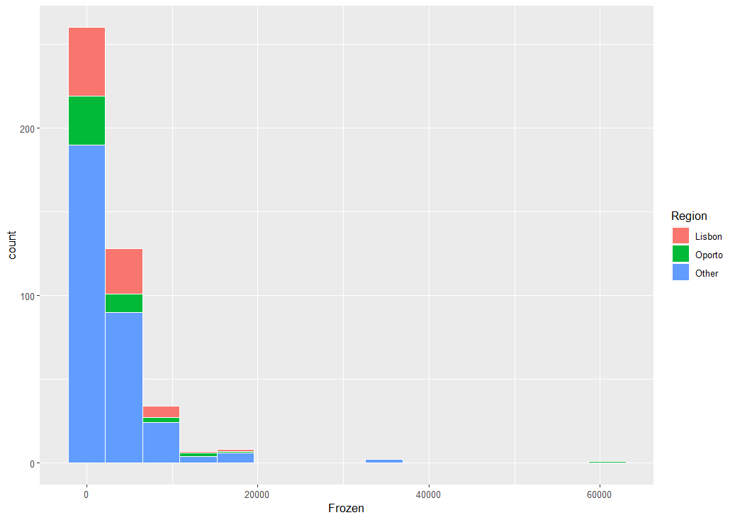
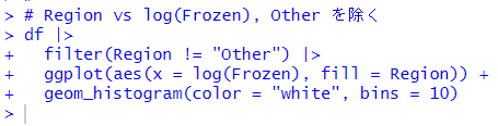
これも Other を除いて対数変換してみます。
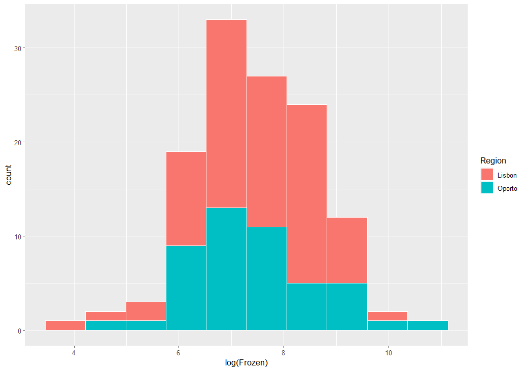
Lisbon のほうが大きな値のようです。
次は、Detergents_Paper です。
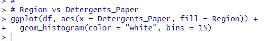
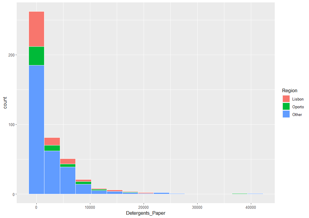
これも Other を除いて対数変換してみます。
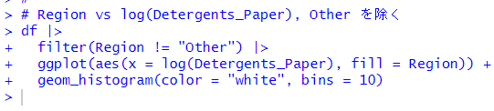
Oporto のほうが大きな値に分布しているようです。
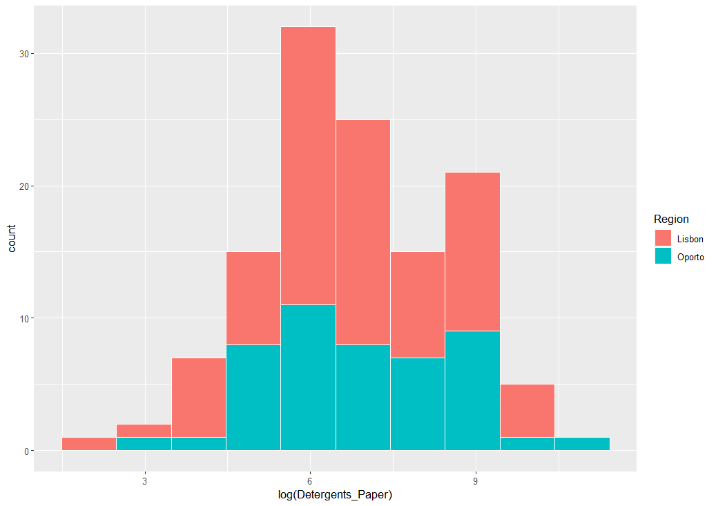
最後は、Delicassen です。
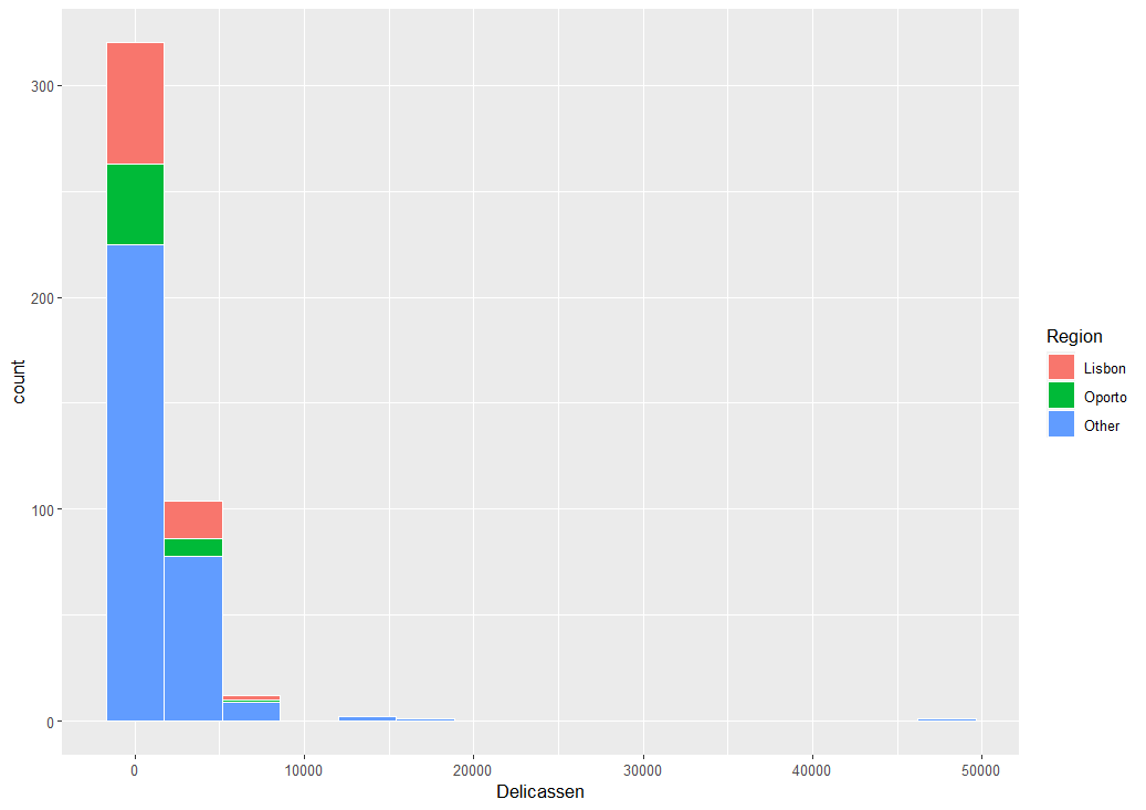
これも Other を除いて対数変換してみます。
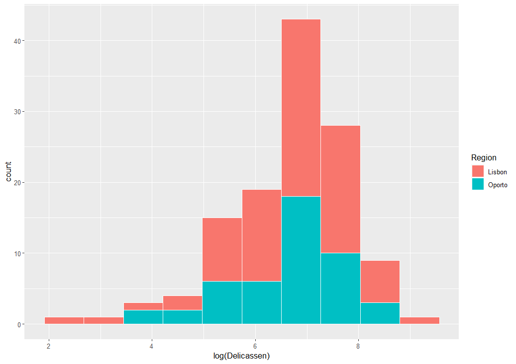
Lisbon のほうが幅広く分布しています。
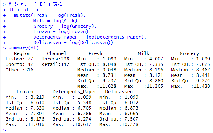
各変数を visualization して、とりあえず、対数変換したほうがよさそうだとわかりました。
そこで、各数値型の変数を対数変換します。
最小値が0、最大値が1に基準化もしたいので、そのための関数を作成します。
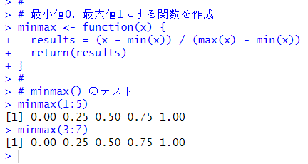
minmax() というカスタム関数を作成しました。これを使います。
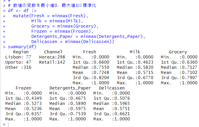
これでデータの前処理は終了しました。
今回は以上です。
次回は、
です。
初めから読むには、
です。
今回のコードは以下になります。
#
# Region vs Channel
ggplot(df, aes(x = Region, fill = Channel)) +
geom_bar()
#
# Region vs Fresh
ggplot(df, aes(x = Fresh, fill = Region)) +
geom_histogram(color = "white", bins = 15)
#
# Region vs log(Fresh)
ggplot(df, aes(x = log(Fresh), fill = Region)) +
geom_histogram(color = "white", bins = 15)
#
# Region vs log(Fresh), Other を除く
df |>
filter(Region != "Other") |>
ggplot(aes(x = log(Fresh), fill = Region)) +
geom_histogram(color = "white", bins = 10)
#
# Region vs Milk
ggplot(df, aes(x = Milk, fill = Region)) +
geom_histogram(color = "white", bins = 15)
#
# Region vs log(Milk), Other を除く
df |>
filter(Region != "Other") |>
ggplot(aes(x = log(Milk), fill = Region)) +
geom_histogram(color = "white", bins = 10)
#
# Region vs Grocery
ggplot(df, aes(x = Grocery, fill = Region)) +
geom_histogram(color = "white", bins = 15)
#
# Region vs log(Grocery), Other を除く
df |>
filter(Region != "Other") |>
ggplot(aes(x = log(Grocery), fill = Region)) +
geom_histogram(color = "white", bins = 10)
#
# Region vs Frozen
ggplot(df, aes(x = Frozen, fill = Region)) +
geom_histogram(color = "white", bins = 15)
#
# Region vs log(Frozen), Other を除く
df |>
filter(Region != "Other") |>
ggplot(aes(x = log(Frozen), fill = Region)) +
geom_histogram(color = "white", bins = 10)
#
# Region vs Detergents_Paper
ggplot(df, aes(x = Detergents_Paper, fill = Region)) +
geom_histogram(color = "white", bins = 15)
#
# Region vs log(Detergents_Paper), Other を除く
df |>
filter(Region != "Other") |>
ggplot(aes(x = log(Detergents_Paper), fill = Region)) +
geom_histogram(color = "white", bins = 10)
#
# Region vs Delicassen
ggplot(df, aes(x = Delicassen, fill = Region)) +
geom_histogram(color = "white", bins = 15)
#
# Region vs log(Delocassen), Other を除く
df |>
filter(Region != "Other") |>
ggplot(aes(x = log(Delicassen), fill = Region)) +
geom_histogram(color = "white", bins = 10)
#
# 数値データを対数変換
df <- df |>
mutate(Fresh = log(Fresh),
Milk = log(Milk),
Grocery = log(Grocery),
Frozen = log(Frozen),
Detergents_Paper = log(Detergents_Paper),
Delicassen = log(Delicassen))
summary(df)
#
# 最小値0,最大値1にする関数を作成
minmax <- function(x) {
results = (x - min(x)) / (max(x) - min(x))
return(results)
}
#
# minmax() のテスト
minmax(1:5)
minmax(3:7)
#
# 数値の変数を最小値0、最大値1に標準化
df <- df |>
mutate(Fresh = minmax(Fresh),
Milk = minmax(Milk),
Grocery = minmax(Grocery),
Frozen = minmax(Frozen),
Detergents_Paper = minmax(Detergents_Paper),
Delicassen = minmax(Delicassen))
summary(df)
#