
(Bing Image Creator で生成: プロンプト Closeup of Primula Polyanthus flowers, purple flowers and pink flowers, background is green grass field, photo)
の続きです。
今回はデータの視覚化をしてみましょう。
まず、各変数のヒストグラムを描いてみます。
popratio: 15歳~64歳の人口割合です。
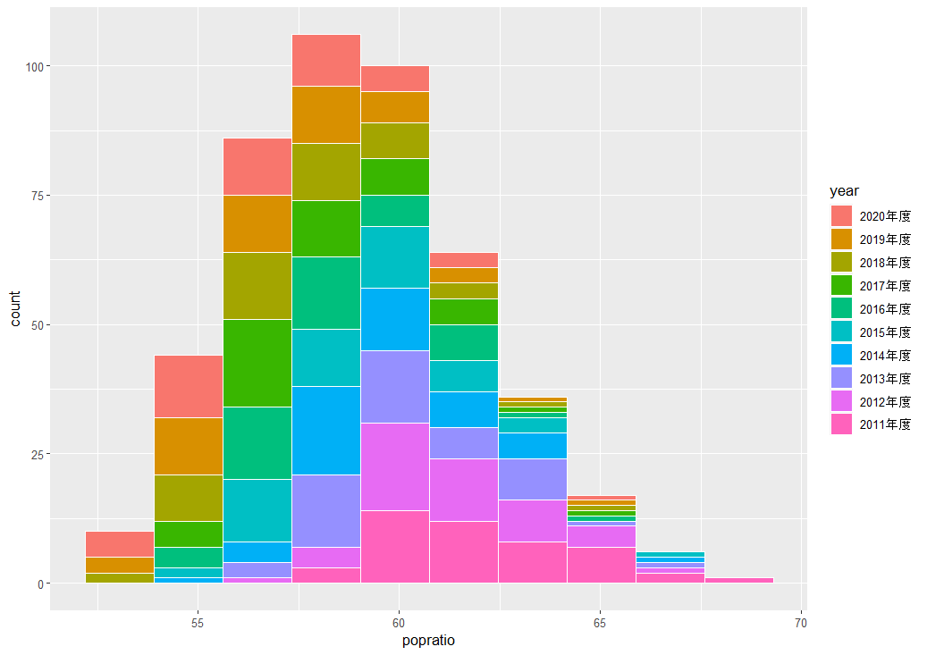
年度を経るにつれて、15歳~64歳人口割合は低下しているように見えます。
l_popratio: popratioの自然対数値のヒストグラムはどうでしょうか?
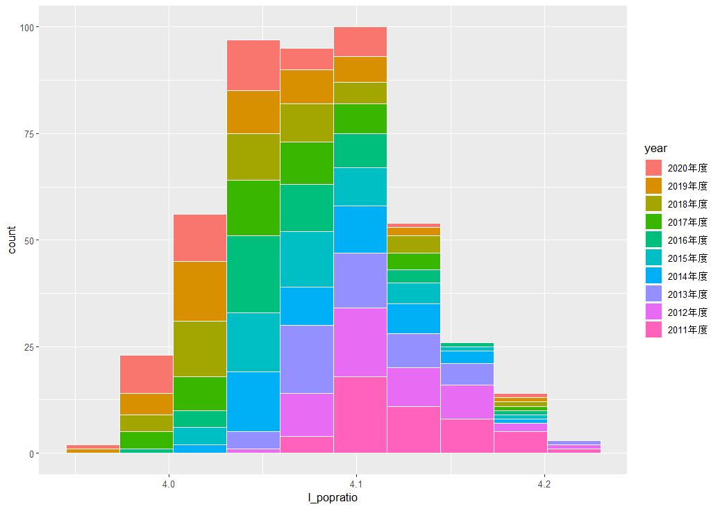
l_popratio のほうが左右対称に近いですね。
次は、income: 1人当たり県民総所得です。

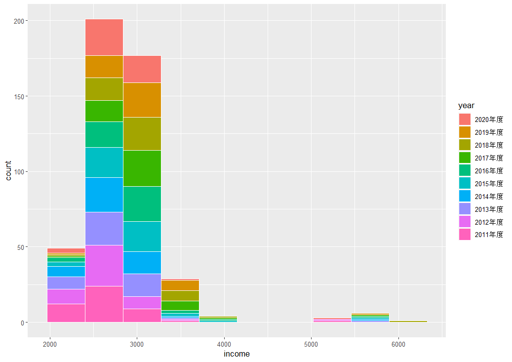
右側に外れ値っぽい値がありますね。
l_income: incomeの自然対数値のヒストグラムはどうなるでしょうか?
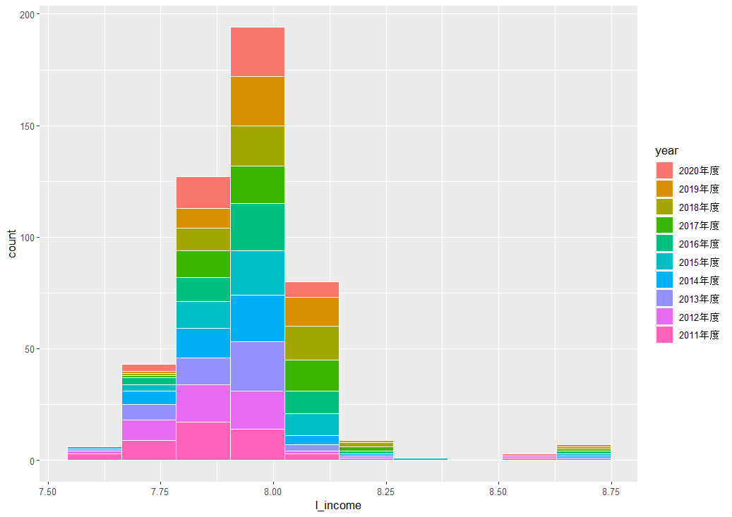
右側にある外れ値っぽい値は残ったままですね。
次は、energy: 1人当たりエネルギー消費量 のヒストグラムを描きます。
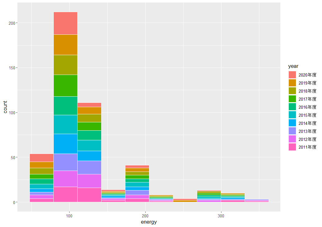
右側の裾野が広い分布です。
l_energy: energy の自然対数値のヒストグラムを描きます。
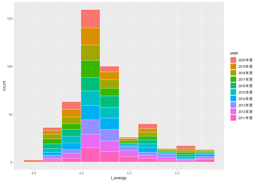
自然対数に変換したほうが、左右対称に近いヒストグラムになりますね。
次は、相関係数マトリックスを描いてみます。
ggcorrplot パッケージを読み込んで、cor() 関数と ggcorrplot() 関数を使います。
一番最新の 2020 年度のデータだけを使います。

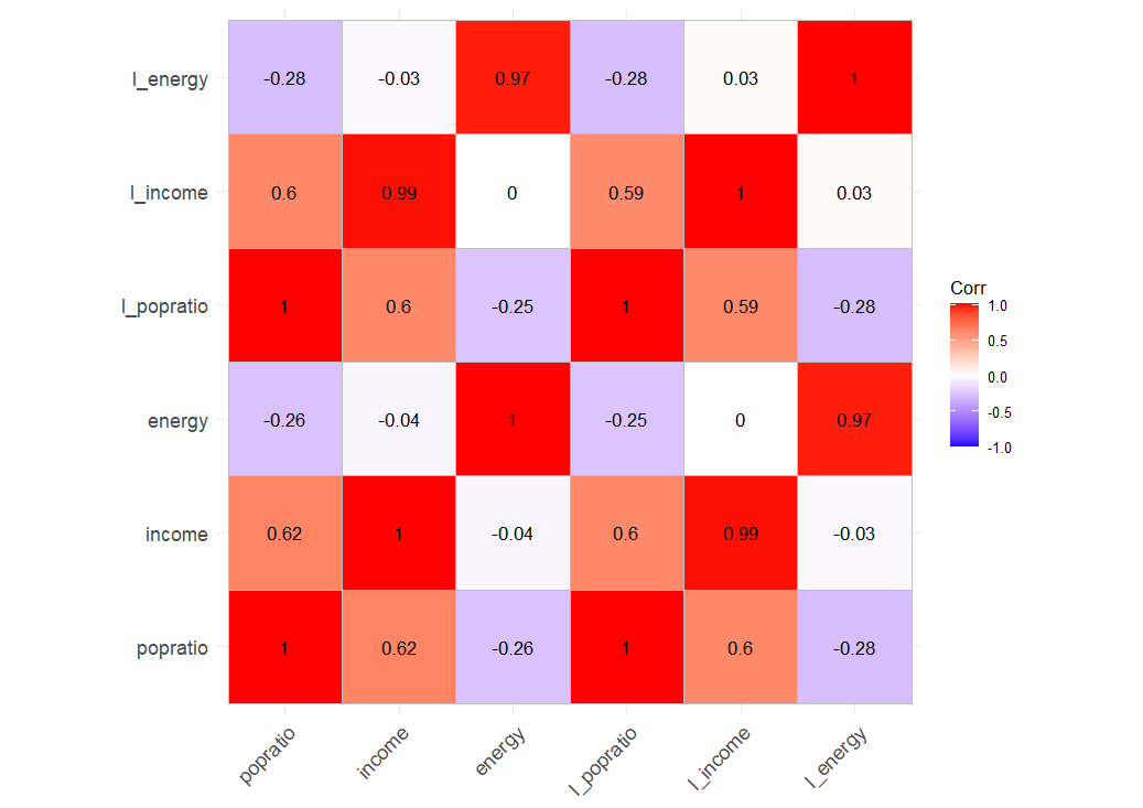
income, l_income と popratio, l_popratio は正の相関ですね。
income, l_income と energy, l_energy はほとんど相関ないですね。
popratio, l_popratio と energy, l_energy は弱い負の相関ですね。
散布図を描いてみます。l_popratio と l_income の散布図です。
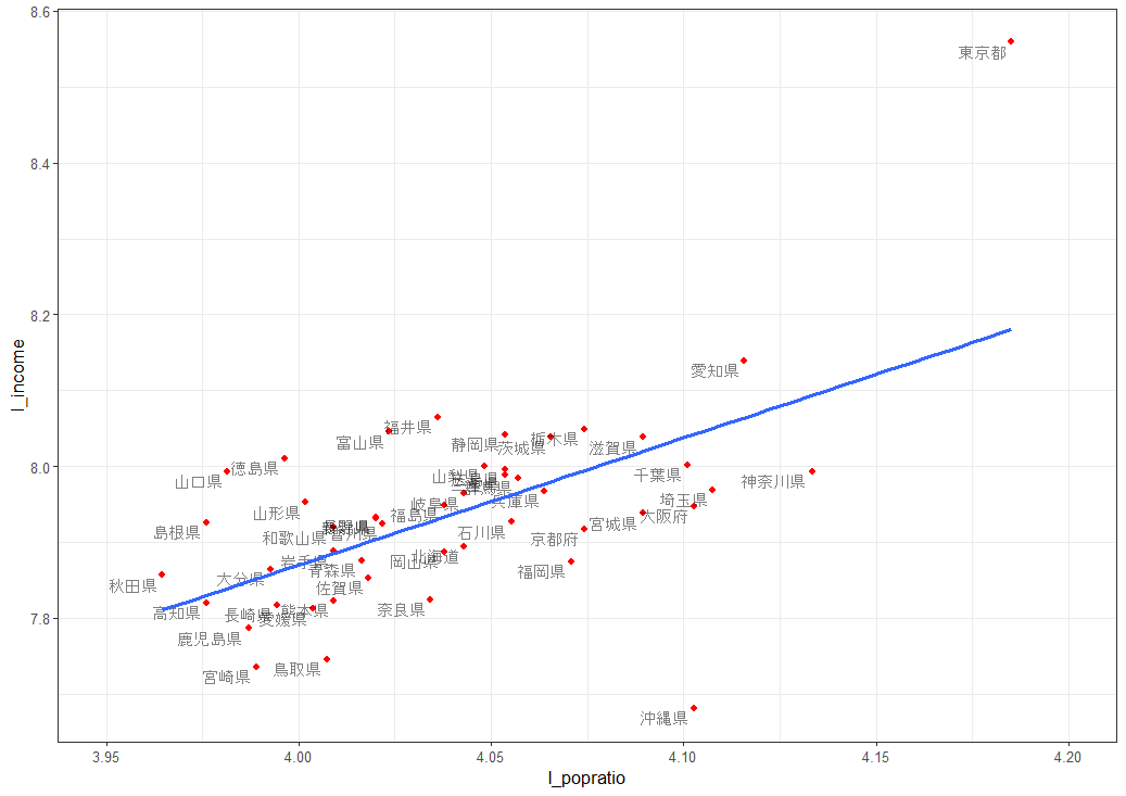
grom_text() 関数で都道府県名を追加しています。
coord_cartesian() 関数で X 軸の範囲を指定しています。
geom_smooth() 関数で線形回帰の線を追加しています。
東京都が外れ値のようになっているのがわかります。
l_poptation が大きいほど、つまり 15歳~64歳人口割合が大きいほど、l_income, つまり1人当たり県民総所得が高いという関係性があります。
次は、l_income と l_energy の散布図です。
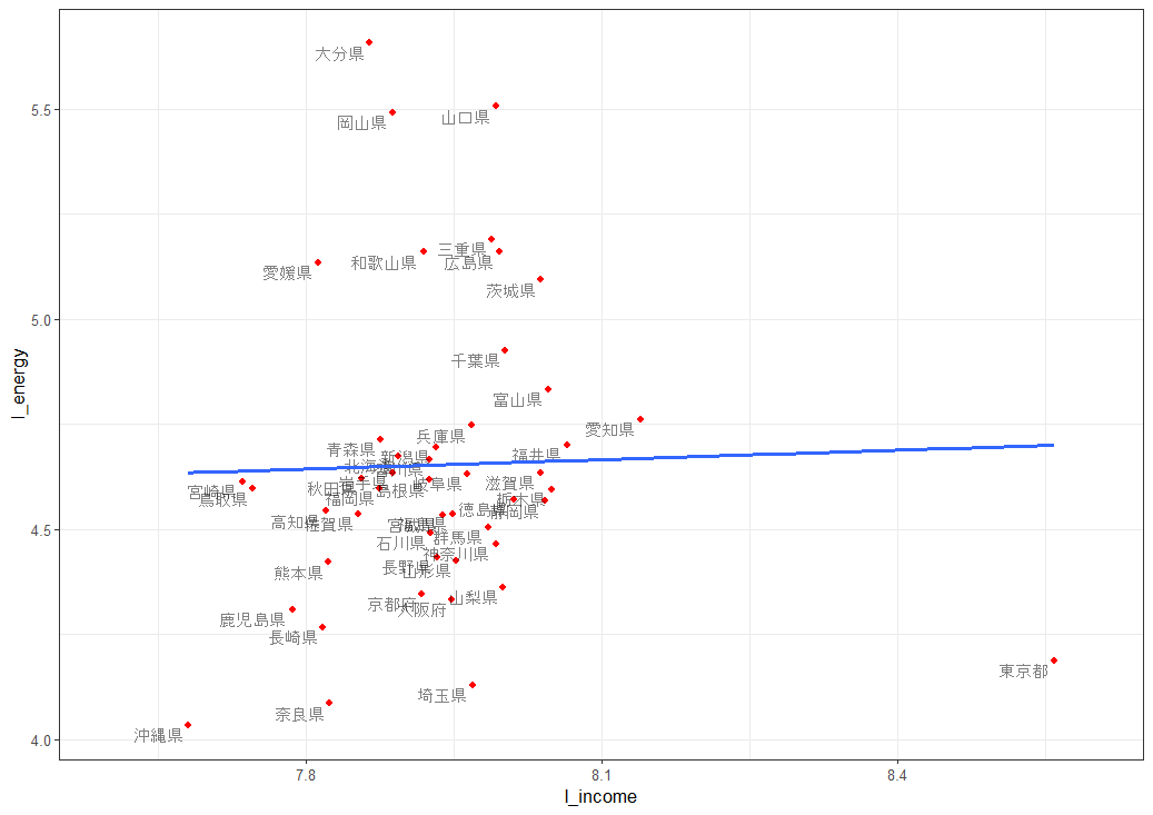
l_income と l_energy はあまり関係が無いような散布図です。
東京都はやっぱり他の府道県とは外れていますね。
次は、l_popratio と l_energy です。
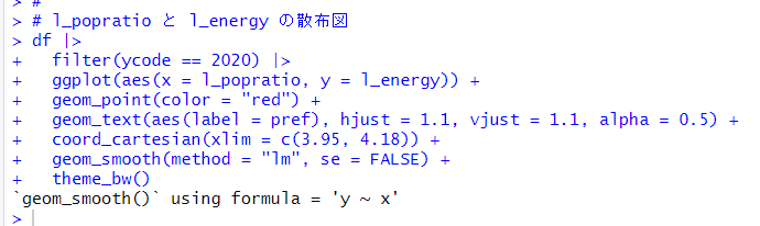
l_poprtio は大きいほど、l_energy が小さいという関係ですね。
大分県や山口県、岡山県などが結構外れ値っぽい値ですね。
今回は以上です。
次回は
です。
初めから読むには、
です。
今回のコードは以下になります。
#
# popratio のヒストグラム
df |>
ggplot(aes(x = popratio)) +
geom_histogram(aes(fill = year), color = "white",
bins = 10)
#
# l_popratio のヒストグラム
df |>
ggplot(aes(x = l_popratio)) +
geom_histogram(aes(fill = year), color = "white",
bins = 10)
#
# income のヒストグラム
df |>
ggplot(aes(x = income)) +
geom_histogram(aes(fill = year), color = "white",
bins = 10)
#
# l_income のヒストグラム
df |>
ggplot(aes(x = l_income)) +
geom_histogram(aes(fill = year), color = "white",
bins = 10)
#
# energy のヒストグラム
df |>
ggplot(aes(x = energy)) +
geom_histogram(aes(fill = year), color = "white",
bins = 10)
#
# l_energy のヒストグラム
df |>
ggplot(aes(x = l_energy)) +
geom_histogram(aes(fill = year), color = "white",
bins = 10)
#
# correlation plot matrix
library(ggcorrplot)
df |>
filter(ycode == 2020) |>
select(popratio:l_energy) |>
cor() |>
ggcorrplot(lab = TRUE)
#
# l_popratio と l_income の散布図
df |>
filter(ycode == 2020) |>
ggplot(aes(x = l_popratio, y = l_income)) +
geom_point(color = "red") +
geom_text(aes(label = pref), hjust = 1.1, vjust = 1.1, alpha = 0.5) +
coord_cartesian(xlim = c(3.95, 4.2)) +
geom_smooth(method = "lm", se = FALSE) +
theme_bw()
#
# l_income と l_energy の散布図
df |>
filter(ycode == 2020) |>
ggplot(aes(x = l_income, y = l_energy)) +
geom_point(color = "red") +
geom_text(aes(label = pref), hjust = 1.1, vjust = 1.1, alpha = 0.5) +
coord_cartesian(xlim = c(7.6, 8.6)) +
geom_smooth(method = "lm", se = FALSE) +
theme_bw()
#
# l_popratio と l_energy の散布図
df |>
filter(ycode == 2020) |>
ggplot(aes(x = l_popratio, y = l_energy)) +
geom_point(color = "red") +
geom_text(aes(label = pref), hjust = 1.1, vjust = 1.1, alpha = 0.5) +
coord_cartesian(xlim = c(3.95, 4.18)) +
geom_smooth(method = "lm", se = FALSE) +
theme_bw()
#