
Photo by Luca Bravo on Unsplash
This post is following of above post.
I will makse some graphs for data visualization using R.
Fist, let's see how our data are distributed.
I use ggplot() + geom_histogram()
First, emp(employed gendar gap)
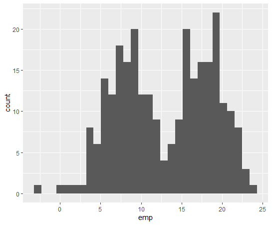
We see double top distribution for emp.
How about self(selfemployed gendar gap)
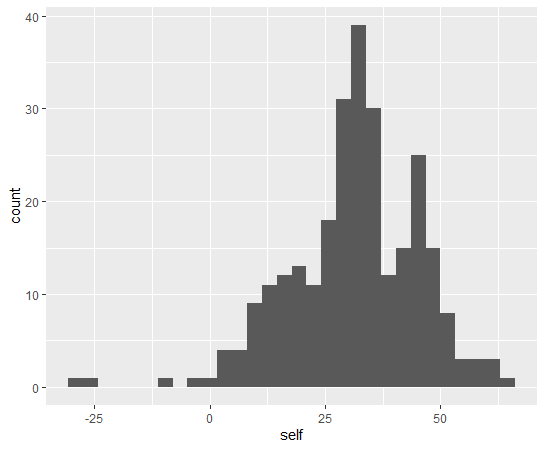
self is single top distribution form.
How about year?

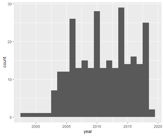
Some year has more than 20 observations.
Next, let's see scatter plots using ggplot() + geom_point()
First, emp vs. self

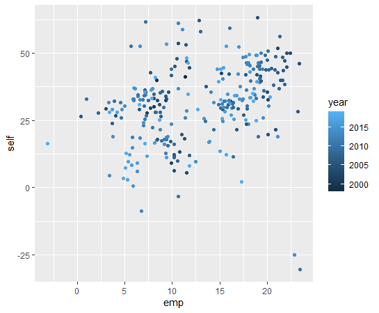
There seems not strong linear relationship.
year vs. emp
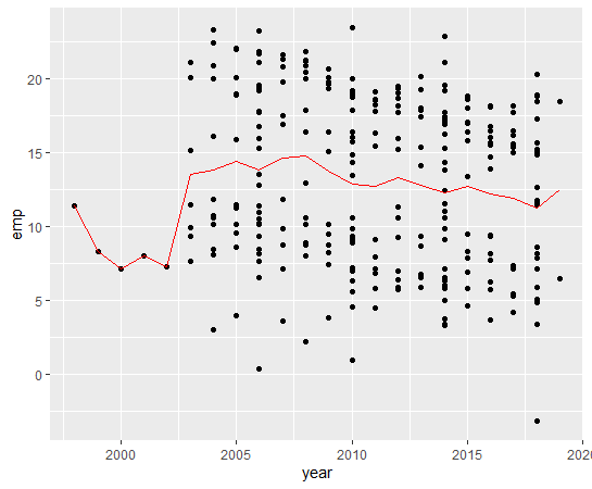
I added year average line with using geom_line().
There seems slightly down trend.
How about year vs. self?
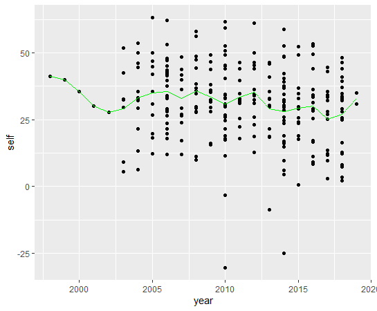
Maybe, there seems weak downtrend.
Next, let's see country vs. emp
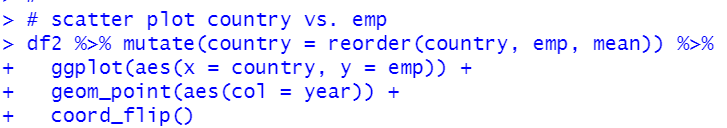
I use reorder() function to re-order country by average emp.
We see many countries lowered gendar gap.
How about year vs. self?
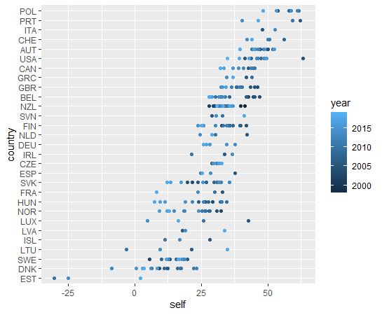
For self, we see negative gender gap, it means female wage is higher than male age.
That's it. Thank you!
Next post is
To read from the 1st post,