
UnsplashのSergey Leont'evが撮影した写真
This post is following of the above post.
In this post, let's see relationship between two variables.
First, let's see correlations.

I use cor() function to see correlation. TRY and men_women has negative correlation, -0.442, TRY and l_usd_cap has positive correlation, 0.746 and men_women and l_usd_cap has negative correlation, -0.207.
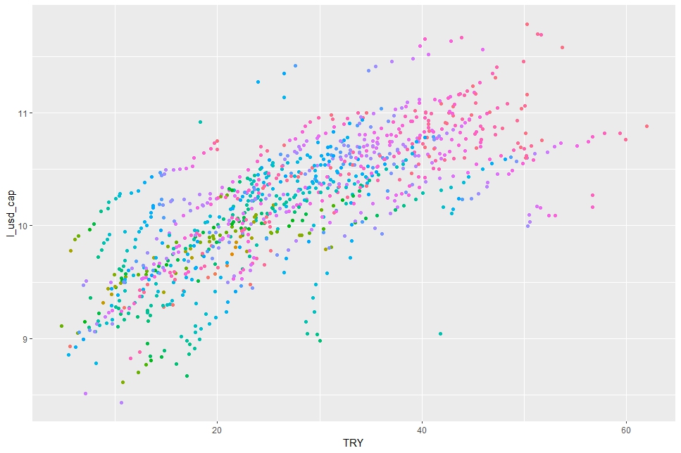
Then, let's make scatter plots with ggplot() + geom_point() function.


I add aes(color = LOCATION) in geom_point() function, so that I can see scatter plots by LOCATIONs. I see each LOCATIONs have positiove relationship between TRY and l_usd_cap.
Let's use aes(color = as.factor(TIME)).

I cannot say any meaningful comment on above scatter plot.
Let's use facet_wrap() function instead of aes(color = as.factor(TIME)).

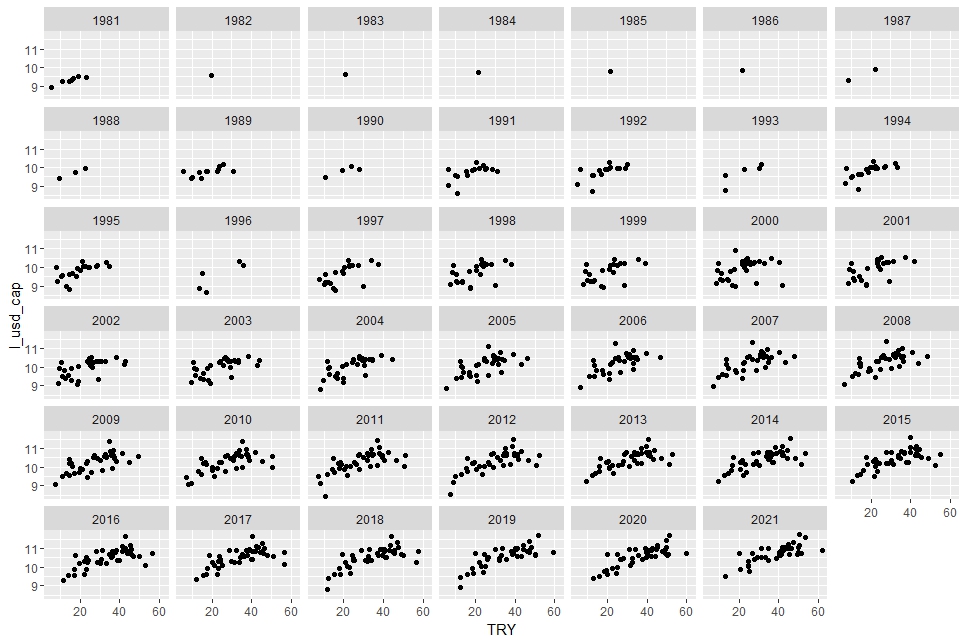
Now, I can say TRY and l_usd_cap have positiove correlations each year.
Next, let's see men_women and l_usd_cap.

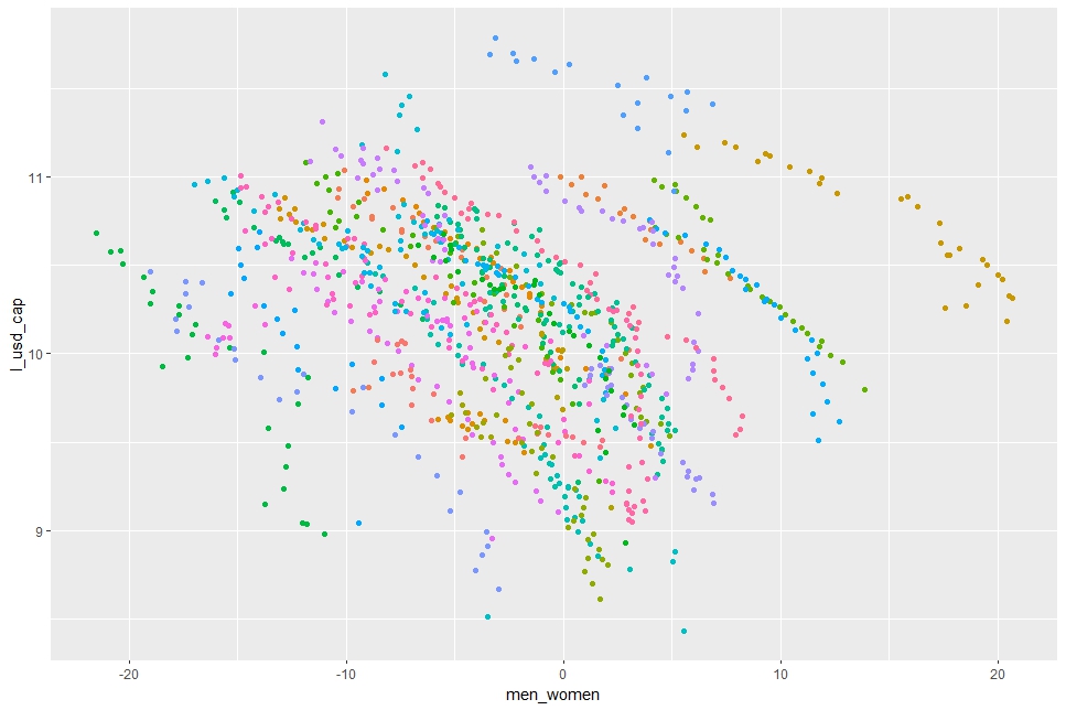
I see men_women and l_usd_cap have negative correlation in each LOCATIONs.
How about by TIME? I use facet_wrap() function.


Oh! It is intersting, when I use facet_wrap( ~ TIME), clear positive relationship between men_women and l_usd_cap disappear .
Next, let's see TRY and men_women.


I see each LOCATION have positive relationship between TRY and men_women.
How about by TIME?


I see there are weak negative relationships.
That's it. Thank you!
Next post is
To read from the 1st post,