
UnsplashのPhong Nguyenが撮影した写真
This post is following of the above post.
In this post I will create 5 names graphs in R.
I refer to Chapter 2 Data Visualization | Statistical Inference via Data Science (moderndive.com)
5 Named Grpahs are
#1 scatterplots
#2 linegraphs
#3 histograms
#4 boxplots
#5 barplots
Let's start with #1 scatterplots
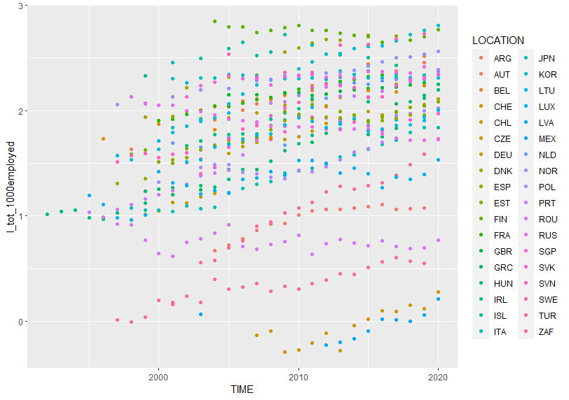
scatterplots shows two variables relationship. The above plot show TIME vs l_tot_1000employed. In general recent time has more large l_tot_1000employed.
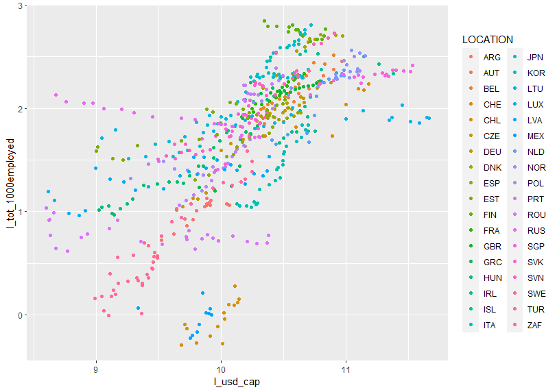
The above scatterplot shows l_usd_cap vs. l_tot_1000empolyed. The more l_usd_cap, the more l_tot_1000employed.
The next 5 named graphs is #2 linegraphs
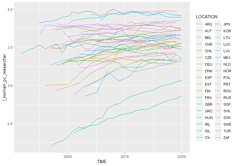
The above linegrap shows TIME vs. l_women_pc_researcher. Recent TIME has largeer l_woemn_pc_researcher.
The 3rd five named graphs is #3 histograms.
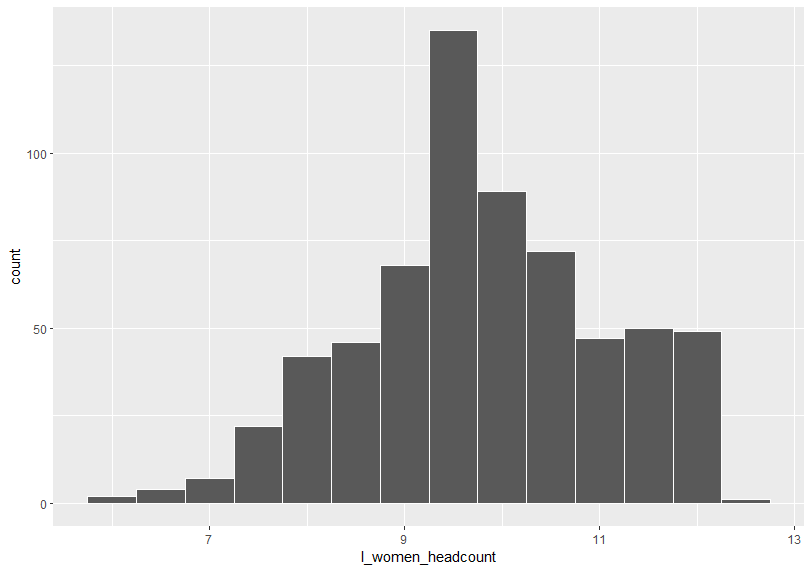
Histgrams shows variable distribution. The above histogram shows l_women_headcount distribution. Let's see another histograms.
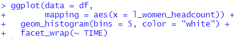
I added " facet_wrap(~ TIME) " so that I can see histograms by TIME.
The 4th five named grapsh is boxplots.
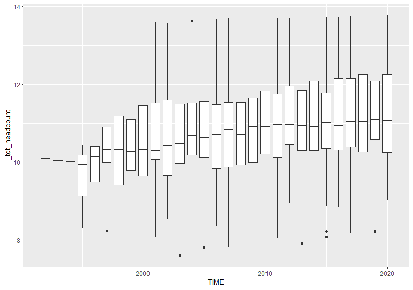
I see recent TIME has greater l_tot_headcount in general.
Tha last 5 named grpahs is #5 barplots.
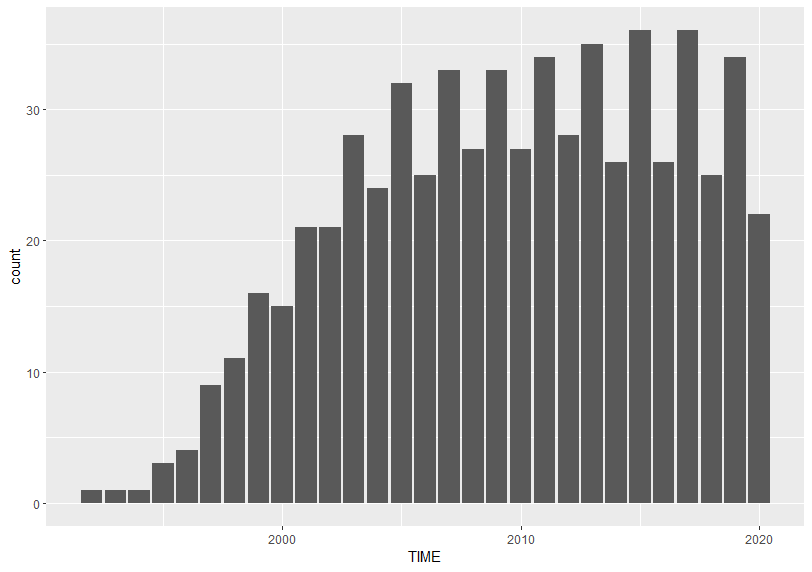
I see odd number TIME has more observations than even number TIME has.
Let's see number of observations by LOCATION.
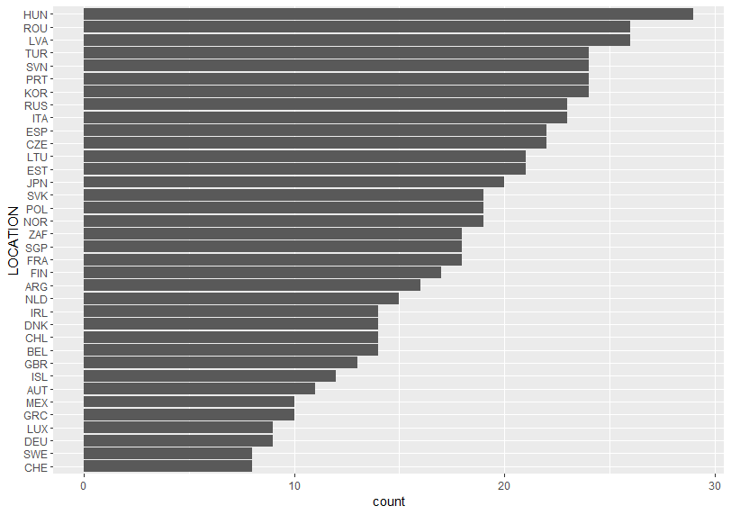
HUN has the most observations.
That's it. Thank you!
Next post is
To read from the first post,