
Photo by Stephen Leonardi on Unsplash
This post is following of above post.
I will make line charts using R ggplot2 package.
Let's start with ni_kg(NITROGEN measured by KG_HA)
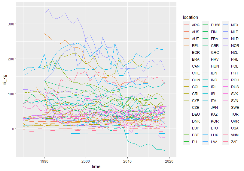
Some locations have declining trend, some have advancing trend.
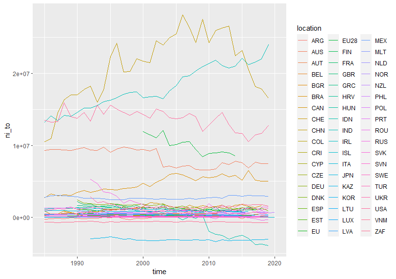
Next is ni_to(NITROGEN measured by TONNE)
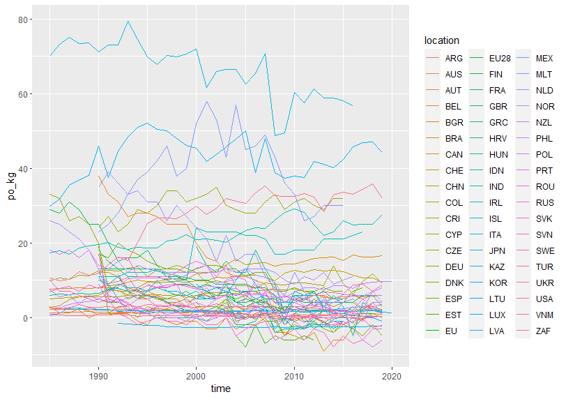
Next, po_kg(PHOSPHORUS measured by KG_HA)
The last is po_to(PHOSPHORUS measured by TONNE)
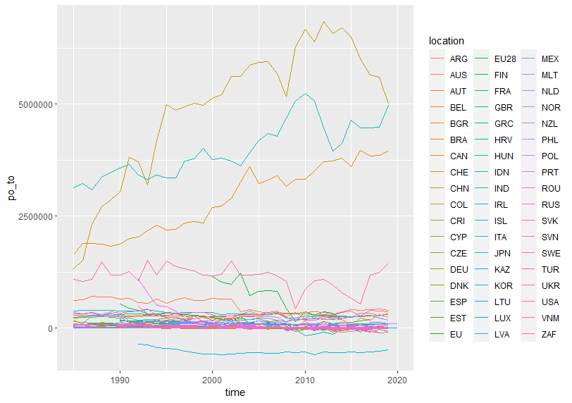
Top 3 locations have increasing trend.
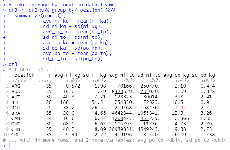
I will make another data frame for average value for location.
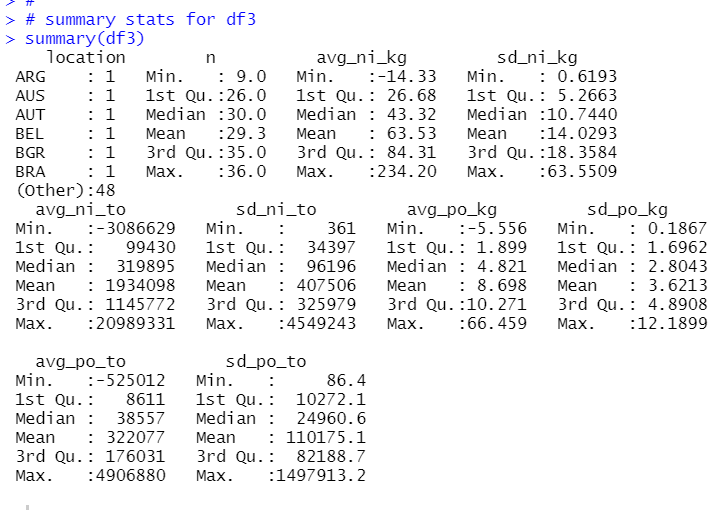
Let's see summary statistics for df3.
That's it. Thank you!
Next post is
To see the 1st post,