
Photo by Leonardo Yip on Unsplash
This post is following of above post.
In this post, I will do data visualization.
Firstly, let's make a histograms.
The previous post shows there are 4 kind of observations, NITOROGEN measured by KG_HA, NITROGEN measured by TONNE, PHOSPHORUS mesaured by KG_HA and PHOSPHORUS measured by TONNE.
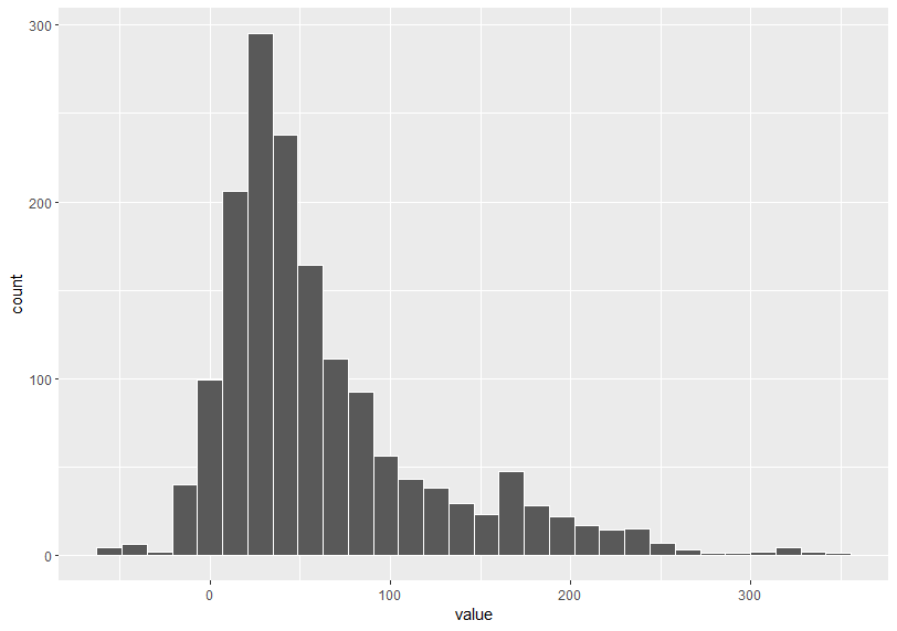
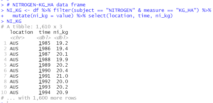
Let's start with NITROGEN measured by KG_HA.
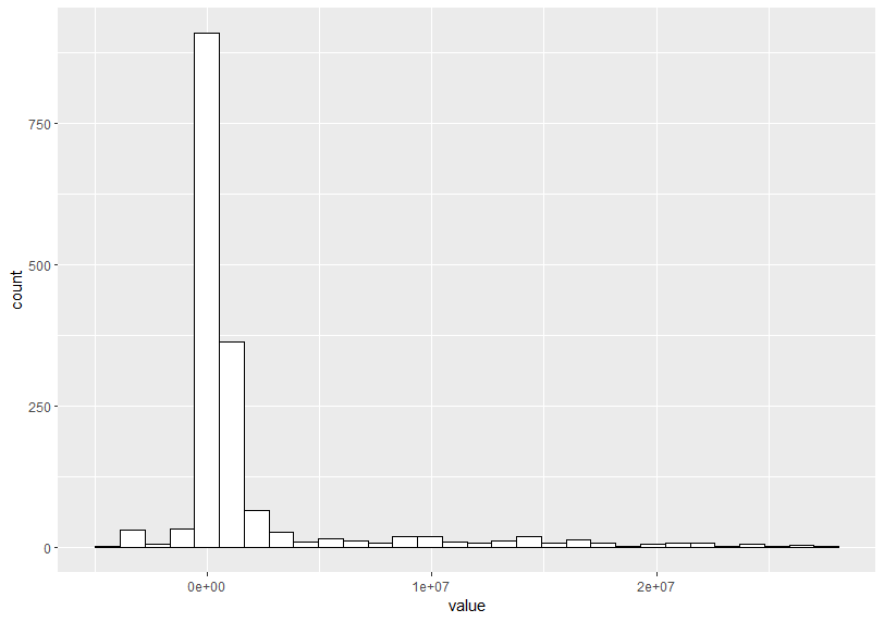
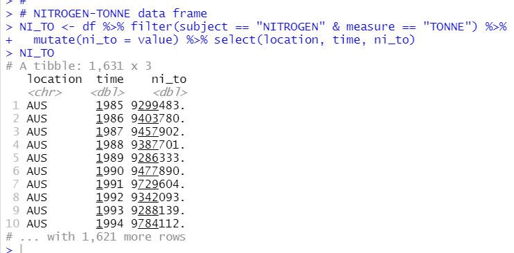
Next is NITROGEN measured by TONNE
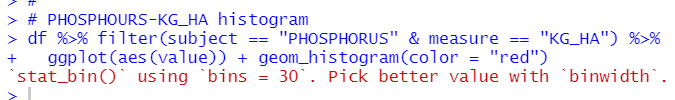
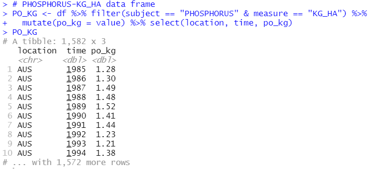
Next is PHOSPHORUS mesured by KG_HA
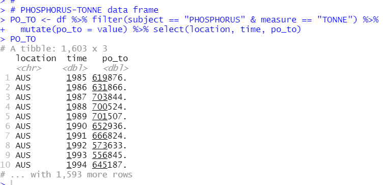
The last is PHOSPHORUS mesured by TONNE
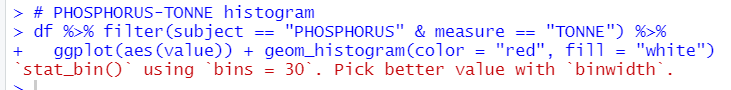
I see measure by KG_HA is more close to normal distribution.
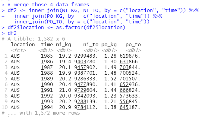
Then, I will make another data frame, which has four columns instead of subject, measure and value.
Then, I will merge those 4 data frames into one data frame.
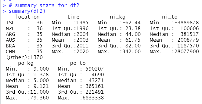
Let's see summary stats for df2.
That's all today. Thank you!
The next post is
To read from the 1st post