
Generated by Bing Image Crator: Photography of Mt. Fuji and beautiful lake and blue sky and red foreasts
This post is following of the above post.
In the previous post, I load OECD Trust in govenment data and per capita GDP data into R. In this post, I visualize those data using ggplot2 package.
First, let's see one variable distribution. I start with country.
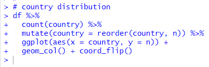
Almost countries have more than 15 observations.
Next, let's see year.
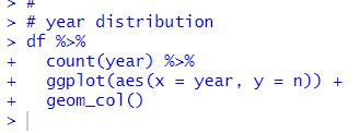
Since, country is categorical variable and year is discrete numerical variable, I use count() function and geom_col() function.
How about trust?
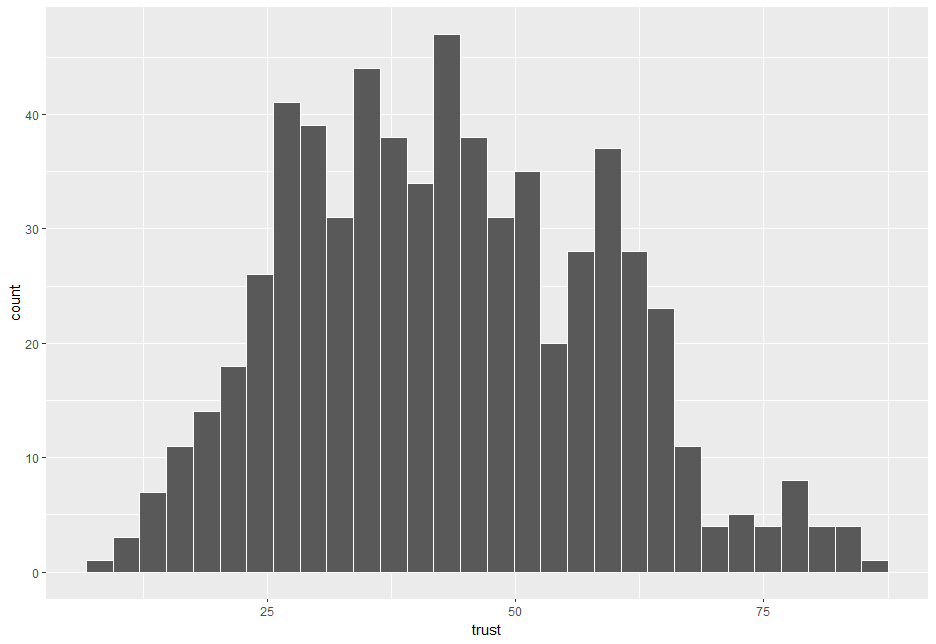
Since trust is continous numerical variable, I use geom_histogram() function to draw a histogram. The distrubution shows a slight right skewed shape.
Let's see pc_gdp.
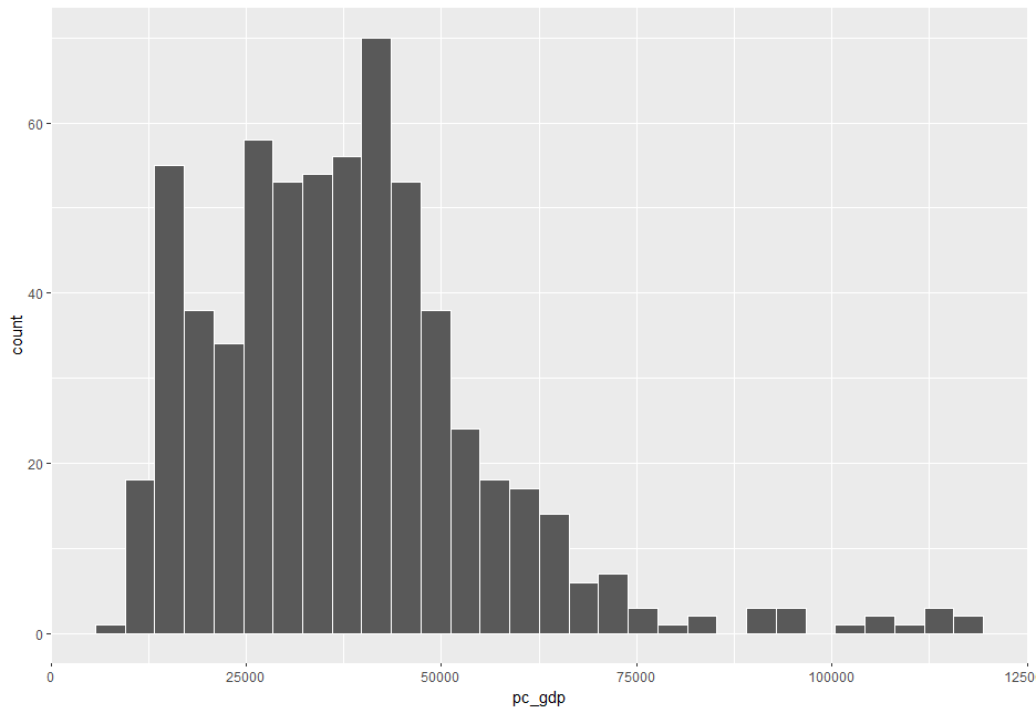
pc_gdp shows very right skewed shape. In this case, it is better to see log converted distribution.
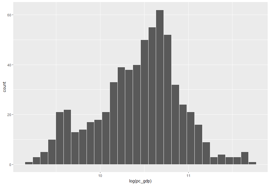
This shape is more symmetric than non-log distribution.
Now, let's move on to see two variables relationship. Let's see trust and log(pc_gdp).
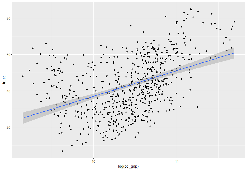
I see log(pc_gdp) and trust has positive relationship.
Let's add year.
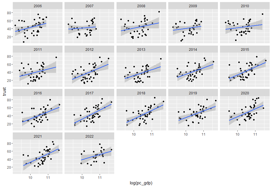
I use facet_wrap() function to add see year effect. In every year, there are positive relationship between trust and log(pc_capita).
Since there are too many countries in the data frame, I don't use facet_wrap(). Instead, I use country avaraged data.
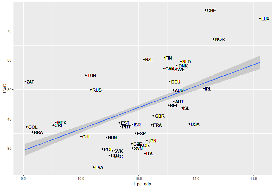
I use geom_text() function to add country name. I see positive relationship on country average data.
Let's see year average data.
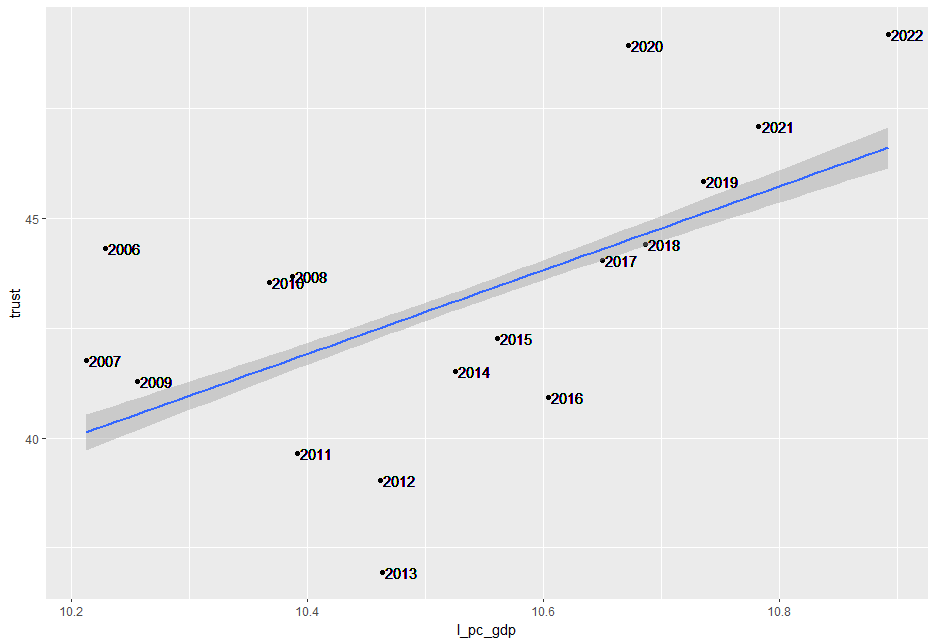
There is positive relationship on year average data.
So, I assume there is positive relationship between log(pc_capita) and trust in government.
That's it. Thank you!
Next post is,
To read from the first post,