www.crosshyou.info

政府統計の総合窓口のデータや、OECDやUCIやのデータを使って、Rの練習をしています。ときどき、読書記録も載せています。

OECD Discriminatory family code data analysis 7 - Adding Unemployment data to linear regression and using stargazer() function to compare regression models.

Photo by henry perks on Unsplash 

www.crosshyou.info

This post is following of above post.

I load Unenployment rate data. I get this data from OECD we site.

Then, I filter only year == 2019.

Next, I will merge df4 data frame and unem_2019 data frame with merge() function.

let's see how unemployment data is distributed.

it seems skewed.

Let's make log(unenployment) histogram.

l_unem, log(unemployment) is more close to normal distribution, so I will use l_unem for linear regression analysis.

After adding log(unemployment), "atwm": Attitides Towards Working Mothers and "em": Early Marriage are still significant varaibales.

Let's compare three liear regression model results.

That's it. Thank you!

Next post is


www.crosshyou.info


To read the 1st post,


www.crosshyou.info


OECD Discriminatory family code data analysis 6 - Adding Inflation data to linear regression, still "atwm" and "em" are significant.

Photo by Alexander Schimmeck on Unsplash 

www.crosshyou.info

This post is following of above post.
In this post I will add inflation data into previous post's linear regression model.
Firstly, I will load inflation data. I got the inflation data from OECD web site.

Then, I use only 2019 data.

Then, I merge df3 data frame and inf_2019 data frame.

I see minimum inflation is 0.3382 and max is 53.5483, mean is 3.78 and median is 2.06.

Let's check how inflation is distributed.

Uhm... It seems better to use log(inflation).

log(inflation) is more normaly distributed than inflation. So I will use l_inf: log(inflation) for linear regression.

After adding l_inf, atwm and em are still significant variables.

The higher atwm and em, the lower lpc_gdp.
Let's compare previous post's regression model, fit_lm2 and this post's model, fit_lm3.

coefficients for atwm and em are very similar value between fit_lm2 and fit_lm3.

That's it. Thank you!

Nxt post is


www.crosshyou.info


To read the 1st post,


www.crosshyou.info


HistDataパッケージのJevons

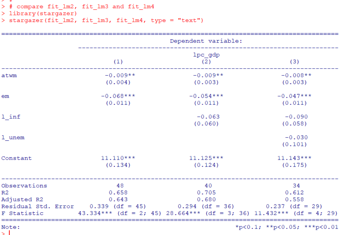
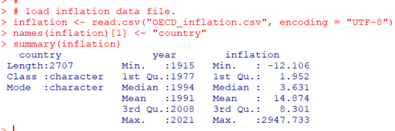
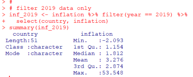
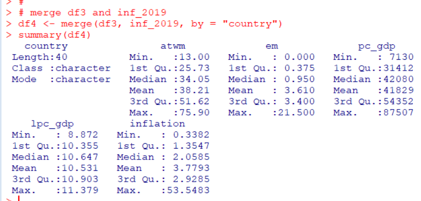
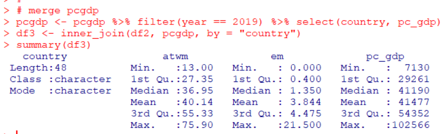
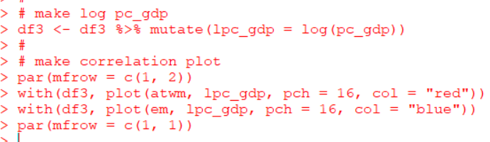
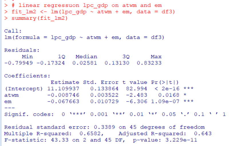
Photo by Setu Chhaya on Unsplash 

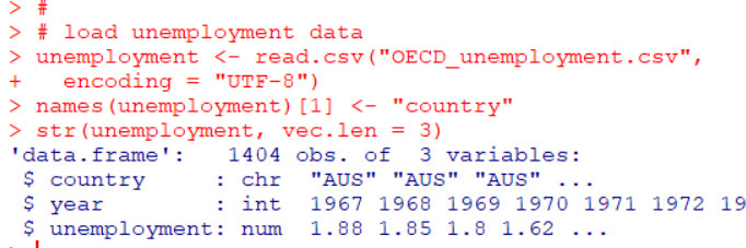
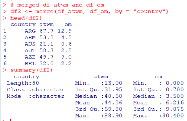
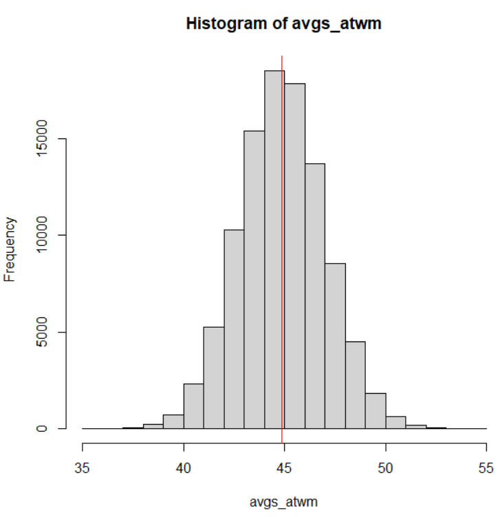
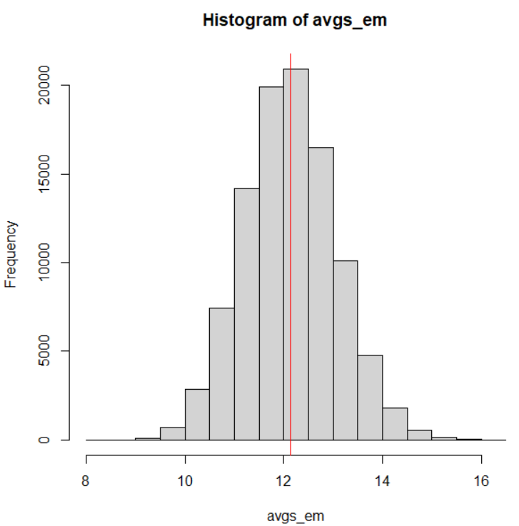
HistDataパッケージのJevonsというデータは、1871年のNatureという雑誌に掲載されたW. Stanley Jevonsの実験のデータです。

黒いビーズを複数個、パッと見せて、何個だったか答えさせるという実験です。人間が一度に認識できる数がどのくらいか、というのを調べる実験です。一般に7個前後、と言われていますね。
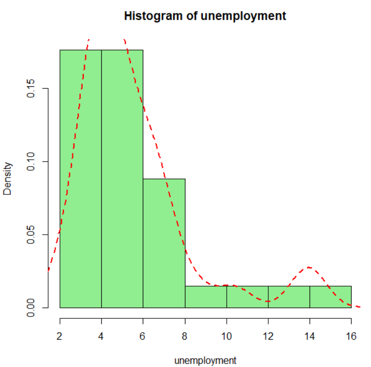
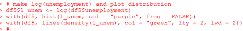
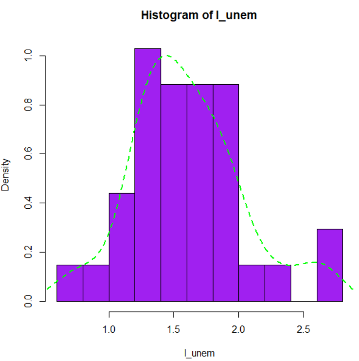
早速データを見てみます。

actual が実際のビーズの数、estimatedが答えた数、frequencyは度数、errorは誤差ですね。

一番始めの行は、actual:3, estimated:3, frquency:23, error:0 なので、実際のビーズが3のとき、3と答えたのが23回あって、誤差は0だった、という意味です。

ヘルプのコードを実行していきましょう。

はじめは、xtabs()関数で表を作っています。

ビーズが、3つ、4つのときは全部正解していますが、5つのときは102回正解で、5回間違っていますね。15個のときは正解は2回で9回間違っています。

次のヘルプのコードは、サンフラワープロット、sunflowerplot()関数です。

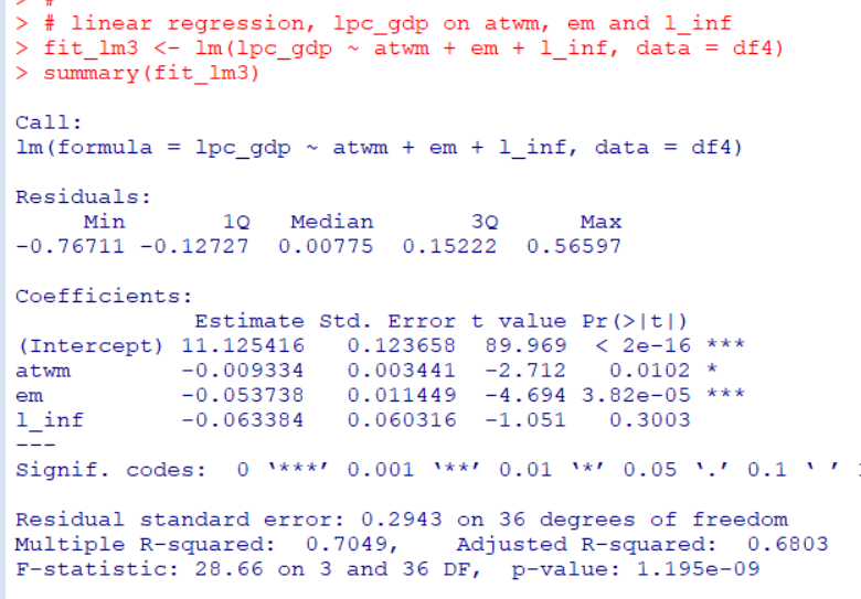
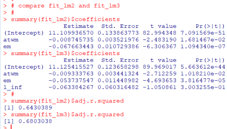
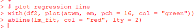
lm()関数で回帰直線モデルを作って、abline()関数でその直線を描いています。

次は、gplotパッケージのbaloonplot()関数を使っています。

そして、最後は、平均の誤差をグラフにしています。

reshapeパッケージのuntable()関数でfrequencyの数だけ実際の観測を作って、テーブルのデータを生データにしています。例えば、actual:3, estimated:3はfrequencyが23でしたので、actual:3, frequency:3の行を23行作っています。

そして、plyrパッケージのddply()関数でactualごとのerrorの平均を計算して、plot()関数でグラフにしたようです。

reshapeパッケージやplyrパッケージを使わなくてもできそうな気がします。

やってみましょう。

rep()関数とデータフレームの行を指定する方法を応用してuntable()と同じことができますし、tapply()関数がddply()関数と同じことができました。

今回はこれでおしまいです。

以下が今回のコードです。

# 2022-05-01
# HIstData_Jevons
#
library(HistData)
data("Jevons")
str(Jevons)
#
# show as tables
xtabs(frequency ~ estimated + actual, data = Jevons, subset = NULL)
xtabs(frequency ~ error + actual, data = Jevons, subset = NULL)
#
# show an sunflowerplot with regression line
with(Jevons,
     sunflowerplot(actual, estimated, frequency,
                   main = "Jevons data on numerical estimation"))
Jmod <- lm(estimated ~ actual, data = Jevons, weights = frequency)
abline(Jmod, col = "green", lwd = 2, lty = 2)
#
# show as balloonplots
library(gplots)
with(Jevons,
     balloonplot(actual, estimated, frequency, xlab = "actual",
                 ylab = "estimated",
                 main = "Jevons data on numerical estimation: Errros 
                 Bubble are area propotional to frequency",
                 text.size = 0.8))
with(Jevons,
     balloonplot(actual, error, frequency, xlab = "actual",
                 ylab = "error",
                 main = "Jevons data on numerical estimation:
                 Errors  Bubble are propotional to frequency",
                 text.size = 0.8))
#
# plot average error
library(reshape)
unJevons <- untable(Jevons, Jevons$frequency)
str(unJevons)
str(Jevons)
library(plyr)
mean_error <- function(df) mean(df$error, na.rm = TRUE)
Jmean <- ddply(unJevons, .(actual), mean_error)
with(Jmean,
     plot(actual, V1, ylab = "Mean error", xlab = "Actual number",
          type = "b", main = "Jevons data"))
abline(h = 0, col = "red", lty = 2, lwd = 2)
#
# reshapeパッケージ、plyrパッケージを使わずに再現する
n <- nrow(Jevons) # Jevonsの行数
index <- rep(c(1:n), Jevons$frequency) # Jevonsのx番目の行を何回繰り返すか
Jevons2 <- Jevons[index, ] # untable()と同じことをしている
Jmean2 <- with(Jevons2, tapply(error, actual, mean, na.rm = TRUE)) # actual
# ごとのerrorの平均値を計算
plot(Jmean2, type = "b", pch = 16, col = "blue", cex = 2,
     xlab = "Actual number", ylab = "Mean error",
     main = "Jevons data") # グラフ作成
abline(h = 0, col = "red", lty = 2, lwd = 2) # 0の水平線を追加


OECD Discriminatory family code data analysis 5 - Linear regression using R. Attitudes Towards Working Mother, Early Marriage and Per Capita GDP

Photo by Bjorn Pierre on Unsplash 

www.crosshyou.info

This post is following of above post.
In this post, I will do linear regression analysis with R.

First, I make a data frame which have "atwm": Attitudes Towards Working Mothers only.

Second, I make a data frame which have "em": Early Marriage only.

Then, I merge those two data frames with merge() function.

Now we have 80 observations in df2.

Let's make a scatter plot for "atwm" and "em".

I use lm() function for linear regression.

p-value is less than 0.05, so I say this model is statistically significant.

Let's make plot for scatter plot and regression line.

We see the higer "atwm", the higher "em".

 Let's test for Heteroskedasticity.

atwm, I(atwm^2) and entire model's p-value are all greater than 0.05, 0.206, 0.263 and 0.363 respectively. So this model is not Heteroskedasticiy.

I have per capita GDP file which is downloaded from OECD web site.
I will load this GDP data file.

I merge this pcgdp data frame and df2 data frame.

I make log(pc_gdp) for linear regression analysis and make two scatter plots.

I wee "atwm" and "em" have negative relationship to "lpc_gdp": log(per capita GDP).

So, the lower "atwm" and "em", the higher per capita GDP.

Let's do linear regression with lm() function.

"atwm" and "em" has statistically significant coefficient. The both coefficients signs are negative. 

Lastly, let's make a 3D scatter plot with scatterplot3d() function in scatterplor3d package.

That's it. Thank you!

Next post is


www.crosshyou.info


To read the 1st post, 


www.crosshyou.info


OECD Discriminatory family code data analysis 4 - Bootstrap method for getting Confidence Interval with R

Photo by Jeremy Santana on Unsplash 

www.crosshyou.info

This post is following of above post.
In the previous post, I get Confidence Interval using standard error.

In this post, I will get Confidence Interval using Bootstrap method.

Bootstrap method is to draw random samples many times and calclates sample averages and get quantile value.

Let's start with "atwm"; Attitudes Towards Working Mothers.

I draw 100,000 samples and calculate average 100,000 times. I use for() loop.

Those 100,000 averages are store in avgs_atwm object.

Let's see a histogram of avgs_atwm.

Vertical red line is an average of avgs_atwm.

Then, I use quantile() function to get 2.5% quantile and 97.5% quantile values.

Bootstrap confidence interval is 40.76 ~ 49.04 while standard error confidence interval is 40.64 ~ 49.09. The both are quite similar value.

Next, let's do with "em"; Early Marriage.

Make a histogram.

Let's compare Bootstrap Confidence Interval and Standard Error Confidence Interval.

The both CI are quite similar.

That's it. Thank you!

Next post is


www.crosshyou.info


To read the first post,


www.crosshyou.info


OECD Discriminatory family code data analysis 3 - average and confidence intervals using R

Photo by Alexander Schimmeck on Unsplash 

www.crosshyou.info

This is following of above post.
In this post, I will calculating confidence intervals for "atwm"; Attitudes Towards Working Mothers and "em",; Early Marriage.

Let's begin.

We can use mean() function to calculate average. "atwm" average is 44.8 and "em" average is 12.1.

To calculate confidence intervals, we need average and followings

--- number of observations

--- standard deviation of observations

--- standard error of observations

--- confidence level, I use 5%

I use lenght() function to get number of observations. "atwm" number of observations is 80.

sd() function gets standard deviation. "atwm" standard deviation is 18.999

Standard error is "standard deviation / sqrt(number of observations)". So the smaller standard deviation, the smaller standard error, the larger number of observations, the smaller standard error.

I use confidence level 5%, it means qt(0.975, n - 1).

Let's calculate confidence intervals for "atwm"; Attitudes Towards Working Mothers.

Confidence Intervals is 40,64 ~ 49.09 at 5% level.

Next, I will calculate confidence intervals for "em"; Early Marriage. 
Before calculate it, I will make custom function with function() for calculating confidence intervals.

Let's check if this function will do.

This result is the same as previous result. So, this calc_ci() is working correctly.

I use calc_ci() to get confidence intervals for "em"; Early Marriage.

"em"; Early Marriage confidence intervals at 5% level is 10.28 ~ 13.97.

Lastly, I make a plot to show average value and confidence intervals.

I use plot() functuon with type = "h" and abline().
That's it. Thank you!

Next post is


www.crosshyou.info


To read the 1st post,


www.crosshyou.info


HistDataパッケージのHalleyLifeTable

Photo by Jasper Garratt on Unsplash 

HIstDataパッケージのHalleyLifeTableはハレー彗星で有名な、エドモンド・ハレーが調べた年齢と死亡率のデータです。

天文に関することの他にこんなこともしていたのですね。

早速データを呼び出します。

84行、4列のデータフレームです。

age は年齢で、1から84まで、つまち1歳から84歳までのデータです。

deathsは、死亡者数です。

numberは、生存者数です。

ratioは生存率です。number(t+1)/number(t)で計算されています。

それでは、ヘルプのコードを実行します。

はじめは、全体の生存者数をsum()関数で計算しています。

3万3894人でした。

次は、plot()関数で年齢と生存者数をグラフにしています。

年齢が高くなるほどに生存者数は減少しています。

次のコードはplot()関数で人口ピラミッドを描いています。

segments()関数というのを使って横線を描いています。

次のヘルプのコードは、生存率と年齢のグラフです。

年齢の若い人たち、幼児と年齢の高い人たち、老人の生存率が低いことがわかります。

これでヘルプのコードは終了です。

lm()関数で生存率と年齢の関係を線形回帰してみます。

5乗項まで追加してみました。どの項目の係数も有意な係数です。

この回帰モデルの曲線を先ほどのグラフの上に載せてみましょう。

けっこういい感じにフィットしていますね。

下に今回のコードを記載しました。

# 2022-04-24
# HistData_HalleyLifeTable
#
library(HistData)
data("HalleyLifeTable")
#
# str()
str(HalleyLifeTable)
#
# What was the estimated population of Breslau?
sum(HalleyLifeTable$number)
#
# plot survival vs. age
plot(number ~ age, data = HalleyLifeTable, type = "h", 
     ylab = "number surviving")
#
# population pyramid is transpose of this
plot(age ~ number, data = HalleyLifeTable, type = "l",
     xlab = "number surviving")
with(HalleyLifeTable, segments(0, age, number, age, lwd = 2))
#
# conditional probability of survival, one more year
plot(ratio ~ age, data = HalleyLifeTable,
     ylab = "probability survive one or year", type = "h")
#
# ratioをageで線形回帰
fit <- lm(ratio ~ age + I(age^2) + I(age^3) + I(age^4) + I(age^5),
          data = HalleyLifeTable)
summary(fit)
#
# 回帰曲線をグラフに追加
lines(HalleyLifeTable$age[-84], fitted(fit), col = "red")
#