www.crosshyou.info

政府統計の総合窓口のデータや、OECDやUCIやのデータを使って、Rの練習をしています。ときどき、読書記録も載せています。

OECD Threatened species data analysis 2 - visualize data using ggplot2 in R


www.crosshyou.info

 This brlog is following of above blog.
This time, let's visualize data with ggplot2 package in R.

Boxplot by SUBJECT

f:id:cross_hyou:20210517193142p:plain

f:id:cross_hyou:20210517193154p:plain

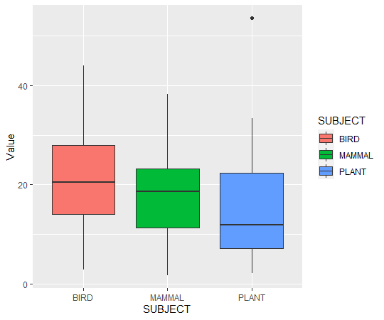
We see BIRD are the highest median and PLANT is the lowest median.


f:id:cross_hyou:20210517193322p:plain

f:id:cross_hyou:20210517193335p:plain

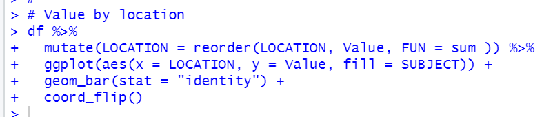
Next, let's visualize by LOCATION

f:id:cross_hyou:20210517194505p:plain

f:id:cross_hyou:20210517194524p:plain

CZE has the higest threatened species proportion. COL has the lowest.

That's it.

Next blog is


www.crosshyou.info


To read the 1st blog,


www.crosshyou.info