
Photo by Lance Anderson on Unsplash www.crosshyou.info
This post is following of above post.
In this post, let's make some graphs to see data distributions.
First, let's see overall student_mobility data histogram.

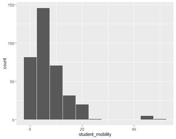
We see there are a few outliers over 40 area.
Next, let's see iso numbers bar chart.

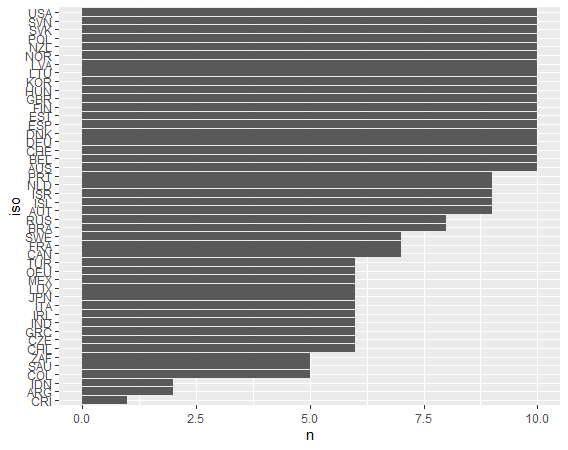
Approximately one thirds countries have 10 years data.
How about year?

We see there are no observations between 2006 to 2009.
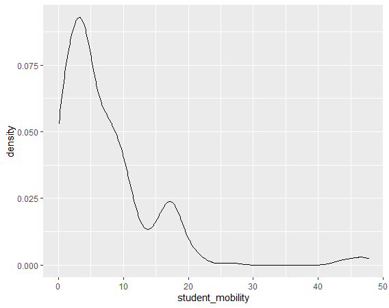
Let's see student_mobility in detail, firstly, density plot.

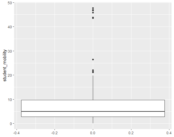
Next, boxplot.

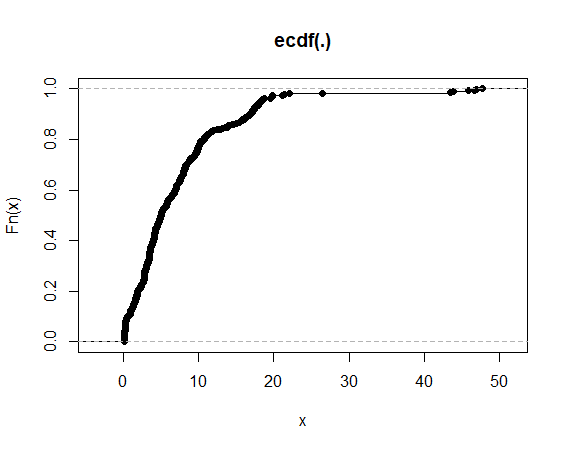
CDF

Student Mobility by ISO

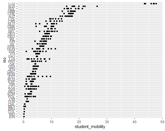
We see LUX(Luxenbrug) is the outlier.


We see median value is increasing slowly.
That's it. Thank you!
Next post is
To read from the first post,