
Photo by Olga Tsai on Unsplash
This post is following of above post.
In this post, let's make average value data frame by country and by year.
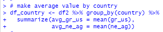
First, I make a data frame for average value by country using group_by() function and summarize() function using R.
The, let's make a sacatter plot.


I load ggthemes and ggrepel packages to make a professional looking graph.

Let's make a economist style graph.


We see GROSSADJ & USD_CAL and NET_AGRWTH are negative correlation.
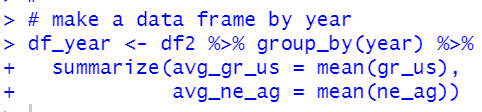
Next, let's make a data frame by year.
Let's make a scatter plot.


We see GROSSADJ & USD_CAP and NET & AGRWTH are negative correlation.
Next, let's see year vs. gr_us

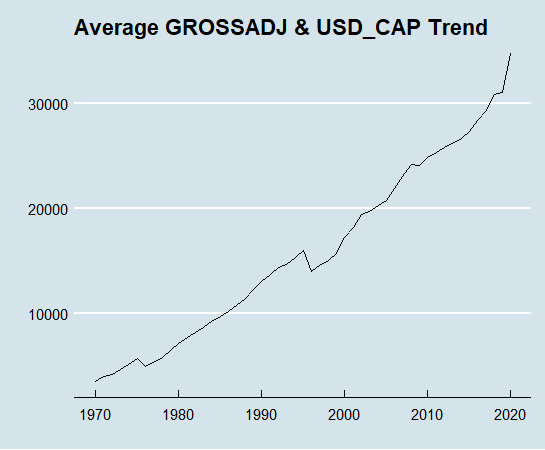
We see GROSSADJ & USD_CAP has increasing trend.
How about NET & AGRWTH?
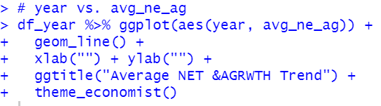
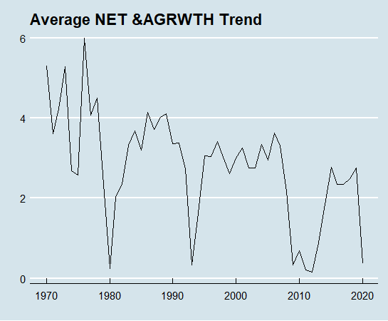
We see NET & AGRWTH has downward trend and it is more volatile than GROSSADJ & USD_CAP.
That's it. Thank you!
Next post is
to see the 1st post,