www.crosshyou.info

政府統計の総合窓口のデータや、OECDやUCIやのデータを使って、Rの練習をしています。ときどき、読書記録も載せています。

OECD Business confidence Index(BCI) data analysis 3 - time-series chart using ggplot() + geom_line()

f:id:cross_hyou:20211023155644j:plain

Photo by NASA on Unsplash 

www.crosshyou.info

This post is following of above post.

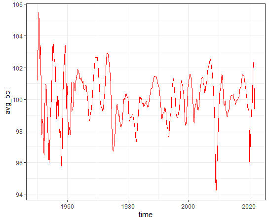
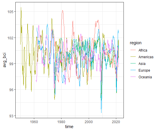
Let's see time-series for bci average.

f:id:cross_hyou:20211023160521p:plain

f:id:cross_hyou:20211023160531p:plain

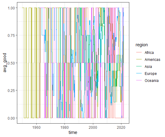
Let's see time-series for good average.

f:id:cross_hyou:20211023160830p:plain

f:id:cross_hyou:20211023160842p:plain

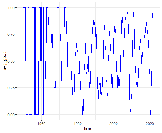
average bci and average good are both very volatile.

what is the correlation for both?

f:id:cross_hyou:20211023161614p:plain

f:id:cross_hyou:20211023161623p:plain

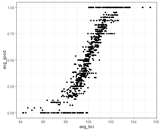
Of course, we see positive correlation.

Let's see by region time series.

f:id:cross_hyou:20211023162159p:plain

f:id:cross_hyou:20211023162211p:plain

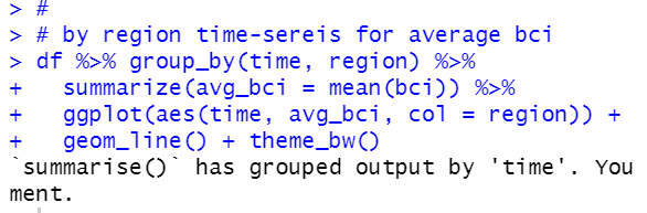
It is too complicated to understand.

Let's see average good time-series by region

f:id:cross_hyou:20211023162602p:plain

f:id:cross_hyou:20211023162615p:plain

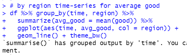
This chart is also too complicated to understand, interpret.

All right, let's focus overall average now. So I will make overall average dataframe.

f:id:cross_hyou:20211023163129p:plain

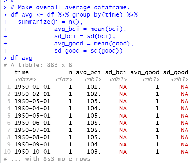
If number of observations is only 1, standard deviations cannot be calculated.

We see 1950-01-01 and other time has NA.

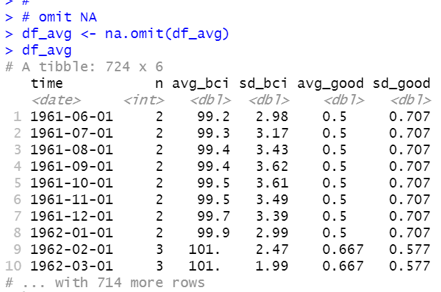
I omit those observations.

f:id:cross_hyou:20211023163429p:plain

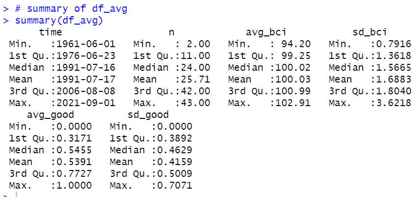
Let's see summary of df_avg dataframe.

f:id:cross_hyou:20211023163725p:plain

All right, let's make those variables time-series charts.

f:id:cross_hyou:20211023164811p:plain

f:id:cross_hyou:20211023164825p:plain

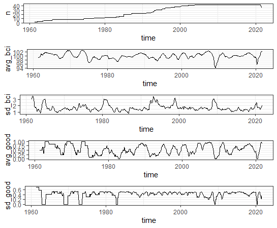
It seems interesting.

That's it. Thank you!

Next post is


www.crosshyou.info


To read 1st post,


www.crosshyou.info