Generated by Bing Image Creator: Long scale view of green forest, blue sky, cosmos flowers, photo
This post is following of the above post.
Let's see which year has the most observations. I use count() function and arrange() function and desc() function.

Year 2018 has the most observations, 2012 and 2015 are the 2nd.
Let's see those three years boxplots.


I don't see any large differences.
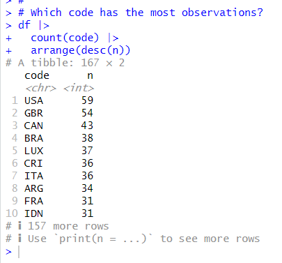
Next, let's see which country has the most observations.

USA has the most, GBR has the 2nd most and CAN are the 3rd.
Let's make a chart for those three countries.


These three countires have different patterns. USA has almost always the smallest and the levels keep between 5 and 6.
Canada and GBR are inverse trending before 1990. then they goes together.
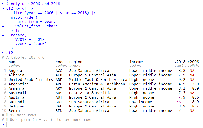
In the above results of observations by year, the oldest year is 2006 and the newest yeat is 2018. So, I use these two years.

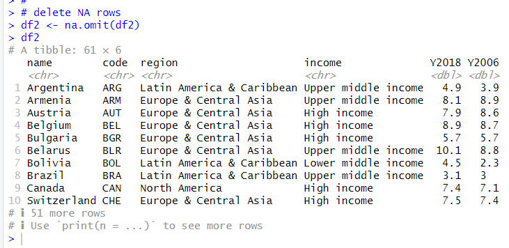
I delete NA rows.

Let's calcukate change net from Y2006 to Y2018.

Let's see summary statistics.

I see Chg_Net and Chg_Pct mean and median are positive.
So from 2006 to 2018, lowest 20% share were increased overall.
That's it. Thank you!.
Next post is
To read from the first post,