www.crosshyou.info

政府統計の総合窓口のデータや、OECDやUCIやのデータを使って、Rの練習をしています。ときどき、読書記録も載せています。

OECD Researchers data analysis 5 - Simple Linear Regression with one numerical variable in R, ModernDive way

UnsplashMadara Parmaが撮影した写真 

www.crosshyou.info

This post is following of the above post.
In this post, I will do linear regression analysis.

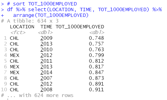
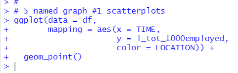
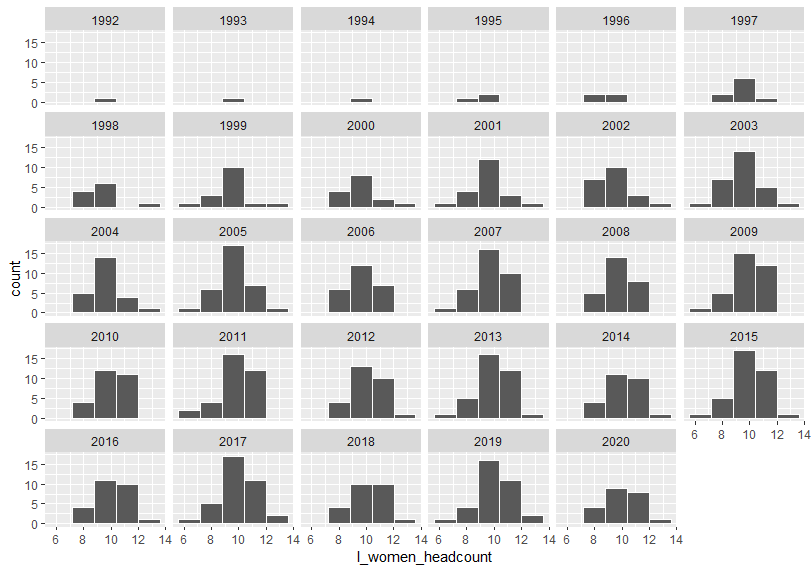
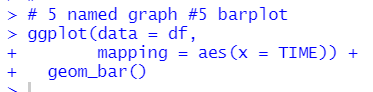
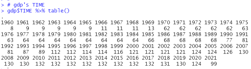
To do this, I make a small(subset) data frame. Let's check what TIME has the most observations.

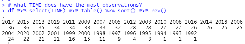
2017 and 2015 have 36 observations. So I filter TIME for only 2017 and 2015.

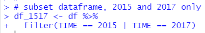
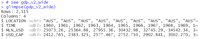
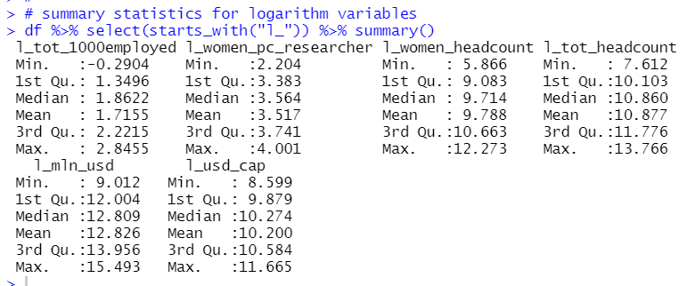
Let's see this dataframe with flimpse() function.

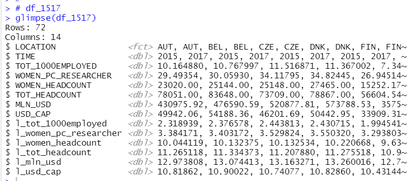
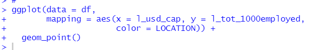
I am interested in that "whether Researchers data is related to USD_CAP or l_usd_cap".

So, firstly, let's check correlation.

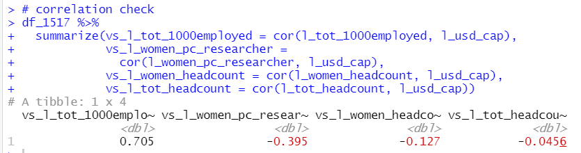
I see l_tot_1000employed is the most correlated to l_usd_cap.

So, let's check linear regression, dependent variable = l_usd_cap, independent variable = l_tot_1000_employed.

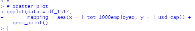
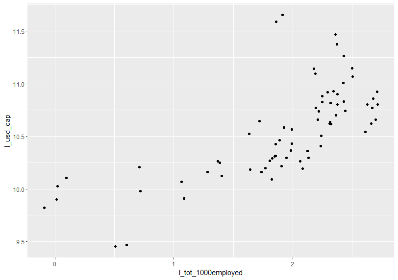
Before doing linear regression, let's see scatter plot.

I use lm() fundtion to make linear regression object.

Then, I usually use summary() function to see linear regression result, but this time I loaded moderndive package and I will use moderndive packages's get_regression_table() function.

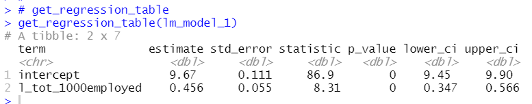
I see l_tot_1000employed's estimate is 0.456. It means when l_tot_1000employed increase by 1, l_usd_cap will increase by 0.456. It means when TOT_1000EMPLOYED inclease by 1%, USD_CAP will inclease by 0.456%.

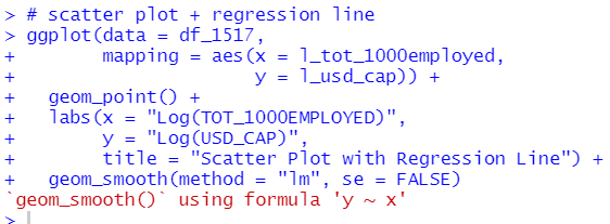
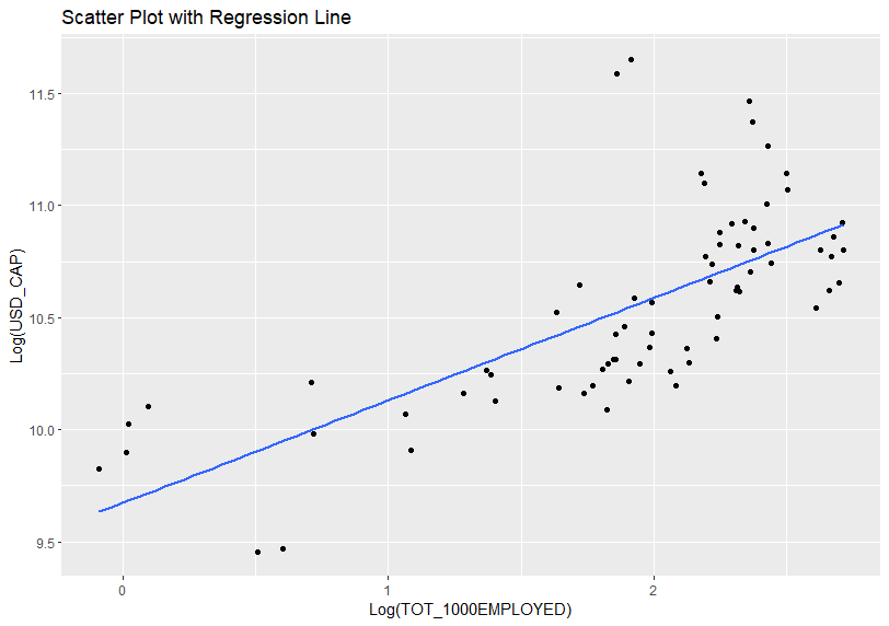
Let's add regression line to the previus scatter plot. I use gerom_smooth() function.

I refered to Statistical Inference via Data Science (moderndive.com)

That's it. Thank you!


The next post is

www.crosshyou.info


To read the first post,

www.crosshyou.info


OECD Researchers data analysis 4 - Sorting dataframe by column in R

UnsplashKarsten Würthが撮影した写真 

www.crosshyou.info

This post is following of the above post.

In this post, let's sort dataframe by variables.

The smallest TOT_1000EMPLOTED observation is CHL 2009.

The largest TOT_1000EMPLOYED observation is FIN 2004.

The smallest WOMEN_PC_RESEARCHER observation si KOR 1997.

The largest WOMEN_PC_RESEARCHER observation is LVA 2008.

The smallest WOMEN_HEADCOUNT observation is LUX 2003.

The largest WOMEN_HEADCOUNT observation is GBR 2019.

The smallest TOT_HEADCOUNT observation is LUX 2003.

The largest TOT_HEADCOUNT observation is JPN 2020.

The smallest MLN_USD observation is ISL 1999.

The largest MLN_USD observation is JPN 2019.

The smallest USD_CAP observation is ROU 1995.

The largest USD_CAP observation is LUX 2019.

So, LOCATIONS which has at least one the smallest/largest variables are CHL, FIN, KOR, LVA, LUX, GBR, JPN, ISL and ROU.

That's it. Thank you!

Next post is

www.crosshyou.info


To read from the first post,

www.crosshyou.info


OECD Researchers data analysis 3 - 5 Named Graphs in R

UnsplashPhong Nguyenが撮影した写真 

www.crosshyou.info

This post is following of the above post.
In this post I will create 5 names graphs in R.

I refer to Chapter 2 Data Visualization | Statistical Inference via Data Science (moderndive.com)

5 Named Grpahs are

#1 scatterplots

#2 linegraphs

#3 histograms

#4 boxplots 

#5 barplots

Let's start with #1 scatterplots

scatterplots shows two variables relationship. The above plot show TIME vs l_tot_1000employed. In general recent time has more large l_tot_1000employed.

The above scatterplot shows l_usd_cap vs. l_tot_1000empolyed. The more l_usd_cap, the more l_tot_1000employed.

The next 5 named graphs is #2 linegraphs

The above linegrap shows TIME vs. l_women_pc_researcher. Recent TIME has largeer l_woemn_pc_researcher.

The 3rd five named graphs is #3 histograms.

Histgrams shows variable distribution. The above histogram shows l_women_headcount distribution.  Let's see another histograms.

I added " facet_wrap(~ TIME) " so that I can see histograms by TIME. 

The 4th five named grapsh is boxplots.

I see recent TIME has greater l_tot_headcount in general.

Tha last 5 named grpahs is #5 barplots.

I see odd number TIME has more observations than even number TIME has.

Let's see number of observations by LOCATION.

HUN has the most observations.

That's it. Thank you!

Next post is

www.crosshyou.info


To read from the first post,

www.crosshyou.info


OECD Researchers data analysis 2 - Converting long format dataframe to wide format dataframe and merge two dataframes with R

UnsplashSakuraが撮影した写真 

www.crosshyou.info

This post is floowing of the above post.

Let's explore gdp dataframe.

gdp dataframe has more LOCATION than researcher dataframe.

gdp dataframe INDICATOR has only one calue, GDP. So I can remove it.

gdp SUBJECT has only one value, TOT, so I can remove it.

gdp MEASURE has two value: USD_CAP and NLN_USD, so I cannot remove it.

gdp FREQUENCY has only one value: A. I can remove it.

gdp TIME starts at 1960 and ends at 2021.

So far, I can remove INDICATOR, SUBJECT and FREQUENCY from gdp dataframe.

Let's see new dataframe.

Next, I merge the two dataframes, before doing that, I convert to dataframe into wide format.

Let's see this new wide format dataframe.

I see AUT 1998 has 5.107570 for TOT_1000EMPLOYED, 18.79060 for WOMEN_PC_RESEARCHER, 5901 for WOMEN_HEADCOUNT and 31404 for TOT_HEADACOUNT.

Let's convert  gdp_v2 to wide format too.

Let's see it.

AUS 1960 has 25073.26 for MLN_USD and 2412.765 for USD_CAP.

Finally, I can merge the two wide format dataframe.

Let's see it.

Then, I convert LOCATION to factor type from character.

Let's see summary statistics with summary() frunction.

I see all numeric variables are greater than zero, so I will make natural logarithm variables.

Let's see log variables summary statistics.

Let's call it a day. Thank you!


The next post is

www.crosshyou.info


To read from the 1st post,

www.crosshyou.info


読書記録 - 「生物学探偵セオ・クレイ 森の捕食者」 アンドリュー・メイン著 ハヤカワ・ミステリ文庫

著者は有名なマジシャンだそうです。才能がいっぱいあるのですね。

主人公のセオ・クレイは生物工学(原著を確認していなですが、たぶん、bioinfomaticsだと思います。)の教授で、生物学とコンピュータサイエンスを融合した学問分野の教授です。

面白かったので、2作目も読んでみようと思います。

OECD Researchers data analysis 1 - Load CSV file into R with read_csv() function.

UnsplashMarek Piwnickiが撮影した写真 

In this post, I will analyze OECD Researchers data.

Researchers are professionals engaged in the conception or creation of new knowledge, products, processes, methos and systems, as well as in the management of the projecs concerned. This indicator is measured in per 1000 people employed and in number of researchers, the data are available as a total and broken down by gender.

From the OECD website, (Research and development (R&D) - Researchers - OECD Data), I get the CSV file like above.

I also get the GDP data from the OECD website, (GDP and spending - Gross domestic product (GDP) - OECD Data).

Let's analyze(play around) those data with R!

Firstly, I load tidyverse package and moderndive package because I am reading Statistical Inference via Data Science (moderndive.com) and I am planning to follow this book.

Next, load data files.

I use glimpse() function to see data.

The both dataframe have the same variable names.

let's check each variables.

I start with researcher's LOCATION

researcher's INDICATOR

researcher's INDICATOR has only one value: RESEARCHER, so I can remove it.

researcher's FREQUENCY has only one value: A. I can remove it.

Time is from 1981 to 2020. 2011 has the most observations, 150.

All right, let's remove INDICATOR and FREQUENCY from researcher dataframe and rename variables.

Let's see researcher_v2 with glimpse() function.

All right. Let's call it a day. Thank you!


Next post is,

www.crosshyou.info


都道府県別の経済構造実態調査のデータの分析6 - R言語のlm()関数で回帰分析をして、ggplot() + geom_point() + geom_abline()で散布図に回帰直線を重ねる

UnsplashClement Souchetが撮影した写真 

www.crosshyou.info

の続きです。

前回はANOVA分析をしてみました。今回は回帰分析をしてみようと思います。

pc_val: 一人当たりの売上高を被説明変数にして回帰分析をしてみます。

まず、p_male304050: 30代40代50代の男性の比率を説明変数にしてみましょう。

回帰分析をする前に、散布図を描いてみます。前回でtidyverseパッケージを読み込んでいますので、今回はplot()関数ではなくて、ggplot()関数とgeom_point()関数で散布図を描いてみます。

p_male304050の値が大きいほうがpc_valが大きいような感じです。

lm()関数で回帰分析をして、summary()関数で結果を表示します。

p_male304050の係数が6.23なので、p_male304050が0.01, つまり30代40代50代の男性の比率が1%上昇したら、pc_valが0.0623, 6230円一人当たりの売上高が増加します。

pc_valの平均値は約35万円なので結構大きい影響のように思います。

先ほどの散布図に、回帰分析で得られた回帰直線を重ねます。

p_male304050だけだと、pc_valを説明するのは難しいですね。R2は0.009372ですから、0.9%しかp_male304050はpc_valを説明していません。

industryを説明変数に加えてみます。

R2が0.8014になりました。industryも加えると、pc_valの値を80%ぐらい説明できます。

hospiとsellingの係数が統計的にかなり有意な値です。

hospiとsellingの回帰直線を重ねてみます。

sellingの回帰直線の傾きはもっと大きな傾きになっているほうがいい感じですよね。

新しい industry 区分として、selling, hospi, その他の3つの区分を作ります。

case_when()関数というのを利用して、hospiはhospi, sellingはselling, その他はotherとして、mutate()関数でsectorという名前で新しい変数を作り、as.factor()関数でファクター型に変換しています。

このsectorとp_male304050を説明変数にします。そして今回は相互作用項も加えます。

sectorがhospiのときの回帰直線は、

pc_val = 1.730 - 4.2478 * p_male304050 です。なんと、30代40代50代の比率が高いほうがpc_valは減少するのですね。


sectorがotherのときの回帰直線は、

pc_val = 1.730 -2.2286 + (-4.2478 + 7.449) * p_male304050 です。30代40代50代の比率が高いほうがpc_valは増加します。


sectorがsellingのときの回帰直線は、

pc_val = 1.730 - 8.8731 + (-4.2478 + 57.3695) * p_male304050 です。30代40代50代の比率が0.01, つまり1%上昇すると、pc_valは53万円も増えます。


散布図にこの3つの回帰直線を重ねてみます。

sellingの傾きが大きいことがよくわかります。

今回は以上です。

初めから読むには、

www.crosshyou.info

です。