
UnsplashのOchir-Erdene Oyunmedegが撮影した写真
This post is following of the above post.
In this post, I will analyze correlations of vatiables.
Let's begin with crop field area. I can use cor() function to see correlation coefficient.
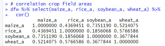
I see maize and soybean have relatively strong positive correlation: 0.735 and rice and soybean have weak correlation: 0.185.
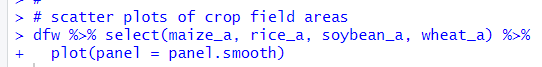
Let' see scatter plots. I use plot() function.
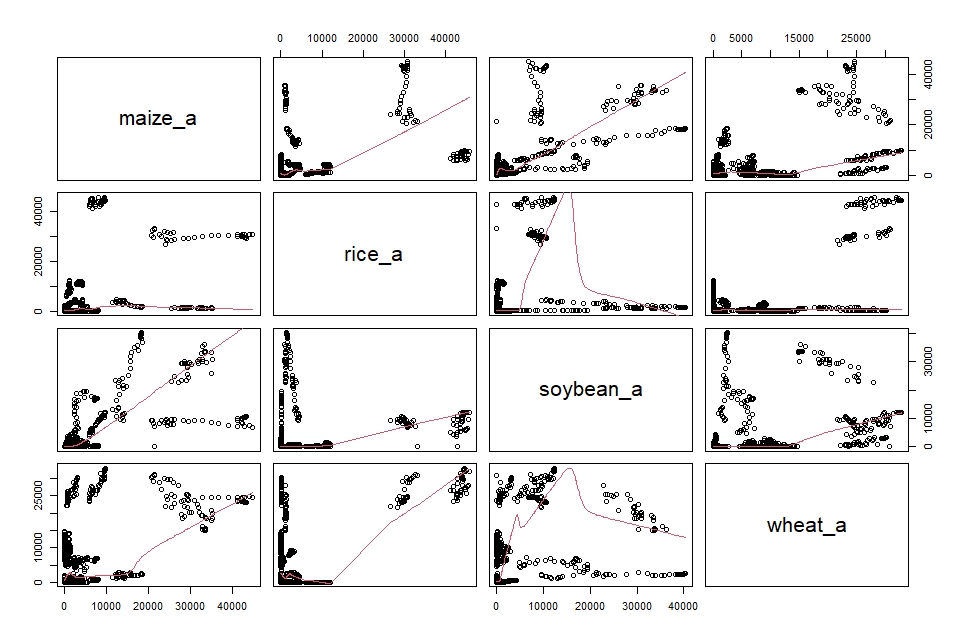
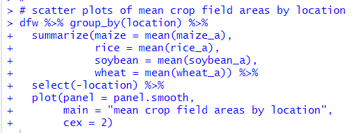
Uhm.... I think it is better to calculate average by location before checking correlation.
Oh, after calculationg average by locatin, maize and soybean have still relatively strong correlation and rice and soybean have still relatively weak correlation.
Let's make scatter plots.
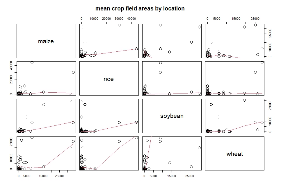
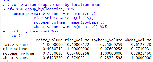
Next, let's see volume.
maize and soybean, rice and wheat have relatively strong correlation. soybean and wheat have relatively weak correlation.
Let's see scatter plots.

Then, let's see productivity.
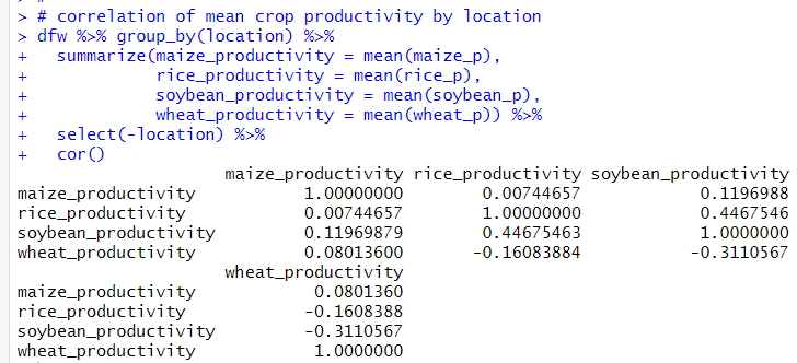
There are a few nagative correlation pairs. Rice and wheat, soybean and wheat have negative correlation.
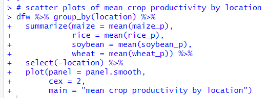
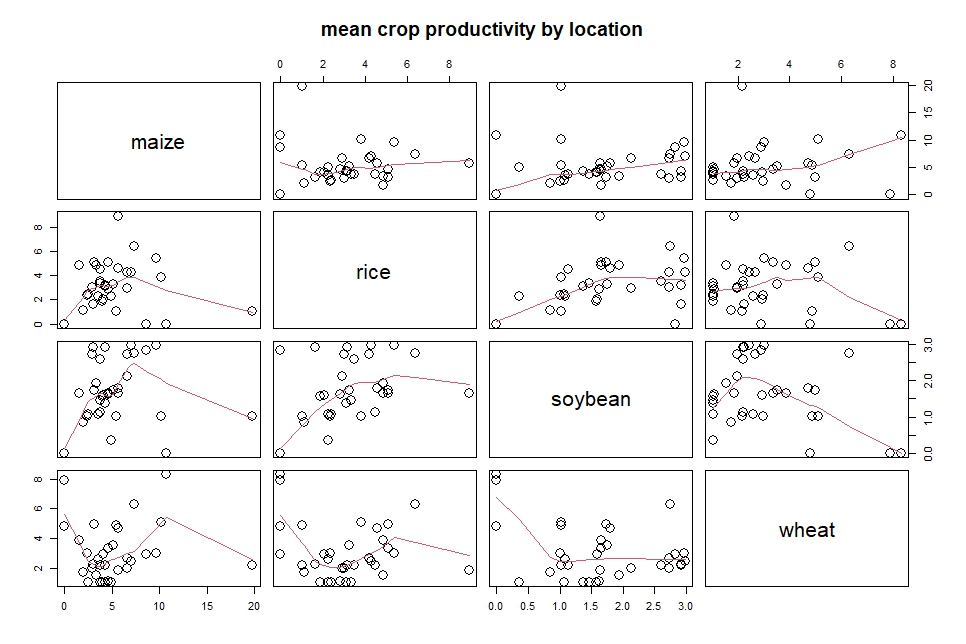
Let' see scatter plots.
That's it. Thank you!
Next post is
To read from the 1st post,