
UnsplashのAyesha Firdausが撮影した写真
This post is following of the above post.
In the previous post, I load CSV file data into R with read_csv() function. In this post I make a data frame for analysis use.
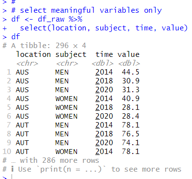
First, I select meaningful variables only using select() function.
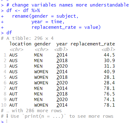
Next, I rename variable names to more understandable with rename() function.
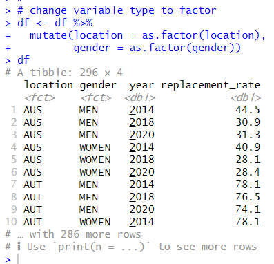
Thirs, I change data type to factor for character variables with as.factor() function and mutate() function.
Great! Let's use summary() function to see summary statistics.
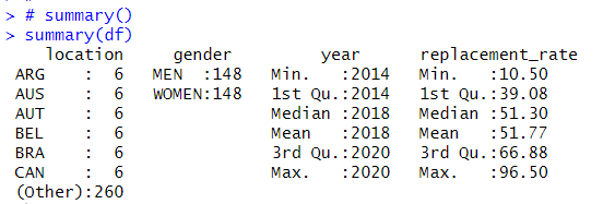
I see each location has 6 observations, MEN and WOMEN have the same number of observations, year starts from 2014 to 2020, replacement_rate range is 10.50 to 96.50.
What I would like to analyze are two things.
1. replacement_rate are different for MEN and WOMEN
2. replacement_rate are different for 2014 and 2020.
Let's see histogram of all replacement_rate.
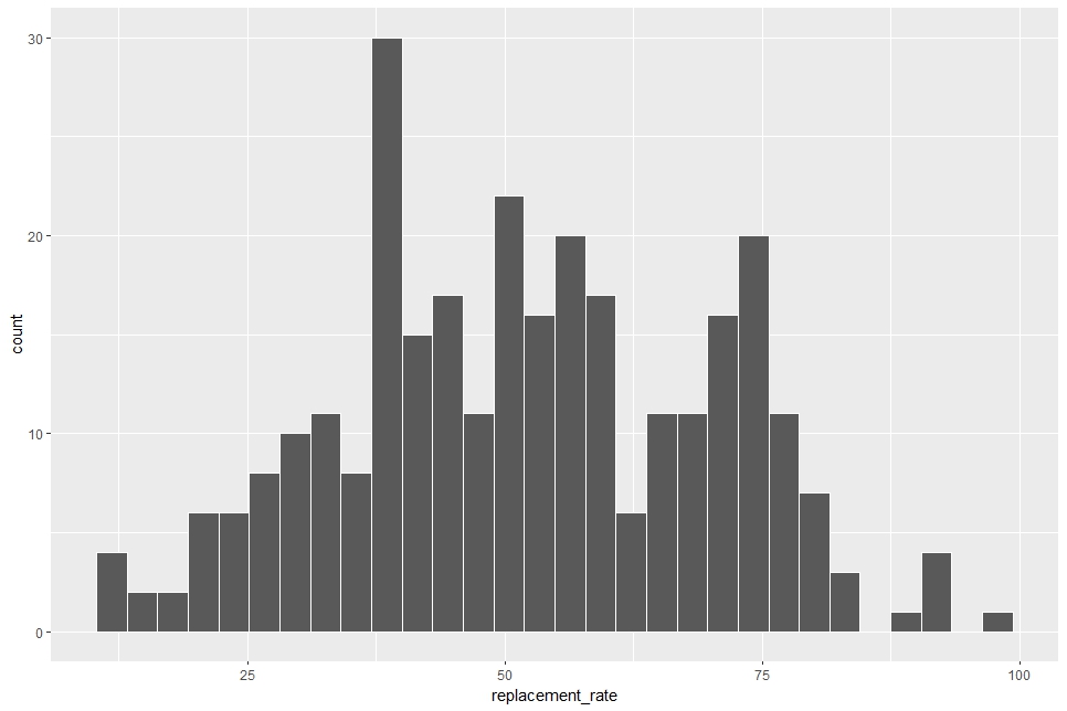
Since the average value of relacement_rate is 51.77(%), the histogram is centerd around 50.
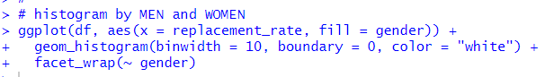
Let's divied MEN and WOMEN
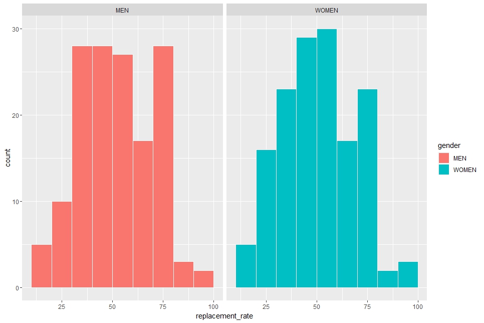
In geom_histogram() function, I use binwidth = 10 to make binwidth is 10, boundary = 0 to place a histogram with 0. In addition, I use facet_wrap() function to make histograms for MEN and for WOMEN.
The two histogram look very similar, so I feel there is not much different between MEN and WOMEN.
Next, let's see 2014 and 2020.
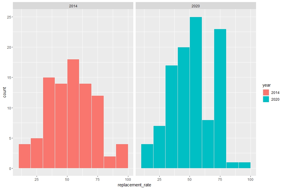
Uhm... I cannot tell there are much difference.
I need statistical inference to tell whether there is differnece in MEN and WOMEN, in 2014 and 2020.
That's it. Thank you!
Next post is
To read form the first post,