
Generated by Bing Image Creator
www.crosshyou.info
This post is following of the above post. In this post I will analysis difference between 2014 and 2020.
First, I make a data frame to calculate difference between 2014 and 2020.
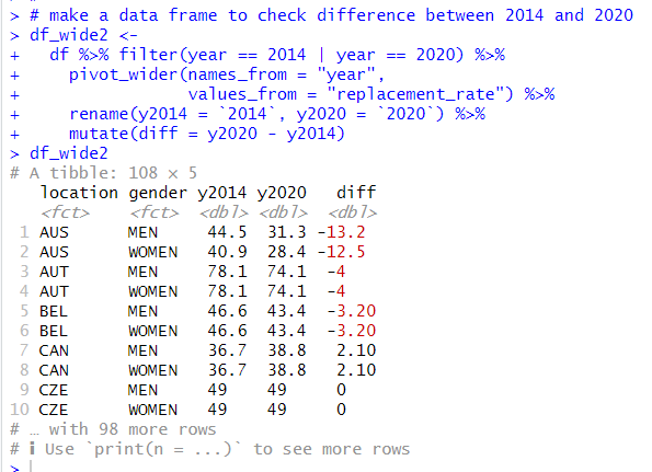
filter() function makes observations for 2014 and 2020 only.
pivot_wider() function transform a data frame from long format to wide formant.
rename() function makes a new variable name.
Then, mutate() function makes a new variable, "diff", which is the replacement rates between 2014 and 2020.
I see some locations have negative value, somes have positive value.
Let's see summary statistics with summary() function.
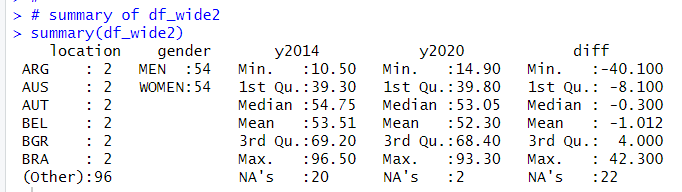
Oh, there are some NAs. I will delete NA rows with na.omit() function.
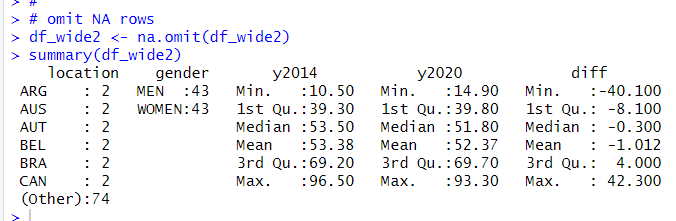 I see mean diff is -1.012. Let's see a histogram of "diff".
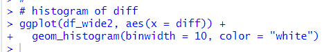
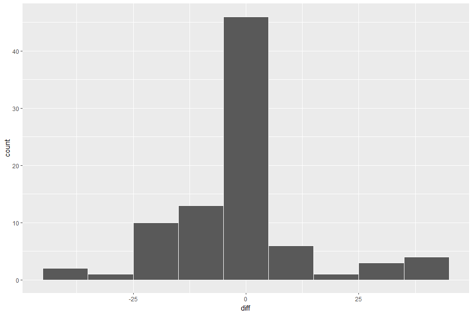
Almost observations are at around 0.
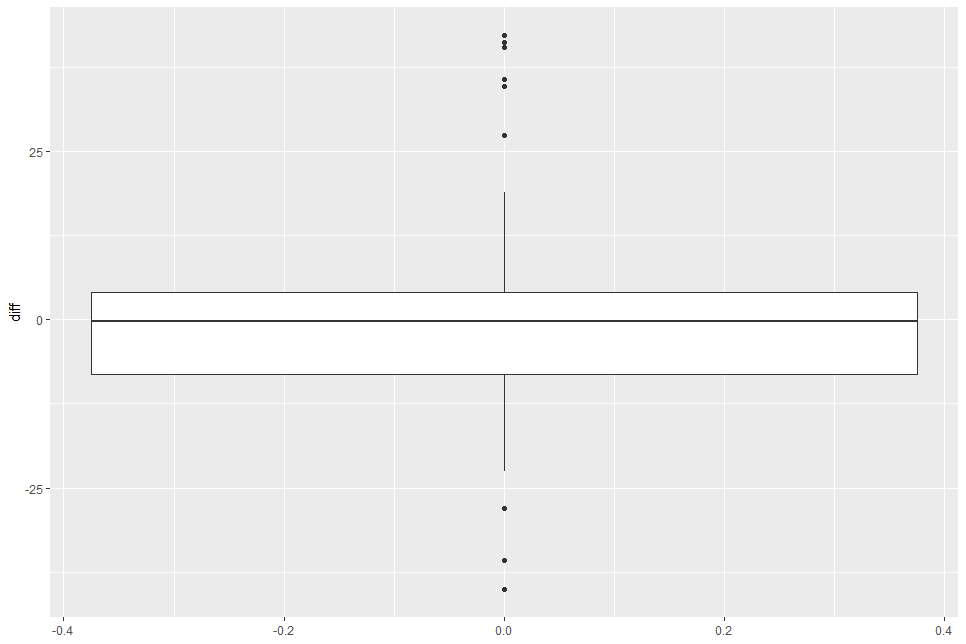
Boxplot shows median value is near 0.
Let's see there is gender difference.
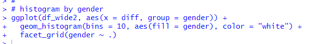
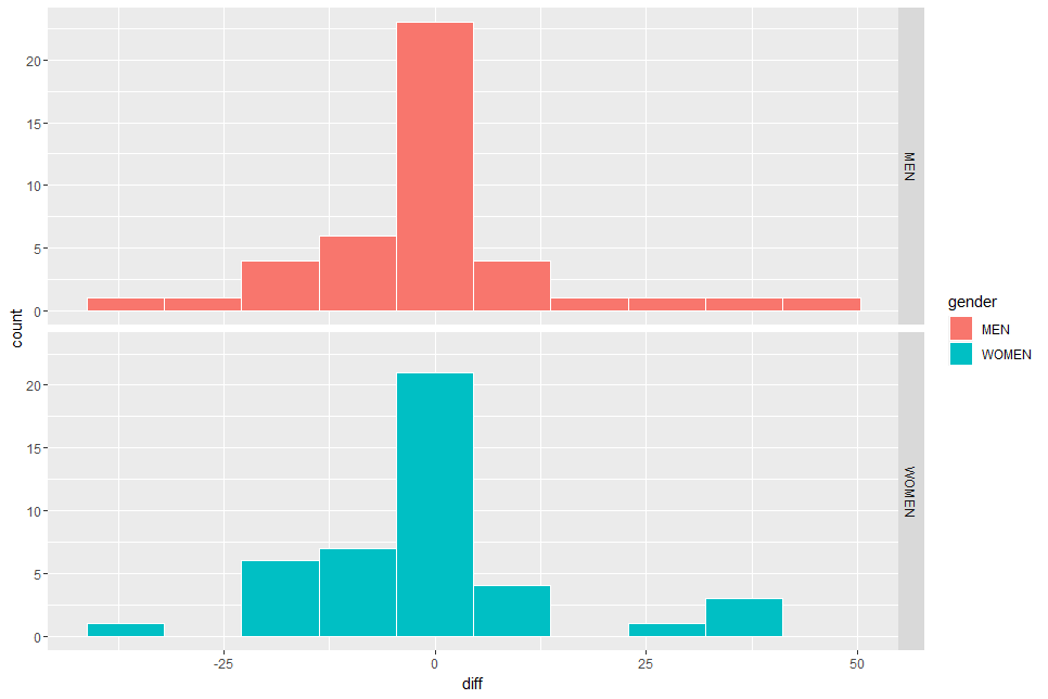
I don't see there is much difference.
Let's use boxplot too.

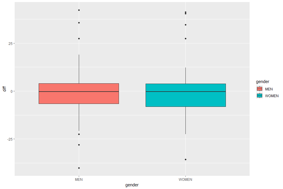
In the above boxplot, I don't see much difference neither.
So, from the point of visualization view, I don't see the difference between 2014 and 2020, by gender, by overall.
That's it. Thank you!
Next post is,
To read from the first post,