
Photo by Eugene Golovesov on Unsplash
This post is following of above post.
In this post let's ee make a correlation matirx.
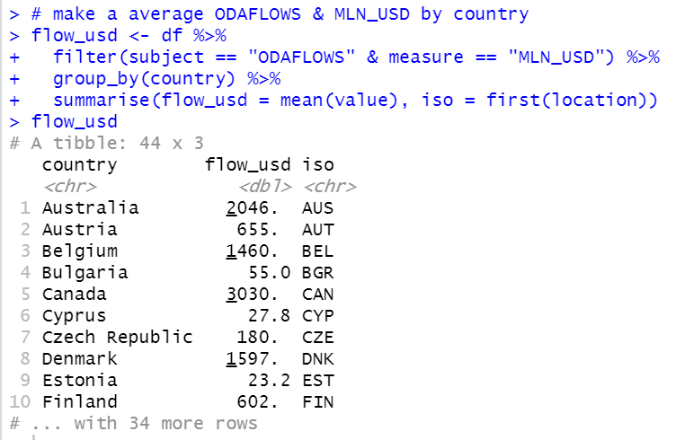
To begin with, I make a data frame for average ODAFLOWS & MLN_USD by country.
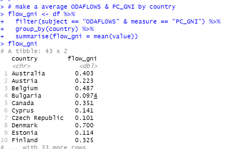
Next, I make ODAFLOWS & PC_GNI data frame
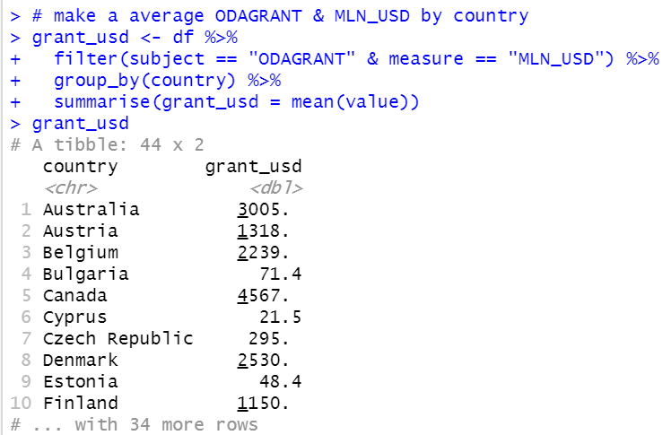
Next, I make ODAGRANT & MLN_USD average by country.
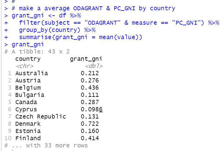
Lastly, I make ODAGRANT & PC_GNI average by country data frame.
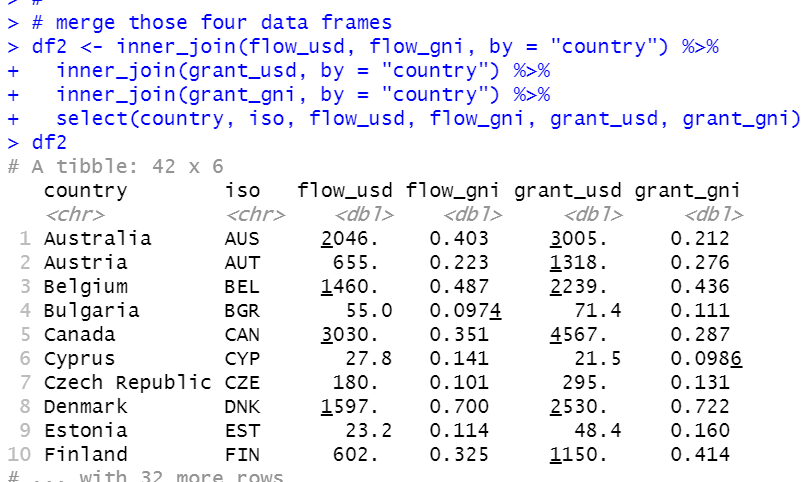
Now, we have four data frames. I will merge them into one data frame with inner_join() function.
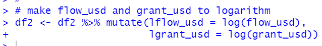
Then, I add logarithm of flow_usd and grant_usd because these two variables became more normal distribution when it is converted to logatirthm.
All right, let's see correlation matrix.
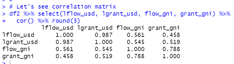
We see lflow_usd and lgrant_usd are strongly correlated.
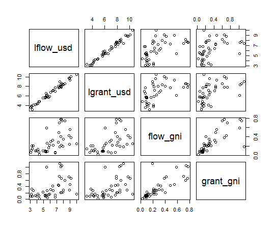
Let's make a scatter plot matrix.

That's it. Thank you!
Next post is..
To see the 1st post,