www.crosshyou.info

政府統計の総合窓口のデータや、OECDやUCIやのデータを使って、Rの練習をしています。ときどき、読書記録も載せています。

OECD Net ODA data analysis 3 - Visualizing data with ggplot() + geom_boxplot() and geom_line(). U.S.A. has the largest ODAFLOWS & MLN_USD.

f:id:cross_hyou:20210627200233j:plain

Photo by Chris Lejarazu on Unsplash


www.crosshyou.info

 This blog is following of above blog.
This time, let's visualize ODAFLOWS & MLN_USD data.

Fisrtly, let's see time x value

f:id:cross_hyou:20210627201057p:plain

f:id:cross_hyou:20210627201114p:plain

Let'c caluculate average value by time and plot a line chart.

f:id:cross_hyou:20210627201507p:plain

f:id:cross_hyou:20210627201518p:plain

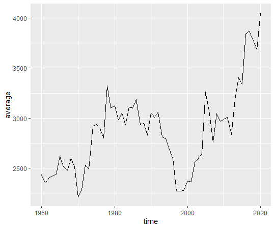
We see a trough before 2000 and 2020 is the highest value.

Now, let's see by location.

f:id:cross_hyou:20210627202004p:plain

f:id:cross_hyou:20210627202013p:plain

USA has the highest average value. DEU has the 2nd, FRA has 3rd and JPN has 4th.

USA is U.S.A., DEU is Germany, FRA is France and JPN is Japan.

I add scale_y_log10() to convert y-axis to logarithm.

f:id:cross_hyou:20210627202620p:plain

f:id:cross_hyou:20210627202631p:plain

We can see more detail for  smaller value locations.

That's it. Thank you!

 Next post is


www.crosshyou.info


To read the first blog,


www.crosshyou.info